
*See pictures below*
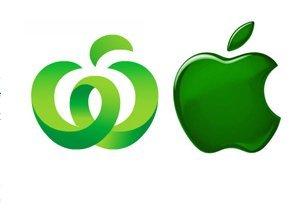
Apple is taking Woolworths to court over the retailer's latest logo: a green, stylized "W" Apple claims bears too much resemblance to its trademarked Apple.
The Woolworths logo (see below) does bear some resemblance to the Apple symbol in color and shape. However, according to Mashable,
The Australian-based Woolworths claims that their logo is simply a stylized "W" paired with an "abstract leaf symbol". One could, however, also say that it's a stylized person with outstretched arms, or an "apple being peeled".
This isn't the first time Apple's gotten protective of its look. Last year, Apple sued the Victoria School of Business and Technology for what Apple claimed was a design just a bit too close for comfort (see below):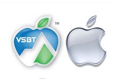
Can Apple really claim any Apple? Hans Hulsbosch, who designed Woolworth's new logo, quips that the company is going too far. "Based on this logic, they would have to take action against every fruit-seller," he said.
According to an entry on Wikipedia, the criteria for trademark infringement is as follows:
- Strength of the mark
- Proximity of the goods
- Similarity of the marks
- Evidence of actual confusion
- Marketing channels used
- Type of goods and the degree of care likely to be exercised by the purchaser
- Defendant's intent in selecting the mark
- Likelihood of expansion of the product lines
What do you think? Too close for comfort or should Apple just chill?