More

Holiday Google Doodle: Today's Logo Took 250 Hours To Make (PICTURES)

Holiday Google Doodle

The Huffington Post   First Posted: 12/23/10 01:23 PM ET Updated: 05/25/11 07:20 PM ET

From December 23 through December 25, the Google homepage will display a large interactive doodle in place of the regular Google logo.

The impressive holiday doodle features 17 illustrations, designed to look like framed paintings that depict scenes of peace, joy and beauty around the world. The small pictures expand when you mouse over them, and clicking each frame links to a Google page explaining that particular scene.

For example, a frame on the far right enlarges to show Santa and his reindeer on a snowy rooftop. If you click that picture, you're brought to a Google search results page, where you'll find an animated video of the holiday carol "Up On the Housetop."

Another frame enlarges to show three women in bright clothes performing an Indian classical dance. Yet another frame shows a snow-capped Mount Fuji.

Chief doodler Micheal Lopez and his team of four artists worked on the complex project for roughly 250 hours. "We want to end the year with a bang," said Lopez, who began work on the holiday doodle back in July, according to the Wall Street Journal.

Take a look at the screenshots (below) of this year's holiday doodle. To view the interactive version, visit Google.com before evening on December 25.

LOOK:

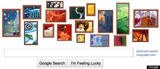
HOLIDAY GOOGLE DOODLE DETAIL:

FOLLOW HUFFPOST TECH

From December 23 through December 25, the Google homepage will display a large interactive doodle in place of the regular Google logo. The impressive holiday doodle features 17 illustrations, desi...
 
 
  • Comments
  • 55
  • Pending Comments
  • 0
  • View FAQ
Comments are closed for this entry
View All
Favorites
Recency  | 
Popularity
Page: 1 2 3  Next ›  Last »  (3 total)
This user has chosen to opt out of the Badges program
photo
01:34 PM on 12/26/2010
If all those paintings had actually been created by the Google staff then 250 hrs would make sense, otherwise...
01:09 PM on 12/26/2010
It was a nice change. They should leave it up for a while.
05:43 AM on 12/26/2010
So with the billions saved in this internatio nal tax avoidance scam, they could have bought everyone a new Ipad to view this work of art!
http://programbilgi.blogcu.com/
photo
HUFFPOST SUPER USER
Indigo River
01:51 AM on 12/26/2010
It's by far the best Doodle. The work paid off. 250 hours. That's when you count the time of each individual together, right? So divide this by 5 and you have 50 hours.
08:53 PM on 12/25/2010
Am I missing something here? How is this impressive and complex? A few graphic images linked to specific google pages? 250 hours? To do what exactly?

Looks more like a whimper to me.
This user has chosen to opt out of the Badges program
photo
MyTake
Release the Hydrogen Economy now!
05:22 PM on 12/25/2010
Well, of course Google staff can end the year with a "bang" because they all got raises and bonuses through that international "Irish" income shifting corporate tax avoidance scam that Google employed, thanks to Exxon and General Electric who did it first.

So the Google Corporation paid on average just 4.5% rate of federal taxation in any Nation in which they operated in.

So with the billions saved in this international tax avoidance scam, they could have bought everyone a new Ipad to view this work of art! Oh, sorry, Ipad uses the Safari browser. Well they can by the Notion Ink Adam for everyone instead.
HUFFPOST SUPER USER
scooterpie99
01:23 PM on 12/25/2010
Signs that Google has become too big...way too much overhead.
photo
durant
Editor & publisher of Europeforvisitors.com
12:00 PM on 12/25/2010
The Venice image in the Google Holiday Doodle points to a search-results page for "Venice gondolas," where our travel site has the top-ranked Web search result. As a consequence, we're seeing thousands of extra page views on our "Venice Gondolas and Gondola Rides" article. Some Google users must be spending a lot of time clicking on images and search results from the Holiday Doodle!
photo
HUFFPOST SUPER USER
DomainDiva
Aviation SaaS Entrepreneur and Technical SME
07:33 AM on 12/25/2010
Pitiful display. No artistic talent whatsoever. Grade: F
photo
HUFFPOST SUPER USER
Indigo River
01:53 AM on 12/26/2010
Who are you say what art is? On that note, show your pieces. It's always easy to criticize. But can you do it better?

Note: A more naturalistic work of art doesn't make it better.
photo
HUFFPOST SUPER USER
DomainDiva
Aviation SaaS Entrepreneur and Technical SME
10:12 AM on 12/26/2010
It's not about me doing better. It's about the Google brand. If a new user was looking at that visual mess would they have known it was google?

Answer: NO!!! Not in a million years. As a frequent google user I was visually stymied for a bit trying to figure out what google was trying to say.

Never ever is a design department ever supposed to turn out work that makes the brand unrecognizable. That's what 250 hours was spent on...making a worldwide brand totally unrecognizable...that's why the F.

The egos of the designers showed through in that they were totally willing to bypass the brand. This also shows that Larry, Sergei and Eric are not on the ball either. Your BRAND is what you protect at all costs. Whatever message is being conveyed...the user needs to know the brand behind it.

If you are in a foreign country and go to the store to purchase items you buy by BRAND. That visual cue that tells the purchaser what the item is even if you cannot read what's on the box or bag.

Sorry for upsetting you so.
10:12 AM on 12/26/2010
as if your opinion is any more valid. who are YOU to say what art is?
03:49 AM on 12/25/2010
Really...
Are these pictures THAT amazing?
Really?
I really appreciate the fact that the artists spent 250 hours on this instead of 250 hours re-working the look, icons, style, layout, etc. of the Android Market.
This user has chosen to opt out of the Badges program
01:20 PM on 12/25/2010
Your statement assumes that engineering groups are interchangeable (i.e., that the web graphics design people can just pick up stuff from the Android UI development people). This is rarely the case, especially when moving across platforms.

Second, 250 hours across 5 people means they spent a week or so designing the layout and each of the 17 elements and implementing the rendering features. That's really not that long a time period for that scope of work.
HUFFPOST SUPER USER
CitizenRob
01:30 AM on 12/25/2010
250 whole hours for 5 employees... Gosh, That's like... 1 whole week. How did Google ever manage to take on such a massive project, do you think they had to hire special project management people to handle the whole weeks worth of work.
.
photo
HUFFPOST SUPER USER
Blackstonia
12:34 AM on 12/25/2010
It's interesting that they can do this but I'm just trying to get some work done. I understand that PCs are toys for most people but where can I go to find people who take them seriously?
12:43 AM on 12/25/2010
Don't you have work to do?
Time to get back to it!
11:41 PM on 12/24/2010
uh, i'm being driven crazy. how on earth do interact with this interactive art??? I click on it and all it does is take me to results for "happy holidays".
11:43 PM on 12/25/2010
uh, are you sure you know what interactive means? Did you not interact with it when you clicked on it? :)
11:28 PM on 12/24/2010
I am mesmerized by these photos each time I click on my google home page. I think they did a fantastic job.
This user has chosen to opt out of the Badges program
photo
04:43 PM on 12/24/2010
What a waste of time, I can only hope that this isn't what job creation will be in the coming months,
Google has more ways to sit ideally by and be non-productive and do nothing.