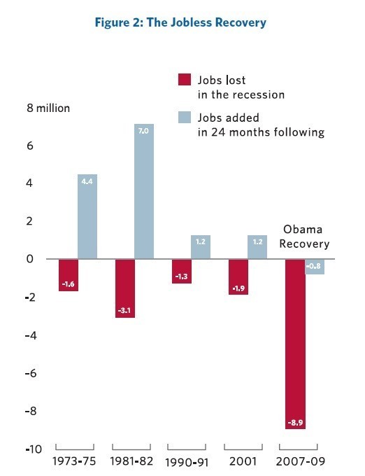
Now that Mitt Romney's "jobs speech" has concluded, the lion's share of the Twitter buzz is centered on this chart, from Romney's "Believe In America" plan for "jobs and economic growth."

At first blush, the chart is confusing as it seems to attribute the job losses that occurred in the two years before President Barack Obama was sworn in to Obama, deeming the whole mess part of the "Obama recovery." While I don't doubt that the Romney campaign will be only too pleased to leave voters with that impression, I'd say that this may have more to do with a poorly designed chart than anything else. The bracketed years on the x-axis refer solely to the years of the recession, yet it lumps the years of "recovery" into the same time frame. Ideally, it should be broken out -- the legend on the chart, which demarcates the blue bars as "jobs added in 24 months following" is doing the heavy lifting in terms of making that clear. It also doesn't help that the words "Obama recovery" hover over the whole thing.
Again, the Romney camp is probably only too happy to have people confused by this. But to end my own confusion, I went ahead and read the text that accompanied the chart on page 16.
With no recovery in economic growth, there has been no recovery in the job market. Post-recession periods of the past have been marked by dramatic increases in employment. In the two years following the 1973-'75 recession, more than four million full-time jobs were added. The two years after the 1981 recession saw more than seven million new jobs. Even the relatively shallow recessions of 1990-'91 and 2001 were each followed by significant job growth. President Obama's recovery, by contrast, never even started. In the two years after the end of the recession in 2009, the economy has actually shed additional jobs.
Okay, so, as the accompanying text says, "In the two years following the 1973-'75 recession, more than four million full-time jobs were added. The two years after the 1981 recession saw more than seven million new jobs." So, I think we can all agree that this is an effort at measuring the job growth in years following the bracketed years at the bottom, and that "Obama recovery" refers to the "-0.8" that occurred in 2009-'11.
That said, this is still a pretty glib and misleading way of telling the story. Romney basically asserts "Post-recession periods of the past have been marked by dramatic increases in employment" as if this is just the natural after-effect of having a recession -- and that Obama has somehow disrupted Nature itself. Romney continues, "Even the relatively shallow recessions of 1990-'91 and 2001 were followed by significant job growth." But there's only one recession on the chart that's not a shallow recession: the 2007-'09 one!
And that's the one that's a different animal. Unlike the other recessions cited -- which came about because of monetary policy restraints imposed by the Federal Reserve (the subsequent rebounds coming about as a result of lifting those restraints) -- the 2007-'09 recession occurred because of this thing we now affectionately refer to as a massive economic collapse. It's the one that ended in a bunch of insolvent banks being unable to invest in the productive sector of the economy. It's the one that's left a massive output gap. It's the one that's left five job seekers for every job opening. And beyond the jobs lost (8.9 million, as the chart says), the economy has to add 140,000 jobs every month in order to keep pace with the growth of the labor force.
What's Obama to do in addressing this? By and large, he has to convince Congress to act on measures that might stimulate job growth. In the most optimal climate he needed to operate within, vote 60 in the Senate was someone like Sen. Ben Nelson (D-Neb.) or Sen. Joe Lieberman (I-Conn.). For most of his tenure, the 60th in the Senate has been a Republican. So the best way of telling the story of why more hasn't been done to create jobs is to say, "The opposition party obstructed these efforts."
And now we're living in an era where it's perfectly fine to threaten default in order to take $4 trillion and counting out of the economy, which will go further to ensure the public sector layoffs that are offsetting private sector job growth and keeping us off the pace of labor force population growth. Sure, Obama's efforts in fending off that bit of hostage-taking were limp, and his name is on the dotted line of the deal. Nevertheless, circa 2011, we're well into what can rightly be called a period in which John Boehner is the co-author of the "recovery-less recovery."
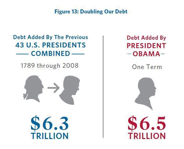
Meanwhile, if you want to talk about Mitt Romney's misleading infographics, here's a much better one:

This is something that Mitt's stolen from Michele Bachmann, who on Jan. 21, 2011, said:
From the time when George Washington took the presidency on his first day to the day George W. Bush left as president of the United States, all 43 presidents, if you take all of the debt combined of all of those 43 presidents, do you know that all of that debt is less than the debt that was accumulated by Barack Obama in one year? That is the level of debt and spending that we have engaged in. So this isn't hyperbole. This is facts.
Romney's citation for this is pretty hilarious:

This makes it look like that's a quote that somebody actually said. In this case, it's been made to look as if it was said, in concert, by the Treasury and the Office of Management and Budget, presumably in some sort of joint-organization choral recitative.
What the Washington Post said about Bachmann's original claim is still true today: it is "mathematically impossible." Romney and his financial team are either too stupid to know this, or they are lying.
[Would you like to follow me on Twitter? Because why not? Also, please send tips to tv@huffingtonpost.com -- and learn more about our media monitoring project here.]