Sometimes data does lie.
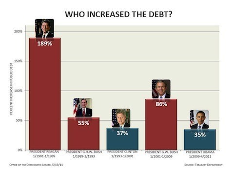
The chart below has been incredibly viral in recent days, making its way across the internet in one form or another, reaching Facebook walls across the country. The problem is, it's incredibly misleading.
According to the MoveOn.org, where it originally gained notice, the chart originated from the office of Nancy Pelosi back in May. The original chart listed the public debt under President Barack Obama to be a meager 16 percent, but was corrected to 35 percent following some investigation by PolitiFact.com (Obama's numbers had been evaluated a year too early).
However, as The Washington Post points out, the data in the chart are still incredibly misleading.
While it lists "percent increase in public debt" as the metric being analyzed, the chart actually measures gross federal debt, which includes debt being held by the likes of the Social Security trust fund. If the chart actually measured public debt, according to the Post, the numbers for Obama and former President George W. Bush would be a lot closer, at 60 and 70 percent respectively.
But what's even worse is the metric being used. The percent of debt has no reflection on GDP, which would compensate for the amount of debt. The Washington Post details the problem:
If the chart were recast to show how much the debt went up as a percentage of GDP, it would look pretty bad for Obama after not even three years in office. In fact, Obama does almost twice as poorly as Reagan -- and four times worse than George W. Bush.
However, there's more to the situation than plain numbers. In fact, the reason for Obama's poor adjusted numbers may largely result from Bush-era tax cuts and spending. This chart, which was released by the non-partisan Center for Budget and Policy Priorities, shows how Bush-era tax cuts will likely be the largest contributor to public debt by the year 2019.
The only question left is, why is this misleading chart (which has been debunked numerous times) still up?
The chart, via Nancy Pelosi's Flickr stream:
Earlier on HuffPost: