

WASHINGTON -- HuffPost Pollster is pleased to announce a small but significant change to our polling charts that should greatly reduce the tendency of our most closely watched charts to give undue weight to a few prominent daily tracking polls.
Our polling charts, like the one shown below that plots national Obama vs. Romney vote preference, are not based on simple averages of recent polls but instead use a statistical technique known as local regression (or loess) to plot summary trend lines based on all of the available survey data. We typically refer to the numbers represented by the end-points of the trend lines as polling "trend estimates."
The advantage of our approach is that regression-based lines smooth out much of the random "noise" in polling results in order to provide a more accurate graphic picture of the true trend, including the occasional "outlier" result that can skew simple averages.
In practice, however, our approach has come with one troublesome shortcoming: The regression procedure treats all individual polls as equal, even when some pollsters release far more data than others. For the Obama job approval chart, for example, two daily tracking polls conducted by Gallup and Rasmussen Reports typically account for about half of all the data points plotted on the chart. To complicate things further, both polls have demonstrated "house effects," producing results that tend to be more negative of President Obama (either on the job approval rating or when pitted against Mitt Romney) than other surveys.
Our abiding philosophy, both at Pollster.com and now at The Huffington Post, has been to resist cherry-picking polls. "We make every effort to include every poll," Pollster.com co-founder Charles Franklin explained four years ago, "even if it sometimes hurts. So even when we see a poll way out of line with other polls and what we 'know' has to be true, we keep that poll in our data and in our trend estimates."
But by releasing results far more frequently than other pollsters, the daily trackers have greater combined influence on the trend estimates than they do in simpler polling averages. In the most recent RealClearPolitics average of the Obama job approval rating, for example, Gallup and Rasmussen are just two of eight polls. But in our chart, as of this writing, the two daily trackers contribute six of nine data points plotted. Thus, this aspect of our system has the effect of giving the daily tracking polls greater weight than they would have in a simple polling average.
The problem would be worse but for our procedure of using only the non-overlapping samples for daily tracking polls. For Gallup and Rasmussen, who release Obama job approval numbers based on a three-day rolling average, that means we start with the most recently published data and work backwards, using only every third release to calculate the trend lines (selecting the interviews conducted on Monday-Tuesday-Wednesday, then the previous Friday-Saturday-Sunday, then the Tuesday-Wednesday-Thursday before that, and so on).
The change we make today is simple. It adds just one more step to our current process. For national charts featuring results from a handful of daily tracking polls -- such as the Obama job approval rating and the Obama-Romney horse race question -- we will average the results for daily trackers so that we use just one data point per pollster, per week to calculate the trend lines, starting with the most recent seven-day period and working backwards, one week at a time. This procedure does not throw out or cherry pick data or pollsters, it simply reduces the number of data points used to calculate the trend lines by averaging multiple data releases within a given week.
So consider again the polls plotted in the last seven days. On the Obama job approval chart, as of this writing, the Gallup and Rasmussen daily tracking polls account for six of nine polls included using our standard procedure. With the weekly averaging in place, Gallup and Rasmussen account for just two of five polls included.
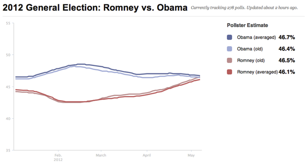
The difference on the overall trend will typically be slight: For the national Obama-vs-Romney vote preference question, the current estimate would be a near tie, with Obama a whisker-thin 0.1 percentage points ahead of Romney (46.5 to 46.4 percent). With the weekly averaging in place, Obama's lead increases by a half a percentage point (to 46.7 to 46.1 percent). The chart below shows that the impact is consistent over time, reflecting the house effects in the Gallup and Rasmussen trackers benefiting Romney.
This change comes with a few qualifications. First, the change only affects the data used to calculate the trend lines. It does not affect the number of data points plotted on our interactive charts or listed in the table that appears below each chart. Those will continue to display independent, non-overlapping releases.
Second, the change does not "correct" for pollster house effects, it only reduces the impact of daily trackers showing large house effects on the overall estimates.
Third, as of this writing, we have only applied the weekly averaging procedure to the two national level charts described above. In the coming days, we will be putting the procedure in place in additional national level charts -- such as the "generic" U.S. House ballot or the right direction-wrong track question -- where a handful of pollsters that release data on a weekly basis tend to dominate. For those charts, we will average multiple surveys from individual pollsters within a three- or four-week window.
Fourth, we will likely remove the averaging procedure for the Obama-Romney national chart in the fall, when the number of organizations releasing daily tracking polls will significantly increase. In late October 2008, for example, eight different survey organizations released rolling-average, daily-tracking surveys, effectively eliminating the problem of one or two pollsters having undue influence on the trend lines.
Finally, expect more upgrades to the HuffPost Pollster charts and data in the coming months. We have much more in store, so please stay tuned!