Occupy Wall Street is all but gone, while income inequality appears here to stay. Such is life in the United States of America, where the divide between rich and poor can sometimes feel like one of the country's only true constants.
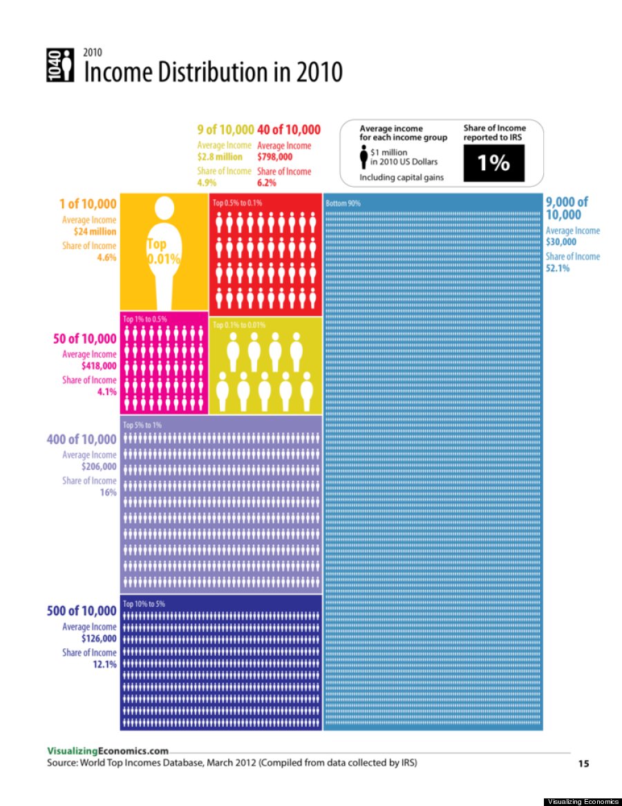
The difficulty is truly grasping the size of that gap, a problem the below infographic by Visualizing Economics helps make easier. Pay special attention to the bottom 90 percent of Americans, who collectively held just a little more than half of the nation's wealth in 2010, all while the wealthiest 0.01 percent held nearly five percent. It's a stark divide many too easily forget.
We'll be presenting infographics from Catherine Mulbrandon's series Visualizing Economics all week on The Huffington Post. Here's the first from her new book, "An Illustrated Guide to Income in the United States":
Visualizing Economics is a website by Catherine Mulbrandon dedicated to publishing infographics about economic data. Visualizing Economics has been featured at Slate.com, NPR.org, WashingtonPost.com, The Big Picture, Seeking Alpha and on MSNBC. Mulbrandon's new book "An Illustrated Guide to Income in the United States" is also now available.
Related
Before You Go
