What do you call a set of 122 maps depicting the variety of word choice, pronunciation and slang across the U.S.? Super viral.
If you've visited Facebook in the past several hours, it's likely you've seen Joshua Katz's work. The graduate student in statistics at North Carolina State University created a series of U.S. dialect maps that, though made just for an end-of-year project for one of his classes, inadvertently set the social Internet ablaze after finding their way onto Reddit and then Business Insider.
"I started the project mostly out of personal interest," Katz told The Huffington Post. He wanted see a smoothed-out version of data collected by Bert Vaux, a professor of linguistics at the University of Cambridge, in a survey of American speech patterns.
"I looked around on the Internet, but was disappointed that I couldn't find anything like that," Katz said. "Then I figured that if I wanted to see the maps, I'd just have to make them myself! I had no idea that they would catch fire like this. It's all pretty surreal."
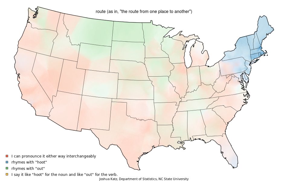
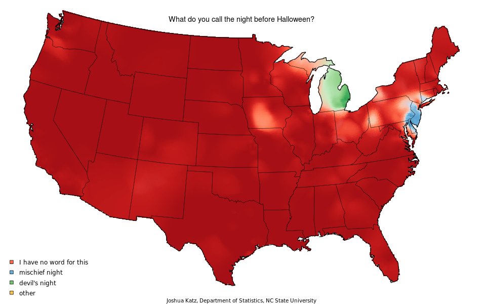
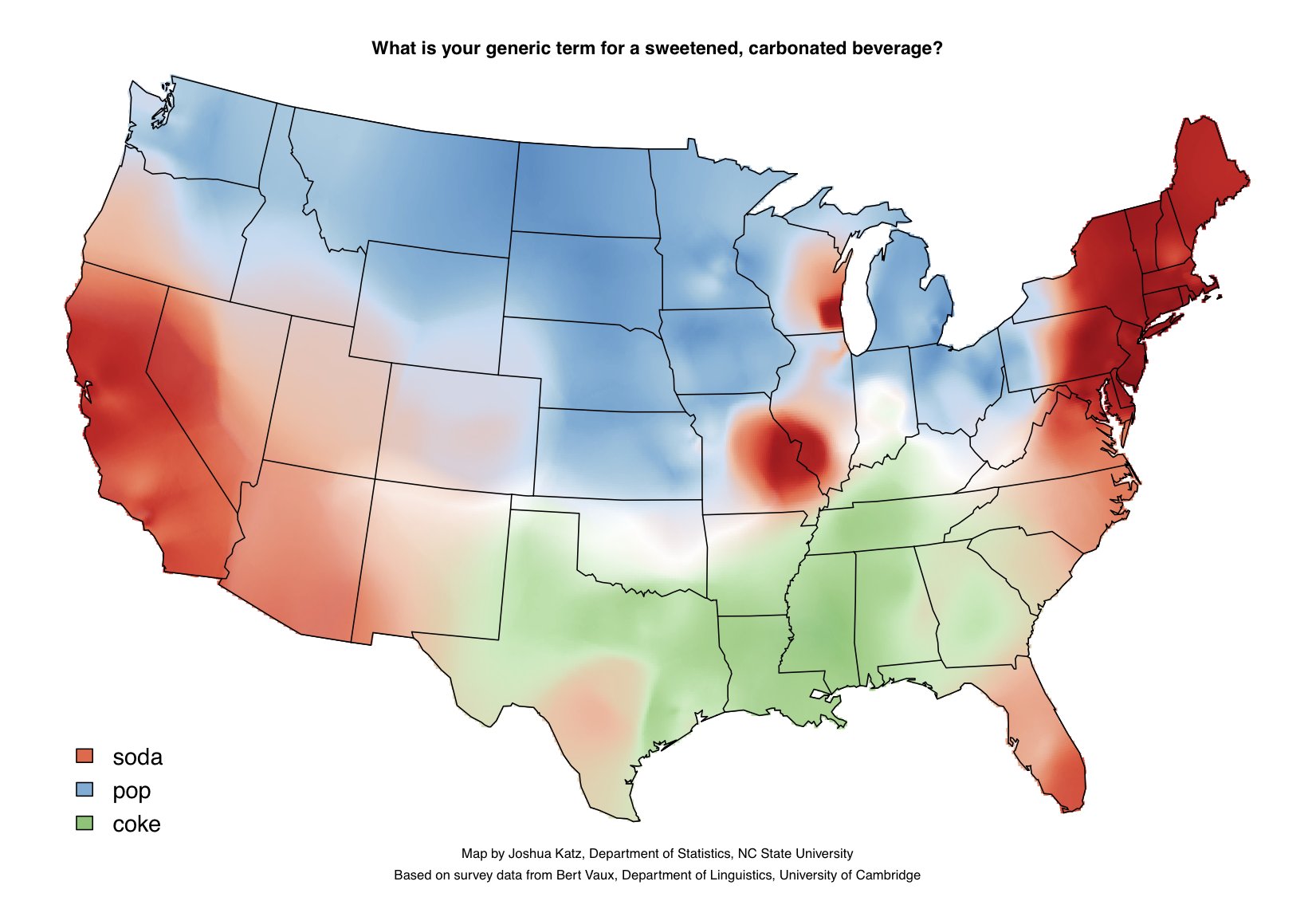
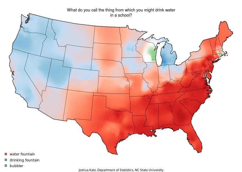
The maps answer questions like "What is your generic term for a sweetened carbonated beverage?" (soda/pop/coke) and "What do you call the miniature lobster that one finds in lakes and streams?" (crawfish/crayfish/crawdad). They naturally engender sharing on social networks, which connect individuals from disparate parts of the country and let them debate regional pronunciation differences, and while letting people from the same places commiserate over shared linguistic quirks.
Katz uploaded the work to his university's website at the end of the academic year. From there, The Abstract, a research blog at North Carolina State, wrote about Katz's project on Tuesday, and Redditor Detsl then discovered and posted them to the subreddit r/linguistics on Wednesday. The website Business Insider soon picked up the story.
Once the maps hit Business Insider, they went ridiculously viral. Less than 24 hours later, the post has almost 17 million page views. The publication's chief technology officier, Pax Dickinson, tweeted the following at 5:48 p.m. ET about the number of people on Business Insider at the time:
The post broke Business Insider's previous record of concurrent views. At 8:45 Wednesday night, Dickinson tweeted that the post peaked at 76,000 concurrent viewers.
The maps' overwhelming popularity caused some disruption on the site where the original study was published. The hosting server "seems to be buckling under the traffic at the moment, but we hope get it running again soon," Katz told HuffPost. The host server has now created a dedicated cluster for the maps, to accomodate the heavy traffic. He also tweeted:
According to Katz's Twitter account, the maps will soon be featured on "Good Morning America."
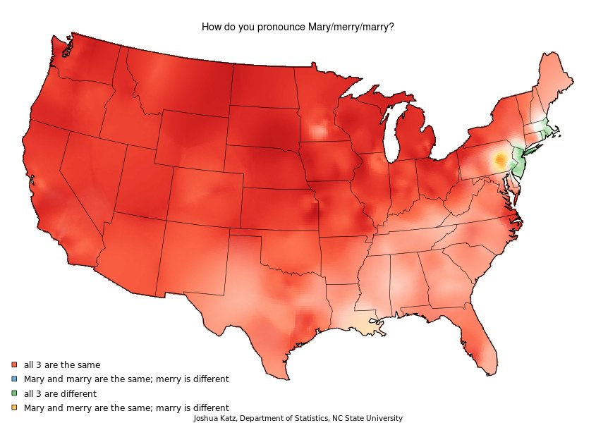
We've chosen some of our favorite maps from the study below:
And of course, you can check out more of Katz's work here or in our slideshow:

Dialect Maps By Joshua Katz
CORRECTION: The original version of this article misspelled University of Cambridge professor Bert Vaux's first name as Burt.