It's officially fashion week, which is super exciting for us here at HuffPost Home. Why? Because we get a glimpse of what's coming next in the world of interiors. This year's accessories and furniture will be influenced by the styles, patterns and, of course, colors that we catch glimpses of from the runway shows.
As a handy guide, Pantone just released their Fashion Color Report for Spring 2014 which is an overview of the hues most prevalent in designers’ current collections. The palette is a medley of pastels, neutrals and pops of vivid brights, and not surprisingly two very different blues weigh heavily.
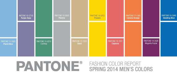
WWD describes these colors as an equal balance. "Dazzling Blue," a brighter more energetic version of navy was chosen as the top color for the season, and it's kept in check by "Placid Blue" which has grey undertones. According to WWD, this is a sign of optimism and a positive outlook about the economy. “This season, consumers are looking for a state of thoughtful, emotional and artistic equilibrium,” said Leatrice Eiseman, executive director of the Pantone Color Institute.
Lucky for us, some of our favorite designers for home already use these fab colors in their lines. Click through to see some of our favorite "dazzling" and "placid" blue furniture and accessories.

Pantone Colors For Spring
Have something to say? Check out HuffPost Home on Twitter, Facebook,
**
Do you have a home story idea or tip? Email us at homesubmissions@huffingtonpost.com. (PR pitches sent to this address will be ignored.)