

Your Mac could soon be a major source of eye strain.
Apple plans to release a new operating system this fall for Mac, OS X Yosemite. When the company demoed the system at its annual World Wide Developers' Conference on Monday, many noticed that the font looked different. In fact, the operating system's new design looks a lot like the iPhone's current one -- leading to speculation that Apple is changing its desktop font from Lucida Grande to Helvetica Neue, the font that's on the iPhone.
If you've ever seen a nerd freak out over comic sans, you'll understand how important fonts are. Many find Helvetica Neue difficult to read, and are not too pleased with Apple's potential decision.
"It's definitely harder to read," Ina Saltz, a typography expert, professor and author of Typography Essentials: 100 Design Principles for Working With Type told The Huffington Post. "The light weight of Helvetica Neue is much thinner. I'm a baby boomer and when I switched to iOS 7, I was like, 'Oh sh*t, what are they thinking?'"
There were a lot of complaints when Apple switched to Helvetica Neue on the iPhone with iOS 7.
It's not confirmed that the font will change, and Apple did not immediately respond to The Huffington Post's request for comment.
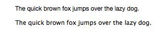
Here's a comparison of the two fonts in size 12. The potential new one, Helvetica Neue is on top. Then there's Lucida Grande below.
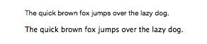
Want to see it smaller? Here they are in 10 pt.
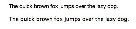
How about larger? This is 18 pt.
So why is it so hard to read? Saltz said the problem is the stroke width, or the thickness of the lines that make up each individual letter. "If you look at that, it's much lighter," she said.
Helvetica Neue doesn't have the legibility that Lucida Grande has, which is especially important for a font that will be used for big blocks of text, Saltz said. "Any good type designer will say that legibility is paramount," she added.
In an interview with Fast Company, typeface expert Tobias Frere-Jones also said the font could be hard to read at small sizes. "Shapes like ‘C’ and ‘S’ curl back into themselves, leaving tight 'apertures'--the channels of white between a letter’s interior and exterior. So each shape halts the eye again and again, rather than ushering it along the line," Frere-Jones said.
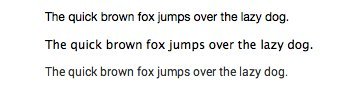
In case you were wondering, Android phones use a font called Roboto. Here's what that looks like in comparison with Helvetica Neue and Lucida Grande. The order below is Helvetica, Lucida, Roboto.
But even if some people think it's hard to read, it might make sense for Apple to switch. "I think it's a good idea to unify the typography across Apple's different operating systems," said Ellen Lupton, the director of the Graphic Design MFA program at Maryland Institute College of Art and the author of several books, including Thinking With Type.
Lupton added that if Apple does make the change, we'll probably get used to the new font pretty quickly. Many of us have seen and read Helvetica for most of our lives, so it shouldn't be a problem, she said.
"Human beings have a remarkable capacity to read typefaces, and I doubt anyone will have much difficulty making sense of Helvetica," she added.
"It’s very hard to pass judgment on the readability of a font because there are so many other elements to consider - not least background and layout," Simon Garfield, author of books like Just My Type, told HuffPost. "It often just comes down to personal preference and what our eyes are used to."
But when it comes to tech companies going all-in for Helvetica Neue, at least one major name is running the other direction. Twitter just changed its font from Helvetica Neue to Gotham on May 30.
This post has been updated with a quote from Simon Garfield.