Use Bold Colors
Francis Amiand
Unpopular with Decorators
You always hear that white, pale gray, and cream-colored walls make a room look bigger and that they are colors you never tire of. So interior decorators neglect the more intense colors. This is a mistake. In the right amount, flashy colors can give a room character at no great expense. You don’t need to move the walls, or invest in expensive furniture or works of art. All you need is a few cans of paint and some brushes and rollers, and you can change everything.
Black, The Decorators' Dark Horse
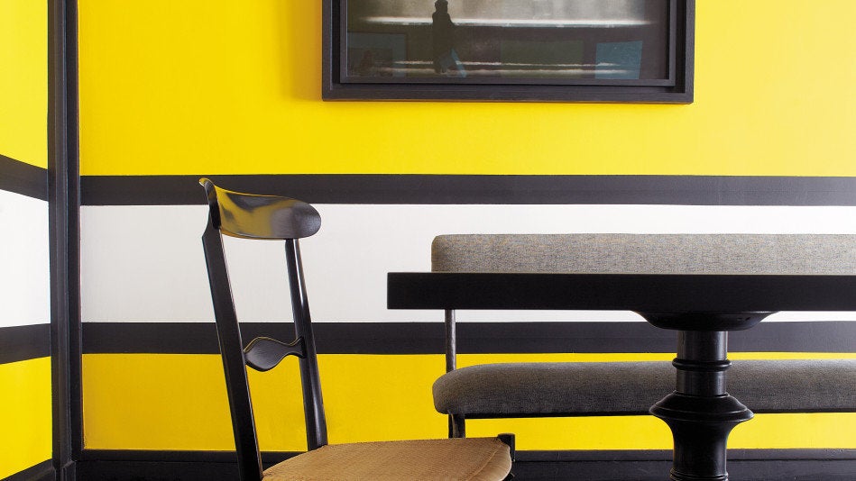
Black is a color that is often ignored. Yet black can provide warmth, set something off, or provide a wonderful backdrop for artworks, pictures, a view. . . . I use black to cover a wall, or put bands of black around a wall to form a frame, and sometimes around a window opening. I also like using black to transform parquet flooring.
White is Now!
White is purity. And it’s all the more luminous when set off against black or some other strong color, just the way lipstick sets off your skin color.
Black + White + Yellow
Chez Moi
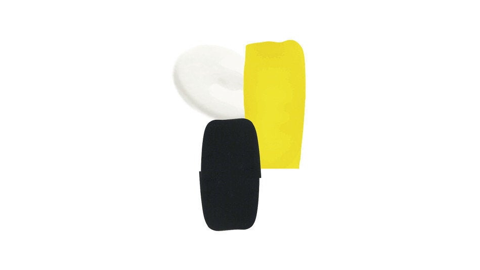
A magic trio that gives energy to a room! Especially when you choose a very saturated, sunny, warm yellow. Before actually applying paint to the walls, I always advise making a sketch using crayons on paper. Then paint the chosen colors onto 8.5 X 11-inch (30 X 20-cm) sheets of paper. Tack them to the walls and consider the effect before committing yourself. And never forget, it’s only paint!
For Every Room, Its Own Color
Francis Amiand
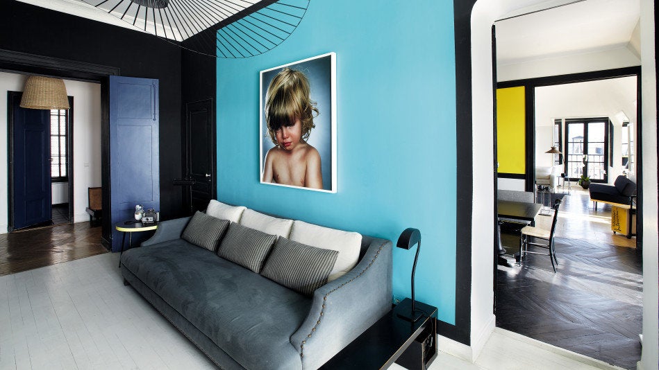
I like the idea of giving each room in the house a strong identity and a specific color. Blue I find particularly pleasing, because it strikes me as urbane, contemporary, and at the same time very restful and poetic, especially when set off by black. An important thing to know about color: The edges and finish need careful attention. If the effect is anything less than crisp, it can look like a mess.
Advertisement
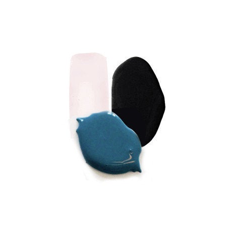
Chez Moi
I dream up color combinations that play off and enrich each other.
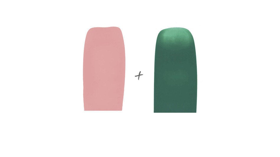
Chez Moi
A light pink, used as an accent color, brings freshness to deep emerald.
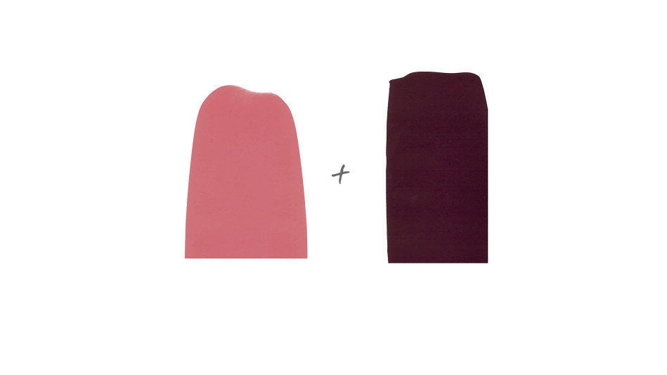
Chez Moi
Contrast dark plum with vibrant pink.
Advertisement
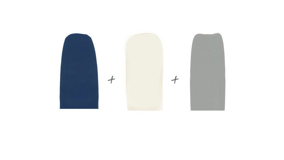
Chez Moi
A trio of colors that, while cool in tone, is ever so soothing.
Chez Moi
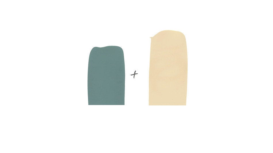
Make a large area of beige and structure it with a coppery green.

Chez Moi
“Sarah blue” is a deep color that adapts to its environment. Veering at times toward turquoise, at others toward green, this shade comes alive according to the light and colors that surround it.
Advertisement
Reprinted fromChez Moi: Decorating Your Home and Living Like a Parisienneby Sarah Lavoine. Copyright © 2015 Abrams Image, New York. Published by Abrams Image.
