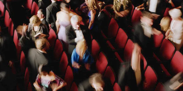
The spring season is here! And it is a super busy one. I know what I'm most excited about, but I am always wondering what others want to see. I'm too close to it after all. I know what is coming up and a lot about each show, most people do not. A lot of people choose a show to see just based on a recommendation, a 3-line description, a discount offer, a TV commercial (as I discussed in my last post) or a print ad. Advertising has always fascinated me. Inspired partially by Erik Piepenburg's New York Times stories on poster art, I decided to ask some New Yorkers what they thought of the art work of the spring. What made them want to buy tickets or at least do some research?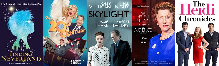
My non-scientific study took this form: I went to some professional offices (banks, law firms) and showed select people about 10 pictures of poster art to see what they thought. This was the least scientific study I've ever done, as I randomly picked people who I thought had the money to go to theater, but probably did so rarely. Also, not every person saw every poster. In other words, take it with a grain of salt.
Advertisements are tricky. They are to get people to buy tickets. A person doesn't necessarily need to like a poster to buy tickets. So no one commented that The Audience had extremely clever art, but I did get a lot of: "Oh, I want to see that. I should get tickets." Whereas a ton of people thought the Finding Neverland poster was pretty (the one without the 3 leads was used), but I'm not sure people followed-up and bought tickets.
In terms of plays, I'm most excited about Skylight, which I've wanted to see since the London run was announced. No one mentioned it as something they wanted to see based on the poster art and no one I spoke to was familiar with the title.
Not a single person reacted positively to the Fun Home art or asked any follow-up questions regarding the show. While I don't hate the art, I do agree that it is sort of a wasted opportunity. This is a show about a cartoonist - the art could be more attention-grabbing than it is.
The poster of On the Twentieth Century impressed many. A bunch of people said it seemed fun. Some people recognized Kristin Chenoweth and one of my mother's favorite leading men, Peter Gallagher, and were excited by their presence. A lot of people told me they were going to get tickets after I described it to them. (Reminding me I need to get my own tickets!)
When I saw the Living on Love art, I emailed the press agent to tell him how much I liked it. Others agreed! A lot of people said it looked old school Hollywood and seemed funny. Score. (I hope I got the exact description of the plot right when people asked.) Only one person recognized Renee Flemming from the photo, but a lot of people recognized the name when I mentioned it.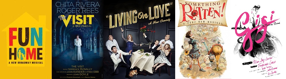
I received a lot of follow-up questions on Hand to God. People were surprised it was a Broadway show (and these aren't insiders!) but seemed intrigued by it.
Not many were familiar with The Heidi Chronicles as a property, but I was surprised at how many people reacted positively when they saw Elisabeth Moss.
A bunch of people told me they were excited about The King and I, but no one commented specifically on the art.
Fish in the Dark got a lot of praise, as much for the name "Larry David" as for the "adorable" fish in the bulb.
People really reacted to The Visit art, many commenting on how remarkable it was that Chita Rivera was back.
There were a couple of good comments about the Gigi and American in Paris posters, but nothing amazing.
One person thought It Shoulda Been You looked cute.
There were unfortunately a couple of negative comments on the Something Rotten! poster, with "silly," a comment I think some would think was positive, being used in a negative tone. However one person asked follow-up questions about it and thought it sounded hilarious.
One person liked the Doctor Zhivago art.
No one commented on Airline Highway.