Experimenting with a bright paint color is a great way to bring a sense of drama and glamour to a room, but choosing the right color can be a tricky process. A color that looks muted on a sample can be too intense when applied to all four walls. Textures and tones found throughout the space can have a tremendous impact on how the color reads in the room. Six design experts give us their top tips to avoid common mistakes when going bold with color.
Mistake #1: Choosing a Color Without Testing Samples.
One of the most fatal mistakes people make when painting with bright or dark colors is that they choose the shade from an itty-bitty paint chip without experiencing the color in the natural light of their space. Always put up samples of at least 2-3 different hues on all four walls of a room before ultimately selecting the winner. Natural light is everything! -- Krista Nye Schwartz & Tami Ramsay, CLOTH & KIND

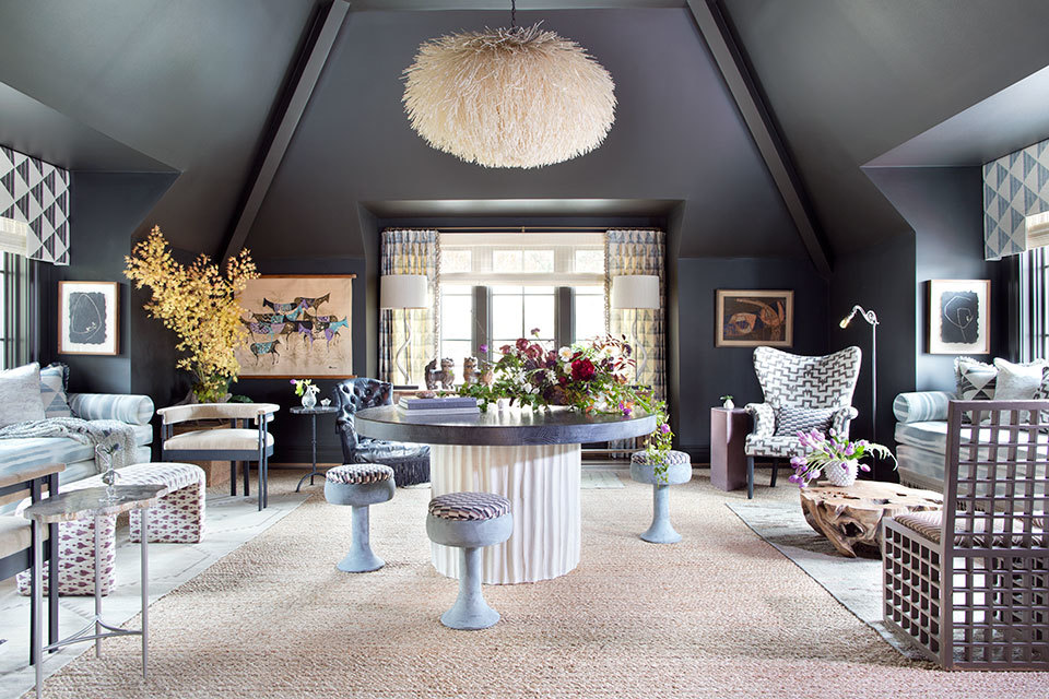
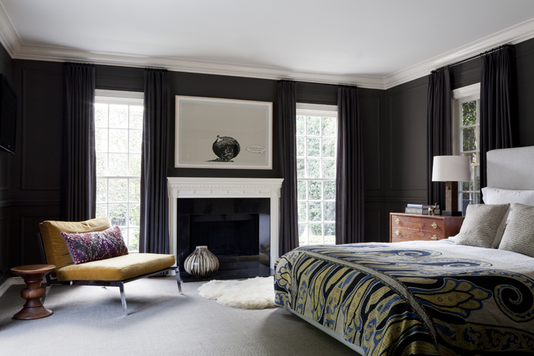
Mistake #2: Trying to Do Too Much.
Use one bright color surrounding an entire room to create elegance and drama. Using multiple bright colors in one space can diminish the effect. -- Stephen Huberman, SGH Designs
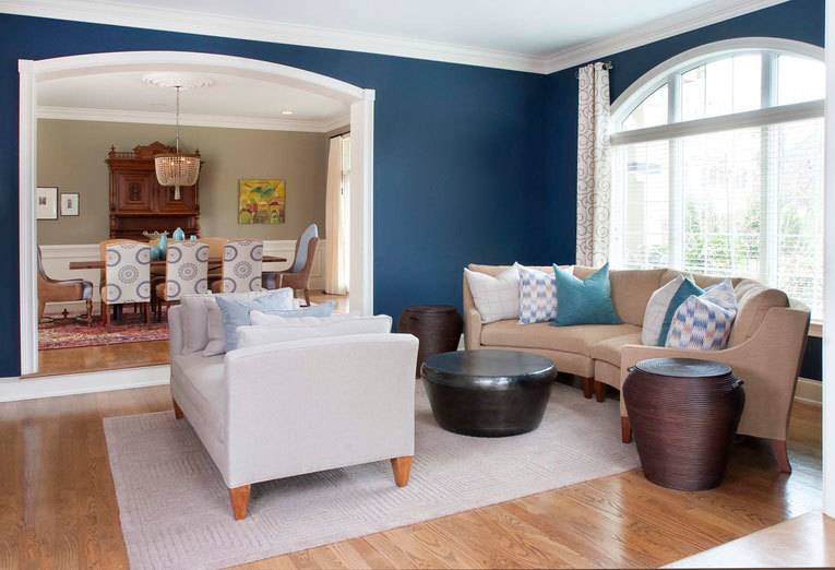
Mistake #3: Forgetting Other Materials & Colors in the Room.
Pay close to attention to the materials of the floor and the color of ceiling, as they will heavily interact with the colors chosen for the wall. Colors change when next to one another, but it is easy to forget that when looking at a paint deck and falling in love with a dramatic color. -- Krista Schrock and David John Dick, DISC Interiors
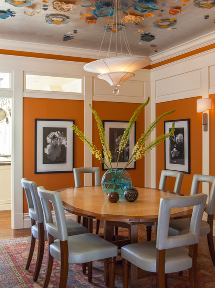
Mistake #4: Thinking that All Whites Are the Same When It Comes to Trim.
Use the appropriate white for trim with bright colored walls. Warm tones need a white with a yellow undertone and cool tones need a white with a cool undertone. If you don't, for example, a warm white will read yellow against a bright blue or a cool white will read gray (or dirty) against a warm orange. -- Claudia Juestel, Adeeni Design Group
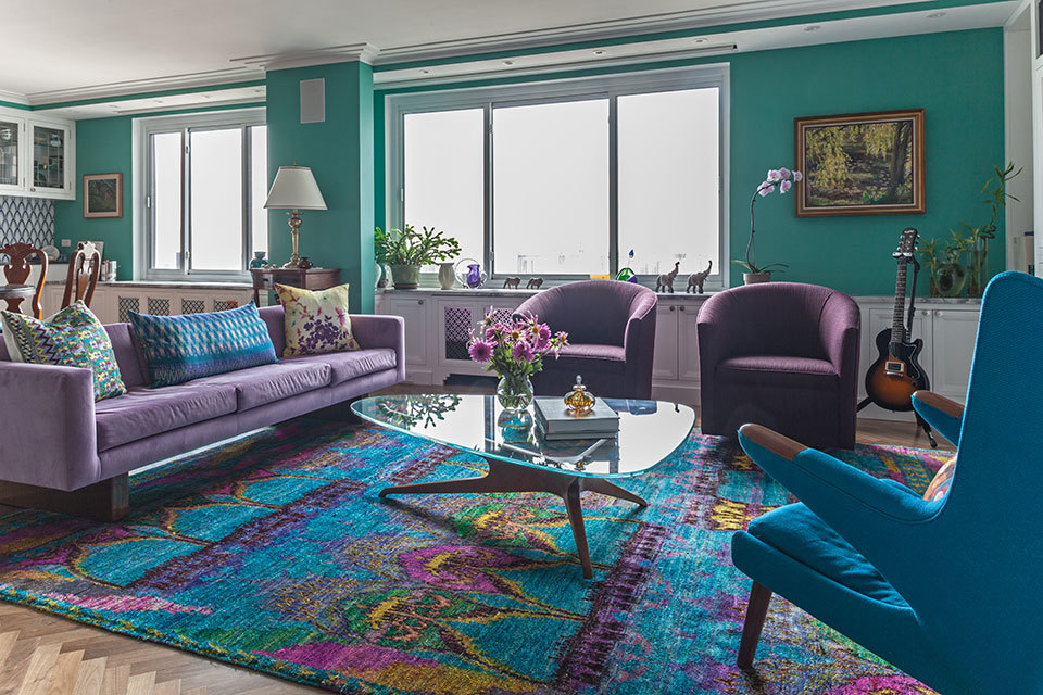
Mistake #5: Not Using Accent Colors for Balance.
When painting a room a bright color, offset it with a complementary color so the bright color is not too dominant. For instance, if your walls are bright orange, use accents of teal. If your room is light purple, use green in the room to create balance. -- Kati Curtis, Kati Curtis Design
Mistake #6: Not Supporting the Color in Other Areas of the Room.
Establish a color and coordination relationship (close or distant) with all items in a space, and then prioritize which story should be told the loudest. This ensures that no matter how bold or dramatic the color on the wall is, its placement is substantiated by the supporting elements around it. -- Nile Johnson, Nile Johnson Interior Design