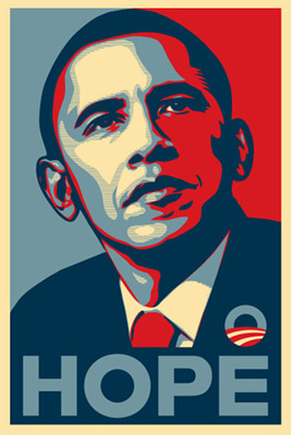
#1

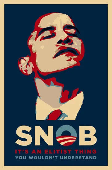
#2
#1: Shepard Fairey's original Obama poster.
#2: The reformulated version on wingnut Michelle Malkin's blog, riffing on the Clinton attack.
Writes Al Shaw, with a take on the graphic design:
Its meticulously-spaced three lines of copy are a direct hit at Obama's signature both in terms of copywriting style ("CHANGE / We can believe in") and his extensive use of the Gotham typeface. On the surface, the parody works--Obama looks arrogant with an upturned chin, and the O in "SNOB" mimics his recurring logo, reiterated over and over with his message of HOPE.
On a deeper level, however, this spoof falls apart because everything it references contradicts what it tries to convey. Shepard Fairey's art is as anti-elitist as it gets. Check out some of the sightings of the poster for an example of what I'm talking about. The typography also reiterates populism. As H&FJ (the creators of Gotham) recount, the font actually originated out of New York's "vernacular lettering" and signage-- liquor store neon signs, hand painted truck lettering, the sign at the Port Authority Bus Terminal, etc. (not exactly bastions of elitism). It was designed to be quintessentially American--lettering from before the era of "graphic design." Considering the Malkin spoof, the letterforms contradict what the words have to say.
Writes Michael Shaw, with a take on the political design:
1. Upturned chin, check.
2. With a preacher-like feel, I'm wondering if there isn't a racial element here, too. Echoes of Reverend Wright?
3. Sorry, but with the hair missing, and the loss of the red to frame the blue facial shading, I get a little skittish seeing Obama's head cocked back and his eyes closed, that dark blue simultaneously wound around his neck and forming a great gaping gap. And what about that red now?
Photoshop of the week: Typical liberal snob (Michelle Malkin)
For more of the visual, visit BAGnewsNotes.com.
(illustration 1: Shepard Fairey via obeygiant.com. illustration 2: Tennyson via michellemalkin.com)