Mobile apps and smartphones have changed everything when it comes to developing a quality website.
From the way we choose a restaurant to the way some people search for a date, mobile apps have encompassed almost every aspect of our lives. And unsurprisingly, the websites of yesteryear are beginning to disappear in favor of refined app-like experiences.
In part due to the proliferation of touchscreens, mobile devices have fundamentally altered expectations for online experiences. Traditional HTML text heavy websites now look as archaic as a Ford Model-T. Faced with the sleek design and refined visual aesthetic of today's top mobile apps, web developers must adapt or fall to the wayside.
In a world where users spend more time using an app then surfing the Internet on their mobile devices, web development has been forced to change. By assessing the way that some of the most popular websites in the world have revamped their websites, it is easy to see how the web is becoming increasingly app-ified.
1) Mashable's App Inspired Redesign

As one of the most popular technology blogs in the world, Mashable needed to make a statement by implementing the latest trends in mobile web development. Techniques employed, such as Responsive Web Design (RWD), have sprung up solely to provide websites with a way to reach mobile users and emulate mobile app experiences.

The end result is an ideal execution of what websites can become if they take cues from apps. Mashable went full-on RWD, meaning that the site adapts its layout and content specifically for smartphones, tablets, and PC users. Aside from the responsiveness of the site, there are several features that are directly drawn from mobile apps.
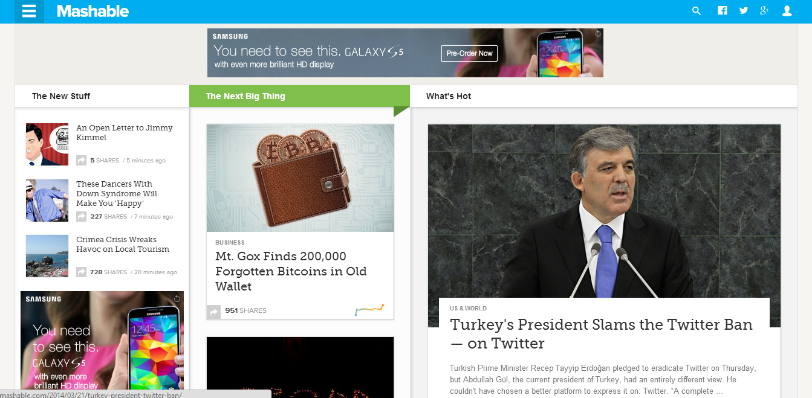
With no noticeable header menu, Mashable uses a sidebar menu accessible in the top left corner of the page. The sidebar stays in that location regardless of the device type used to access it. It's a common feature in countless mobile apps as you can see here:

2) Time Magazine Adapts for Mobile News Readers

Similar to the approach by Mashable, Time underwent a significant redesign to update its presence for mobile and desktop news readers. What makes the redesigned site unique and app-like is the use of the sidebar dropdown menu and a separate 'side-drawer'.

In the side-drawer a reader can instantly view a list of trending stories, while the sidebar drop-down lists each separate section of the site. The side-drawer feature is prevalent in mobile apps thanks to the touch screen interface that allows users to drag the actual menu out from the side of the screen.

Now that many users are familiar with such actions, touch inspired website features are being translated to the desktop. The site also employs infinite scroll to allow the user to continue reading the next article by scrolling down. When accessed on a tablet, the action feels as seamless as it would on a native app built for an iPad or Nexus tablet.
3) The New York Times in 2014

Although NYTimes.com is not a responsive site, there are plenty of features that stem from the world of app development. For their 2014 redesign, The New York Times found some inspiration from the Kindle and Nook eReading apps.

After a user clicks to read a specific article, the font size can seamlessly be enlarged or minimized with a double tap of the mouse. Visitors can also sift through articles by using the arrow keys or clicking an icon on the right side of the page.
The 'App-ification' of Web Development
Traditional web developers have been forced to adapt their skills considerably in recent years. With the rise of iOS, Android and other mobile operating systems, a flurry of new languages and approaches to developing immersive websites has emerged.
The multitude of device types, screen sizes and operating systems makes delivering optimized web experiences much more complicated than in the past. But by emulating the approach to designing for apps, web developers can still create captivating websites in the Post-PC era.
Himanshu Sareen is the Founder and CEO of software development firm Icreon Tech.