
Writing a book is a major achievement. Ask anyone who has ever kissed their manuscript as they mailed it to their editor, or fist pumped right before they pressed "send."
But the writing is just the beginning. With the traditional publishing industry undergoing liposuction in every way, the marketing, the talking it up, the endorsing, and the window dressing are even more critical. That makes the cover (always an important factor in selecting your next read) of critical importance.
Choosing a cover feels a bit like deciding what outfit to be buried in. It's an eternal, fairly final choice. Unless of course you write "The Help " and you get a do-over on the paperback cover, swapping out the mysteriously ambiguous ravens for a picture of the movie stars.
So when choosing the cover do you go bold? Or do you stick with the little black dress? Do you tantalize or reveal? If your book touches on a serious subject do you make the cover more...airy? Do you merely hint at a suggestion of real life sadness? Flap copy is designed to preview the contents of the book, but let's be honest, don't we all judge a book by its cover? Aren't we quick to flick our eyes over what appeals and then pick it up for closer inspection?
This is the era of Facebook and Match.com. We can go right to the visual and decide if we want to fondle the goods or click on by. The cover of a book is the eye candy for the IQ inside. It's the hooked worm on the bobber.
And the cover is where the author (unless they wield major New York Times Book Review list-rattling power) is merely one voice in a chorus of marketing experts.
With my first two books, "In an Instant" and "Perfectly Imperfect," this process was largely out of my hands. My photograph appears on each of the covers, something that still makes me slightly uncomfortable. It's like the wealthy WASP homes I visited as a child where the ubiquitous oil portrait of "mother" in white dress and garden background lurked over the mantle. You will never find a picture of me over my fireplace. Not even if I was the Queen of England. I'm not judging here, I'm just...inwardly cringing at the thought.
I framed a black and white photo of myself that was taken with one of the last giant portrait Polaroid cameras left in the world. It was shot by iconic photographer Mary Ellen Mark and I am most proud of this picture because it was an award I got for being a mother first and an advocate second. You can bet your sweet bippy that professional make up artists and stylists helped curate the illusion of a better me. But I will tell you that this picture hangs in my closet. I'm frankly about the only person who gets to see it besides my husband.
In that photograph I'm fierce and strong, a warrior mother, my arms are on my hips like Linda Carter and I'm ready to Wonder Woman a lobbed spear right back at the bad guys. But on the cover of my first book I'm in a bowel movement brown sweater looking... terribly sad.
"In an Instant" was an honest book about our family's journey and recovery after my husband's injury in Iraq. It's also a love story of sorts. So the cover had to say -- "hey, remember the anchor guy on TV who got hit by a bomb, along with his devoted and egregiously sad wife? The story lies within these pages... come get the poop." And then the color of the sweater kind of underscored the poop part for folks if they managed to mistake my winsome expression.
My second book, "Perfectly Imperfect," is a book of essays about life, some funny while others are more poignant. I had hoped to have one lone, single inanimate object on the cover, like the jar of cream on Nora Ephron's "I Feel Bad About My Neck." I loved that cover. My husband gave me a hideous turquoise ring once and I wrote about it in one of the chapters. I fancied that ring in its heart shaped fuzzy red box on the cover of the book like a whimsical smirk. But since I am NOT Nora Ephron and people DON'T instantly recognize my name, it was decided that I myself would appear on the cover, (marketing calls this branding) bright colors and plaid sneakers and all.
The "Perfectly Imperfect" cover showed readers that I'd regained my sense of humor, cheered up and had bought more fashionable clothing than that of my previous fecal-brown V-neck sweater-wearing phase. The carefree yet scrunched expression on my face, a kind of "what the hey" look, was meant to invite readers to sit a spell. Looking at myself, forever preserved on the cover like a fly in amber, I am reminded of the need for more roughage in my diet, or perhaps a Metamucil colonic.
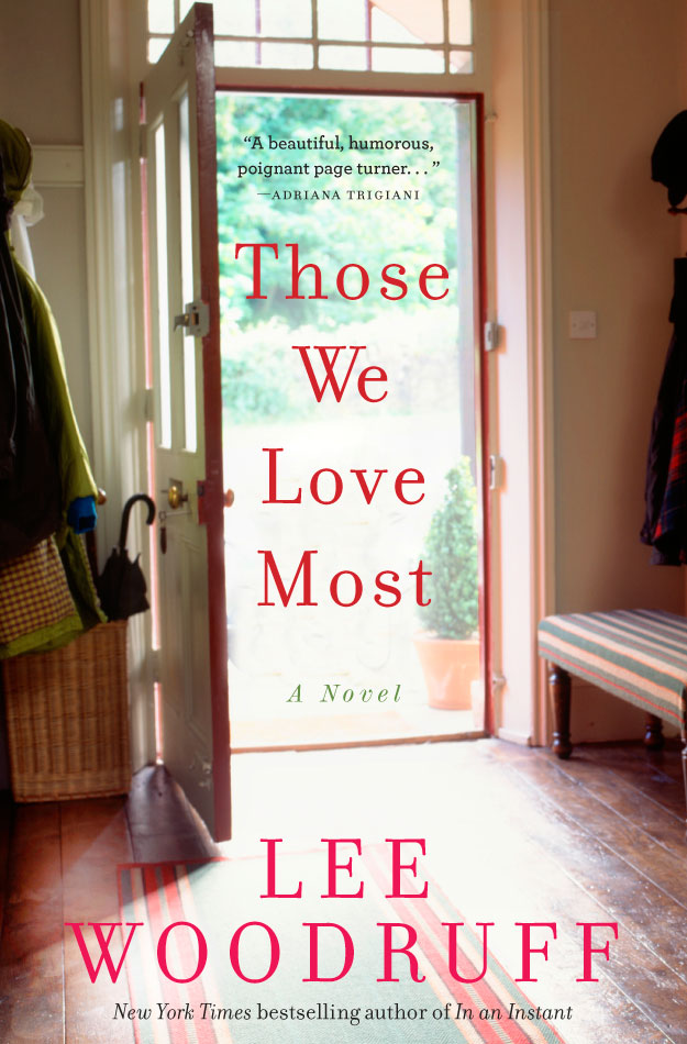
For "Those We Love Most," a work of fiction, the sky was the limit in terms of cover choice. Smarter marketing minds at my publisher Hyperion Voice would need to put their heads together.
"It can't look sad" was what I heard. And the first cover concept was an Adirondack chair on a porch with flowers and sunlight. It looked mystical, hopeful and partially spiritual, like someone was going to slide down Jacob's ladder from heaven and show back up at the dinner table. But it just didn't feel right. Not to mention there wasn't actually one porch in the book.
What about a mere suggestion that something is amiss? I asked. But the rougher stuff, the loss had to be nuanced a bit -- you don't want to scare anyone off. We are just throttling out of an economic recession and people want to escape into bondage, Hermes scarves, S & M and futuristic worlds. If you believe the research, that is.
Another version of the present cover had pink flowers that seemed to originate in Hawaii, despite the fact that the book takes place in the Midwest. It reminded me of some of the 70's feminine hygiene boxes -- before they invented the wing technology and got all graphic and real-world on the outside. But this newer book cover had legs. We were refining and changing.
In the end we got a cover that feels inviting and homey, like I hope my house feels. In fact the eerie thing is that without ever having seen my home, the artist captured my mudroom almost exactly. I figured that was some kind of sign.
So here it is. The cover. I hope it speaks to you too. I hope that when you and others are walking through a book store or airport or scrolling through a website or blog you hear a little... "You hooooo... over here" from my book. And I hope you will be compelled to pick it up.
Follow Lee Woodruff on her Blog at www.leewoodruff.com