
With the London Olympics over, some Londoners are breathing a sigh of relief. During the games, Transport for London published an entire list of tube stations to avoid at peak hours. The list included many famous stations such as Baker Street, Charing Cross, Covent Garden, and Leicester Square. The person responsible for the fact that many of us are so familiar with the names of these underground hotspots was Harry Beck, who in 1931 designed what has become the iconic map of the London Tube. Breaking with the preceding tradition of placing the stations at correct geographic locations, Beck chose the order and the interchanges of the stations as his main organizing principle. The resulting straight-line diagrammatic design survived to the present day (Figure 1), and has been copied by most other subway systems.
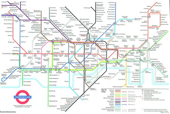
Figure 1: Map of the London Underground
That was not the first time that a map has literally "changed the world" (a phrase coined by British-American author Simon Winchester). In 1815, English geologist William Smith published the first geological map of Britain (Figure 2). Smith's map was revolutionary in that it demonstrated that rock layers, as identified by their embedded fossils, stretch along huge horizontal distances. These findings formed the basis for theories of the geological evolution and age of the Earth, and eventually were even a major contributor to Darwin's theory of evolution of the species.
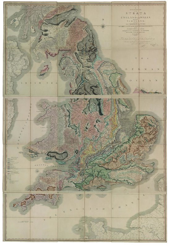
Figure 2: Strata of England, Wales and a part of Scotland, by William Smith. Published by J. Cary in 1815.
Jumping all the way from the early 19th century to the present day, there are other kinds of maps now that may not physically change our world, but do challenge our perspective of it. These are maps of the universe. Take a look at Figure 3. It shows a map that has also become iconic. Dubbed "The Pillars of Creation," it shows eerie pillars of gas and dust in the Eagle nebula. This image was taken in 1995 with the Hubble Space Telescope. Why do I call it a map? What else would you call a two-dimensional image taken from 6,500 light-years away, of pillars that are five times larger than the diameter of the solar system (including the comet cloud that surrounds it)? Just as in maps of the Earth produced by satellites (e.g., at: flashearth.com), all the details you see in this cosmic map are real. Unbelievable as it may sound, the upcoming James Webb Space Telescope will actually produce maps of some parts of the cosmic landscape when the universe was only a little over one percent of its current age! Together with maps of the human genome (see here), these cosmic charts are perhaps the most exciting maps I can think of.
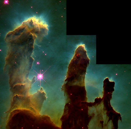
Figure 3: Gas and dust pillars in the Eagle Nebula, M16. Credit: J. Hester, P. Scowen, & NASA