
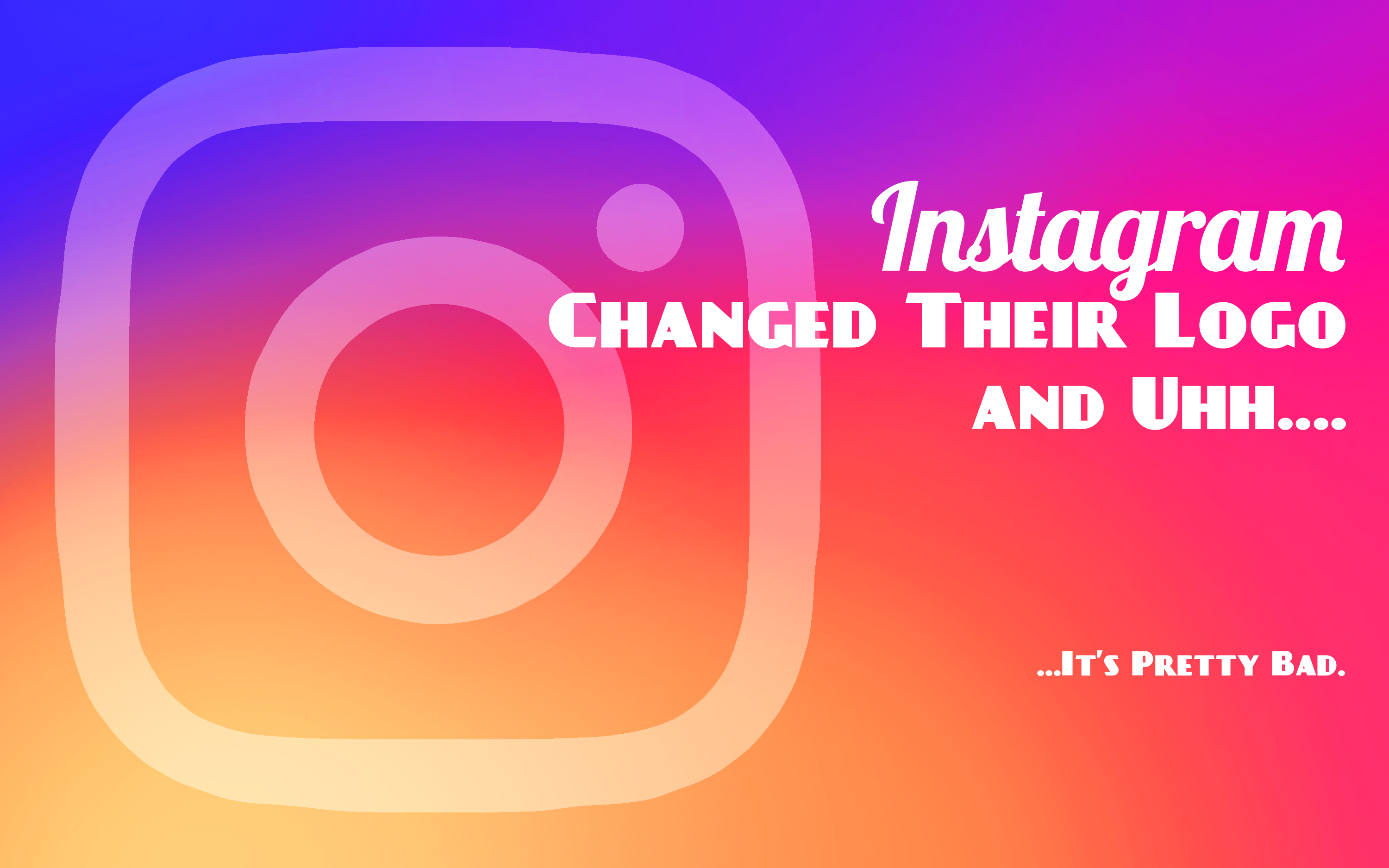
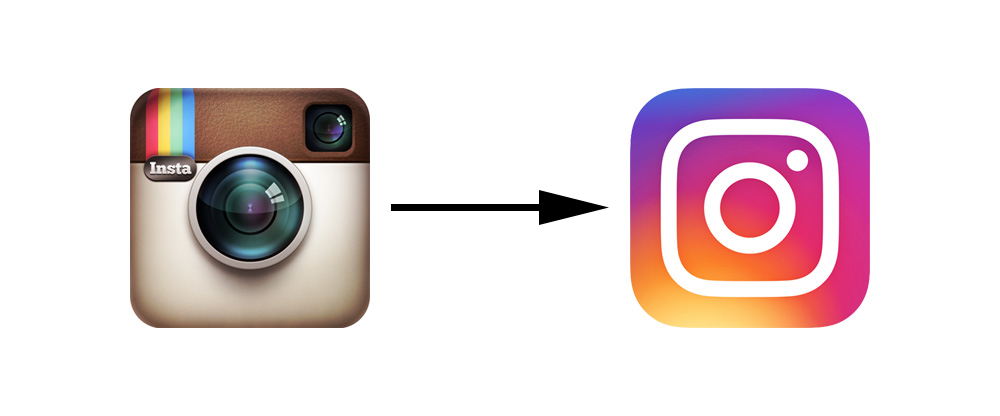
Photo-sharing wunderkind Instagram gave itself a makeover last week, and everyone on the Internet is throwing a pretty big fit over it. While I'm not usually one to partake of the Haterade, I simply cannot help myself here.
Even if we completely disregard the fact that Instagram's iconic Polaroid logo is frequently praised as one of the most recognizable tech logos of all time, the new logo lacks the same depth, cohesion, and resonance as its predecessor.
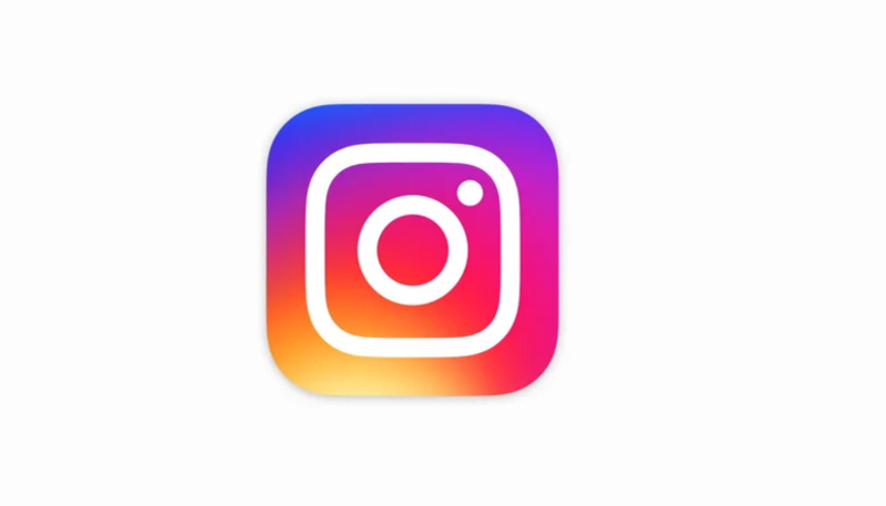
I don't even really know how to describe the before and after. It's like Instagram's logo went to Coachella and "found" itself. I don't know.
The logo has been attacked on multiple fronts, but mainly, people are concerned with the amount of thought and effort (or lack thereof) that went into the logo's execution.
The folks at AdWeek called it a "travesty." Hannah Jane Parkinson, a staffer at The Guardian, said it looked as if the old camera in the logo was murdered at sundown, and a chalk line was drawn around its body. And perhaps most scathingly, one GQ writer said the design felt "unwarranted, a bit self-indulgent, and, quite frankly, out of touch with customers" (and that's probably one of the nicer things said in that particular article).
Yikes.
And the memes have been nothing short of savage:
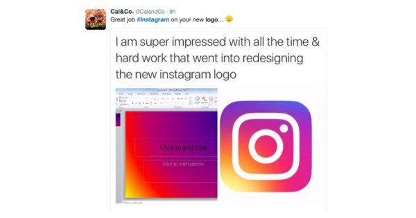
And let's not forget this bad boy:

Is Instagram's New Logo Really That Bad?
Is Instagram's new logo one of the biggest re-branding failures of the year? Yeah, maybe. Eh, probably. But come on, guys...
As someone who works for a brand whose designers, founders, and marketing team spent a significant amount of time designing, and then re-designing, and then re-re-designing their logo until every line, color, shape, or bend made sense and served a purpose, I can empathize with Instagram's new logo change. I mean, no I can't--no one with eyes can. But I can understand how a logo re-design can go awry.
In fact, they happen all the time. Really, there are plenty of brands--some of the best and most well-known in the world--who've gone through ill-advised re-brandings. And on the other hand, some brands just take a while to learn exactly what they're looking for in a logo.
Re-Branding Blunders

Take MasterCard, for instance. You won't come across a "Top X Most Recognizable Logos of All Time" list on the Internet that doesn't include the iconic red and yellow Venn diagram-like monument to the credit industry. But that didn't stop them in 2006 from trying to change things up a bit, by releasing a new logo they thought was more elegant and intriguing to the eye. The result was pretty hideous. They still use use the MasterCard Worldwide logo in their internal corporate branding (apparently), but the old logo came back into circulation fairly quickly--and everyone was glad when it did.
Sometimes brands have to take an L before they learn the old adage: "If it ain't broke, don't fix it."
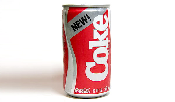
Or what about Coca-Cola? Does anyone remember "New Coke," the re-branding attempt that almost killed the famous soft drink company? In 1985, following the dent made to the Coca-Cola Company by Pepsi's genius marketing ploy, the Pepsi Challenge, the team at Coca-Cola decided it was time for change. They tried to formulate an all-new, better-tasting, revolutionized version of the classic Coca-Cola, and called it "New Coke." They re-branded all of the marketing, and essentially turned it into a whole new product.
... And everyone had a major freak out.
Less than three months after the launch of New Coke, the company came out and publicly announced that they'd be returning to the classic Coke formula, aptly named "Coca-Cola Classic." The world rejoiced and--no, I'm not kidding--the announcement made its way onto the front pages of several national newspapers. It was a big deal, and Coca-Cola learned a major lesson.
What About When it Works?
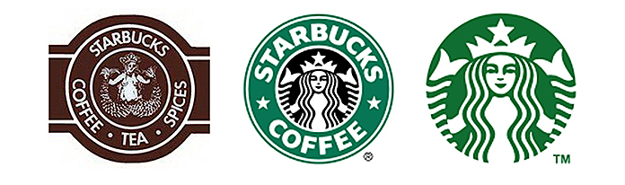
With over 24,000 stores in over 70 different countries, Starbucks is one of the the most influential brands in the entire world. Its logo--a green and white mermaid made of squiggly lines and circles--is easily one of the most recognizable in modern history. But if you came across the original Starbucks mermaid at their flagship store in 1970's Seattle, you'd probably be pretty freaked out by what you saw. The original brown "coffee, tea, spices" logo was simple, but the mermaid in the center was crudely drawn, incorporated too much detail, and showed two too many boobs. Yes, there were literal boobs in the first Starbucks logo.
It's a far cry from what we know today as the iconic Starbucks logo, and Starbucks' customers love the new look. It's clean, elegant, and easy to digest--and it resonates well with the coffee empire's current customer base. Personally, I'm a fan of the 1990's update (center design above), but the current iteration of the green and white mermaid is indisputably eye catching.
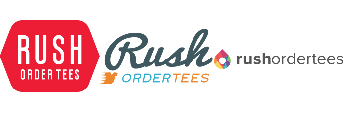
Rush Order Tees has gone through several iterations of our logo, and I can talk firsthand about how difficult the process is. Settling on one logo over another can be an exceptionally difficult task, especially when you decide that it's time for a complete branding facelift, as is what happened with Instagram.
We conducted research on everything and answered all the questions we needed to ask--what colors work and what don't? What design elements are customers are more responsive to? What fonts are consumers more inclined to read? The questions didn't stop there. There are entire fields of study that bridge the gap between psychology and advertising, and we used them at every avenue. At the end of the day, we settled on the current logo (top right in the photo above), and we haven't looked back since. It's colorful; it's casual; but it's also sleek, modern, and inviting. Our customers gave it a thumbs up.
What Was Instagram Thinking?
In a Medium post discussing the blog, Instagram's Head of Design Ian Spalter said the logo was the result of efforts spent to better reflect what the app has evolved into.
"Instagram is now a diverse community of interests, where people are sharing more photos and videos than ever before; using new tools like Boomerang and Layout, and connecting in new ways through Explore," he explained in the blog. "Last year, a group of us started digging into how we could support this evolution while staying true to Instagram's heritage and spirit."
I'm not really sure how they accomplished that goal here, but uhh, at least the gradients are pretty. #Coachella
The point here is that yeah, Instagram kind of blew it with this new logo. No one really gets it, and it doesn't make sense for them at all, especially when their logo was beloved by their users and recognized by everyone from tweens to my grandma (who's no longer with us, by the way). But they thought it was time for something fresh and new, and they gambled. There's nothing ever wrong with that. At the very least, I tip my hat to them for taking the risk, but their fans (myself included) would be doing them a genuine disservice by not voicing their opinions about what is a pretty clear fail.