
(First published on Grafik, April 2016)
Patrick Myles sings the praises of a beautifully crafted letterform which looks as impressive on a block of concrete as it does online and in print.
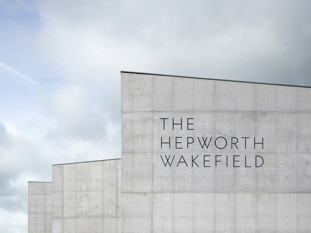
The identity created for The Hepworth Wakefield museum is an embodiment of architecture and graphic design distilled into a single bespoke typeface. The purpose-built gallery is situated in the birthplace of sculptor Barbara Hepworth and exhibits examples of her work as well as other British modernists and contemporary artists. The building by David Chipperfield Architects is designed with striking angular shapes that are also reflected in the gallery spaces within. In response to this the font designed by the London based studio A Practice for Everyday Life (APFEL) in turn reflects the architecture of the gallery building.
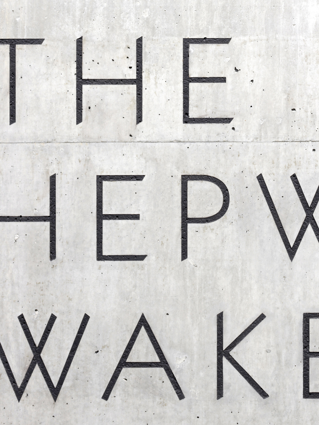
A distinctive feature of the Hepworth typeface is the angled ends of the letterforms. According to the designers, the angles are derived from the roofs of the museum and surrounding buildings. Hepworth Wakefield Regular is a typeface developed not only to be implemented across the usual range of requirements from printed material to website, but to be sand blasted into the raw concrete walls of the building itself. The type design is therefore fully integrated with the architecture itself in a powerful yet elegant way.
There is also something evocative of the modernist typeface that Edward Johnston designed in 1916 for the London Underground. Surprisingly he took his inspiration from the classical letterforms carved in the ancient stone of Trajan's Column in Rome. Johnston reduced the traditional Roman capital to a modern sans serif without sacrificing its personality. I also like the economy of form in the design of the Hepworth typeface and how the bevelled ends of the capitals are a simple detail that creates its own distinct character. The most pleasing letterform for me is the 'W'. It's the most structural of all the characters, and I like the contrast between the pointed and the angled stems. I love the shape it makes and could be a logo in its own right.
The majority of my own work has involved representing three dimensional buildings into two dimensional media. As a result I've spent a lot of time working with fonts that compliment specific styles of architecture and therefore have a deep appreciation for the design of this typeface.
...comprises of 16,000 square metres of purpose-built gallery space. As well as Barbara Hepworth's drawings, prints, models and sculptures, the Hepworth Wakefield also houses an impressive collection of works from Wakefield's former municipal art gallery. Despite some initial resistance from locals about the building's appearance, the gallery welcomed its millionth visitor just two and a half years after it first opened.