
Last month, FAST COMPANY magazine published the best info-graphics of the year from their design blog. The choice was derived from FC's own postings of the most interesting info-graphics they came across on a daily basis.
FAST COMPANY, a business magazine that watches contemporary trends, sometimes writes about design in relationship to business. On their design blog, they discuss product design, architecture, digital media, and branding as they affect corporations, retail businesses, and tech businesses. They write about design the way TIME and BUSINESS WEEK do, meaning they write about it fairly generally. They write about things that people who are not designers have likely seen and understand to a certain degree.
So why does FAST COMPANY have a daily report on info-graphics? Is this a hot trend? Does the general public care about them? Much of FAST COMPANY's readership is in the tech business, which accounts for some of the interest. But the daily infographic of note? Why? Info-graphics are hardly new.
Way before the PC and 24-hour cable news, we referred to them as charts, graphs, diagrams, and maps. Charts, graphs, diagrams, and maps have always existed in business publications and newspapers and were once considered somewhat unexceptional. They were companion demonstrations to editorial stories, hopefully proving the veracity of an author's main thesis. Even though many of them were intricate, beautiful, powerful, or even witty, the editorial stories were the main course and the charts and diagrams, etc. were a side dish.
Charts, graphs, diagrams, and maps have a spectacular visual history of their own and they are collected in museums, libraries, archives, and in important personal collections. They are documented in many books. Art movements like the Dadaist's and the Fluxus group parodied them, as they are natural devices for satire.

"Expanded Arts Diagram" (detail) by George Maciunas, 1966.
When we think of the joke versions of maps, Saul Steinberg's "View of the World from 9th Avenue" immediately comes to mind or Maira Kalman's "New Yorkistan."
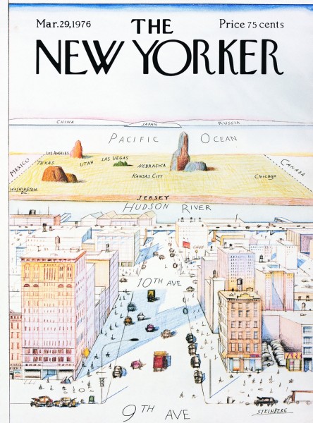
"View of the World from 9th Avenue" by Saul Steinberg, March 29, 1976.

"New Yorkistan" by Maira Kalman and Rick Meyerowitz, December 10, 2001.
I am a big fan of deliberately satirical and/or impressionistic information and they are devices I often use in my design and painting.
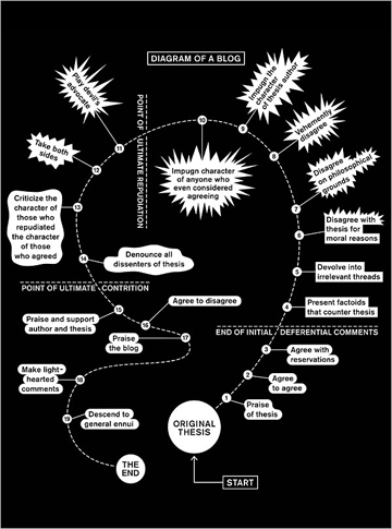
"Diagram of a Blog" by Paula Scher, 2007.
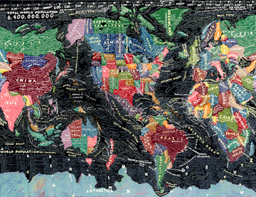
"The World" by Paula Scher, 1998.
We all grew up with charts, graphs, diagrams and maps in our textbooks. Sometimes they inspired and edified us, or broke up boring text that we didn't have the patience to fathom. Other times, they annoyed us because, when poorly designed, they complicated information and made it more inaccessible. But we accepted their validity without question because they were in a textbook. Sometimes we memorized them. We were conditioned to believe them, but we generally believed them in relationship to another text that they illustrated.
Some mainstream publications had a very specific house style for charts, graphs, diagrams, and maps. TIME and FORTUNE magazines have a spectacular history here. FORTUNE magazine was an industry leader in all forms of illustration in the 1930's -1950's.

FORTUNE magazine cover by Walter Allner, December 1952.
In the 80's, Nigel Holmes at TIME magazine created a very specific and identifiable house style for conveying information. Previously, within the graphic design profession, the design of charts, graphs, diagrams, and maps was the least sexy part of any project because charts, graphs, diagrams, and maps were supposed to quantify information, not give it personality. They were dry, even with the most beautiful graphic implementation. They were expected to appear impartial, or at least neutral, in relationship to an article while totally supporting its viewpoint. For an editorial designer, it was much more exciting to compliment editorial content with an illustration or a photograph that conveyed some greater emotion or exhibited a strong point of view through powerful imagery. The general public seemed to respond more enthusiastically to photography or illustration, rather than the "just the facts ma'am" attitude of charts and diagrams.
In the 80's, SPY magazine popularized snarky charts about power structures of New York media or the film industry. ESQUIRE magazine had a similar graphic approach in their annual Dubious Achievement Awards. Currently, many popular-culture magazines like NEW YORK and VANITY FAIR use info-graphics to quantify things that really aren't that quantifiable, like celebrity hotness or what they perceive as culturally high or low brow. The reader enjoys the measurement but doesn't believe it as literal fact.
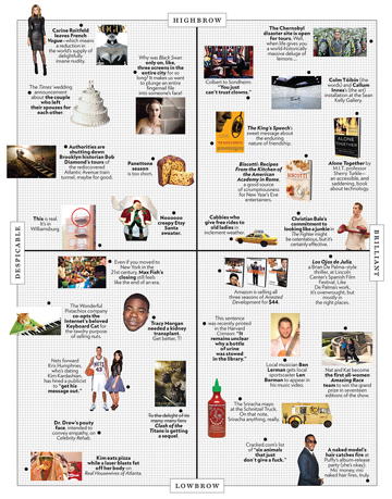
"The Approval Matrix," NEW YORK MAGAZINE, Week of January 3, 2011.
The term "info-graphics" became widely used with the introduction and success of USA TODAY in the late 80's. Large, bright colored daily graphics that demonstrated weather forecasts, sports scores, and financial statistics, etc. seemed more immediate and accessible than reading complete stories, or even large-scale pull quotes. The visual device of the time lured readers into the articles. Other American newspapers and publications began to emulate USA TODAY. THE GUARDIAN in London did a far more sophisticated job of it.
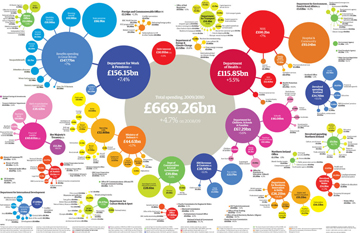
"Government Spending by Department, 2009-2010," THE GUARDIAN.
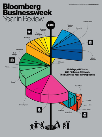
Bloomberg's BUSINESSWEEK recently relied exclusively on info-graphics for their year-end wrap up. Some of the graphics accurately measured things, while others just looked like they did. The style was evocative of Nigel Holmes in the 80's. The charts were understandable, but did not look especially scientific.
Several years ago, The Sunday NEW YORK TIMES introduced the "Op-Chart," which sometimes offers a full page of quantified statistical information, usually on things like the body count of dead American soldiers in the Iraq or Afghanistan war. The charts are pointed and moving. By virtue of the fact that they are placed on the Op-Ed page of the NEW YORK TIMES indicates that while the data is real, the choice and editing of the data is designed to be provocative.
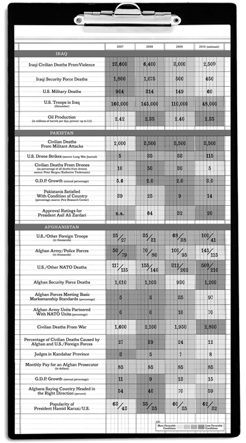
OP-CHART: States of Conflict, THE NEW YORK TIMES, December 26, 2010.
For all major cable news programs, info-graphics are a must. They punctuate every announcement as evidence of the veracity and import of whatever is reported. In the past decade, PowerPoint presentation templates took info-graphics to a whole new level of ubiquity. Every internal corporate, government, or institutional presentation to a group, (about absolutely anything), will consist of a series of dull bullet points accompanied by pie charts, bar charts, triangles, and overlapping circles and arrows, theoretically demonstrating the inarguable strategic logic of any given premise that is being presented. These info-graphics that can be produced on a simple computer program are designed to make talking points look scientific, and therefore, believable.
Recently, "data visualization" has replaced "info-graphics" as the category name for charts, graphs, diagrams, and maps. The term "data visualization" sounds much more scientific than "info-graphics." "Info-graphics" has an industrial sound; you know that somewhere in the process of the info-graphic creation there was a person picking the information and designing the chart. "Data visualization" has a wonderful technological ring to it. You can believe that what you've seen is truly the result of the superior intelligence of a computer program impartially and perfectly quantifying the data gathered by another computer program. No human touched it. No errors. No bias. It is the ultimate in believability. If the information moves on a computer, or LED screen, or better yet, you touch it and it responds to you, better still. More and more often data visualization stands alone as content. It neither accompanies a piece of writing to demonstrate the validity or objectify the written opinion, nor does it intend to make a parody or joke, or even create a feeling. It's intent is to demonstrate and quantify information as if the information merely exists and is not selected. When it is used effectively in advertising, it borders on dangerous. It is the world's most effective form of propaganda.
The FAST COMPANY selection of charts, graphs, diagrams and maps from their daily design blog demonstrate a lot of various pieces of data that seem to create networks. Information looks like a network when there are lots of lines connecting the various pieces of data, or when the data appears as dots that make clusters. The linear connective approach is visually akin to our understanding of the world as connected by phone or electric wires. There is something very appealing visually about the linear network approach. It makes us feel less isolated.
When there are a plethora of dots that overlap one another making clusters, the blobs created look organic. These graphic devices seem akin to the human anatomy, sort of like blood cells or DNA molecules. If the overlapping dots-becoming-blobs are in complimentary colors that are rendered transparent (red over green etc), and if they exist on a black field, they can resemble infrared photography or x-rays. This is the visual language of medical science and when applied to any form of quantified information it serves to make it more believable.
Some of topics that employed these graphic devices on the FAST COMPANY design blog were:
- Contradictions in the bible
- Why people move away from New York
- A measurement of your own interest in various things as revealed by what you twitter, etc
- The power structure of a Mexican drug cartel
- Bars that have the highest check-in ratio from men to women
- Friendships around the world
All of the charts, graphs, diagrams, and maps look interesting and involving. They are designed to appear scientific and very believable. They are immediate, even urgent, and you have the sense that you are about to learn something. They are all part of an increasing trend away from reading, reflection, and understanding the world in a broader context. Information becomes style. Information is an end in and of itself: it exists by itself, with no over view, no history, no context, and demonstrates that almost anything can be measured. It is faux info.
Ask a designer to make a diagram of your clothes closet and how many white and black articles of clothing you have worn and on what days and see if there is a pattern. There probably is one. It will make a sensational chart. Compare the amount of homeless people in relationship to the amount of trees in various neighborhoods. It sounds important, doesn't it? A diagram with those statistics might really look significant.
Faux info is seductive because it looks like a computer program has gathered all the data, put it in the proper order, quantified it, made all of the appropriate comparisons and links, and fed it to you in a scientific style that demonstrates authority and infallibility. The information does your thinking for you, and you don't have to think at all. Buyer beware.