Co-written with Naomi B. Robbins
In light of the great Blizzard of 2015 that wasn't, we might look at how accurate are weather forecasts and especially long-term forecasts.
Naomi B. Robbins of NBR Graphs, with whom I co-wrote this post, and I collected predicted highs and percent chance of rain in the long-term weather forecasts from mid-August through December. Special credit to Naomi for all the data visualizations in this post.
Ultimately, the forecasts are quite accurate. Here are some findings....
- Comparing predicted highs to actuals, the same day forecast averages ~2 degrees off, the 1-4 day forecasts average 2.5 - 3 degrees off, and the 9-day averages nearly 6 degrees off. (We used absolute value so +2 one day and -2 the next don't cancel each other out.) Notably, even the 9-day forecast is more accurate than comparing actuals to the average highs for NYC, which average 6.2 degrees off.
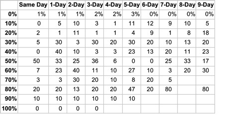
The same day forecast has been extremely accurate as to whether or not it will rain. For the 134 days we tracked, it rained at least .1" (our threshold for rain) 30 times (22% of the time). When same day predicted 0% (78 times), it rained just once. Other same day predictions were similarly accurate: It rained 1 of 10 times (10%) when there was a 10% chance of rain, 2 of 11 (18%) for 20% chance, 1 of 4 (25%) for 30% chance, 2 of 5 (40%) for 40% chance, 4 of 4 (100%) for 50% chance, 4 of 6 and 2 of 3 (67%) for 60% and 70% chance, and 100% of the time (1 of 1, 3 of 3 and 9 of 9) for 80%, 90% and 100% chance of rain. Even the long-term forecast is fairly accurate. It didn't rain any of the 16 days the 9-day forecast predicted 0% chance of rain, it rained 15% of the time the 9-day predicted 10%, etc. Here's a chart showing error rates (absolute value of the difference of predicted and actual).Error Rates (%) for Precip (Absolute value of difference between predicted and actual)
Graphs...
Following are some charts that enable a closer look at the data.
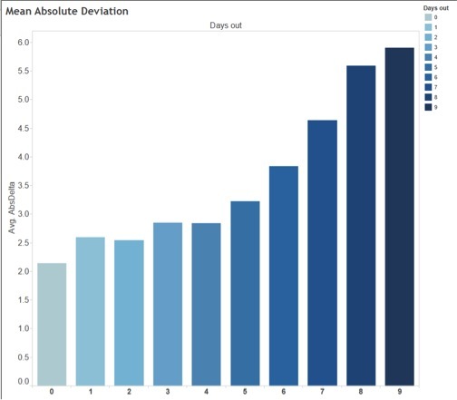
The first figure shows the mean absolute deviation by number of days out the forecast is made. The further out the forecast was made the darker the color in the chart. This color legend applies to all other charts as well.
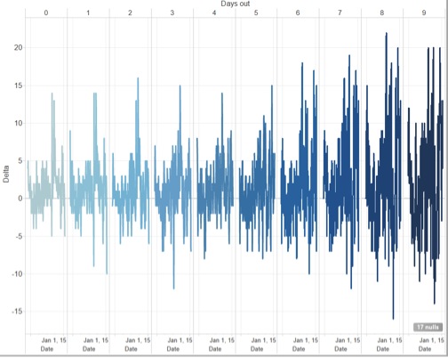
The second chart shows delta, which is the actual minus the forecast by the number of days out.
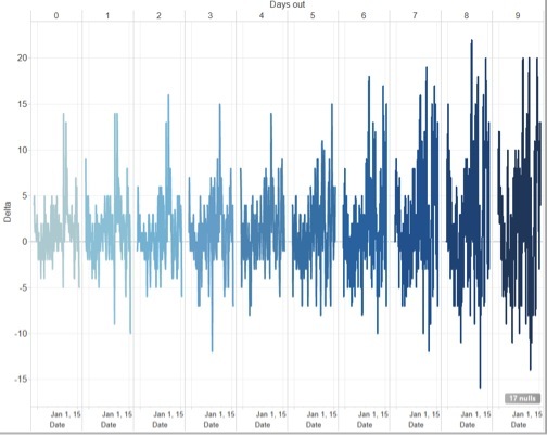
We notice that as the forecast goes further out, the spikes or large deviations get bigger. We also notice that forecasts for all days out were less accurate in November and December than in August through October.
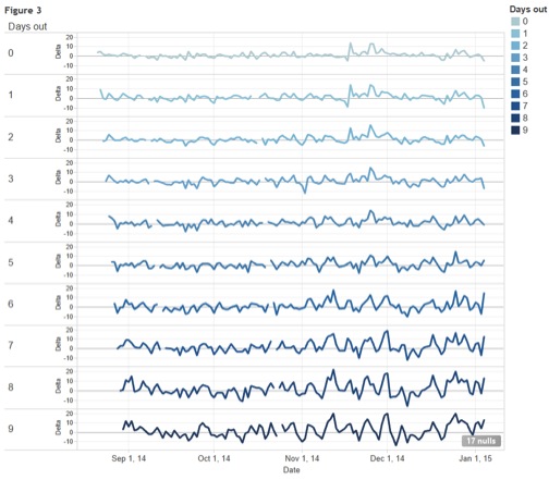
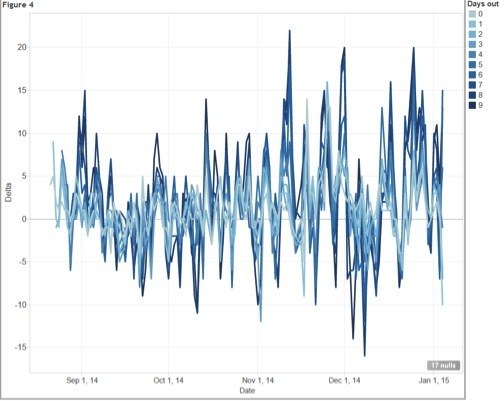
The third figure shows the same information as Figure 2, but with the days out stacked instead of side-by-side. Different arrangements emphasize different aspects of the data.
Again we notice that variability increases as we go further out in days forecast and for any of the days out variability increases as winter approaches. In this view it is easier to notice that the spikes are on the same date for all numbers of days out.
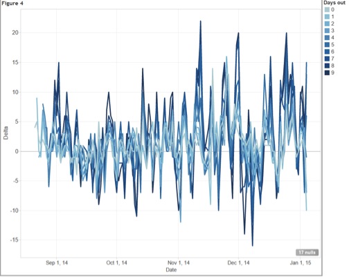
The fourth figure shows all of the data in one chart. If we had used different colors for the different days out the chart would look like one jumbled mess. However, this sequential color scheme shows that the lower days out (lighter colors) have smaller deviations and the spikes are mostly the longer forecasts.
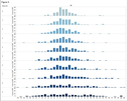
The fifth figure shows temperature difference between forecast and actual by how many days out the forecast is. You can see that same day forecasts are clustered much more closely around 0, while 9-day forecasts are much more dispersed. For all forecasts same-day through 9-day, actual temperatures were a bit higher than forecast.
Some background notes on the data....
- The predictions are from the Weather Channel's 10-day forecast. Interestingly, the predictions on their website sometimes differ from the 10-day forecast on their iPhone app. We tried to get the forecasts at or about 8 a.m. but didn't always get it right at 8. And there were two days when we didn't capture the data.
Actual highs/precipitation came from the Weather Channel until they redesigned their site in November and stopped showing previous day actuals. Weather Channel now links to Weather Underground, which has previous day and historical actuals. We have doubts about how accurate their data are. On both sites, the actual previous day and historic highs and precipitation data change over time. Of course this makes exact analysis of prediction accuracy impossible. We used .1" as a threshold for rain, as .01" of rain isn't really a rainy day. Our raw data / analysis is on Google Drive. All figures created using Tableau and are available with
.
Support HuffPost
Our 2024 Coverage Needs You
Your Loyalty Means The World To Us
At HuffPost, we believe that everyone needs high-quality journalism, but we understand that not everyone can afford to pay for expensive news subscriptions. That is why we are committed to providing deeply reported, carefully fact-checked news that is freely accessible to everyone.
Whether you come to HuffPost for updates on the 2024 presidential race, hard-hitting investigations into critical issues facing our country today, or trending stories that make you laugh, we appreciate you. The truth is, news costs money to produce, and we are proud that we have never put our stories behind an expensive paywall.
Would you join us to help keep our stories free for all? Your contribution of as little as $2 will go a long way.
Can't afford to donate? Support HuffPost by creating a free account and log in while you read.
As Americans head to the polls in 2024, the very future of our country is at stake. At HuffPost, we believe that a free press is critical to creating well-informed voters. That's why our journalism is free for everyone, even though other newsrooms retreat behind expensive paywalls.
Our journalists will continue to cover the twists and turns during this historic presidential election. With your help, we'll bring you hard-hitting investigations, well-researched analysis and timely takes you can't find elsewhere. Reporting in this current political climate is a responsibility we do not take lightly, and we thank you for your support.
Contribute as little as $2 to keep our news free for all.
Can't afford to donate? Support HuffPost by creating a free account and log in while you read.
Dear HuffPost Reader
Thank you for your past contribution to HuffPost. We are sincerely grateful for readers like you who help us ensure that we can keep our journalism free for everyone.
The stakes are high this year, and our 2024 coverage could use continued support. Would you consider becoming a regular HuffPost contributor?
Dear HuffPost Reader
Thank you for your past contribution to HuffPost. We are sincerely grateful for readers like you who help us ensure that we can keep our journalism free for everyone.
The stakes are high this year, and our 2024 coverage could use continued support. If circumstances have changed since you last contributed, we hope you’ll consider contributing to HuffPost once more.
Already contributed? Log in to hide these messages.