
An election eve chart wrap... data is still coming in, and the models are still updating, but here's where things look this morning (Pacific time).
Anticipated swing from 2008, two-party terms. The left column of data shows Obama's two-party vote share by state in 2008; the right column shows the estimated Obama two-party vote share from my model, as of this morning:
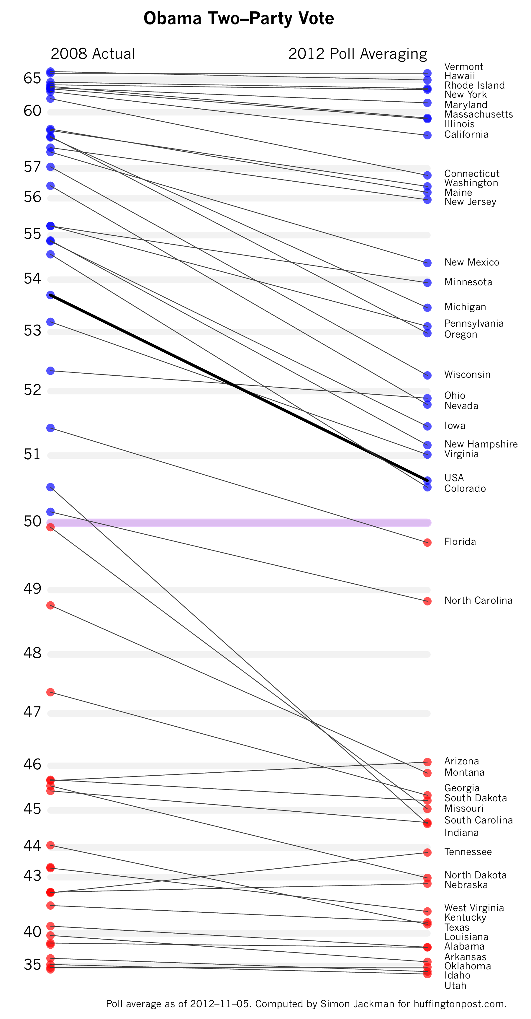
I've posted versions of this graph at various stages of the campaign. Now, on Election Eve, we're back to a position we saw in September, with Romney simply not bringing enough states below over the 50-50 line to win the election. Indiana, North Carolina, and Florida are the only states to flip, at least according to the model and the polling data. Not shown on the graph is the uncertainty associated with the estimates; i.e., Florida is not much better than a 50-50 coin flip, but a state further up the tree, like Ohio, is estimated to stay with Obama with probability approaching 100 percent. See below.
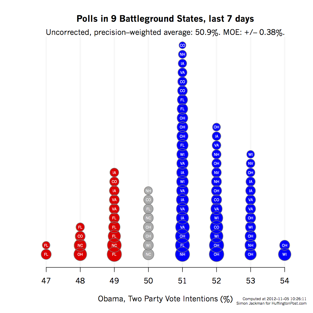
No models, no house effects, just the battleground polls. Forget the modeling, forget the house effect corrections. Just take each battleground state poll appearing in the Pollster data base in the last seven days. Convert each poll to a two-party number for Obama: Obama/(Obama + Romney)*100. Plot in the "stacked" format shown below. Moreover, weigh each poll by its sample size so as to get a poll average. Obama 50.9 percent, +/- 0.4 percentage points. That is 4.5 sigma north of 50-50. Or more simply, "OTMOE" (Outside The Margin Of Error)...
A distribution over Obama Electoral College counts. The bottom line (literally): The probability of an Obama win in the Electoral College is now about 90 percent. Three-hundred-thirty-two and 303 are the two most likely Obama EV outcomes, closely followed by 347. Averaged over the distribution: 309.
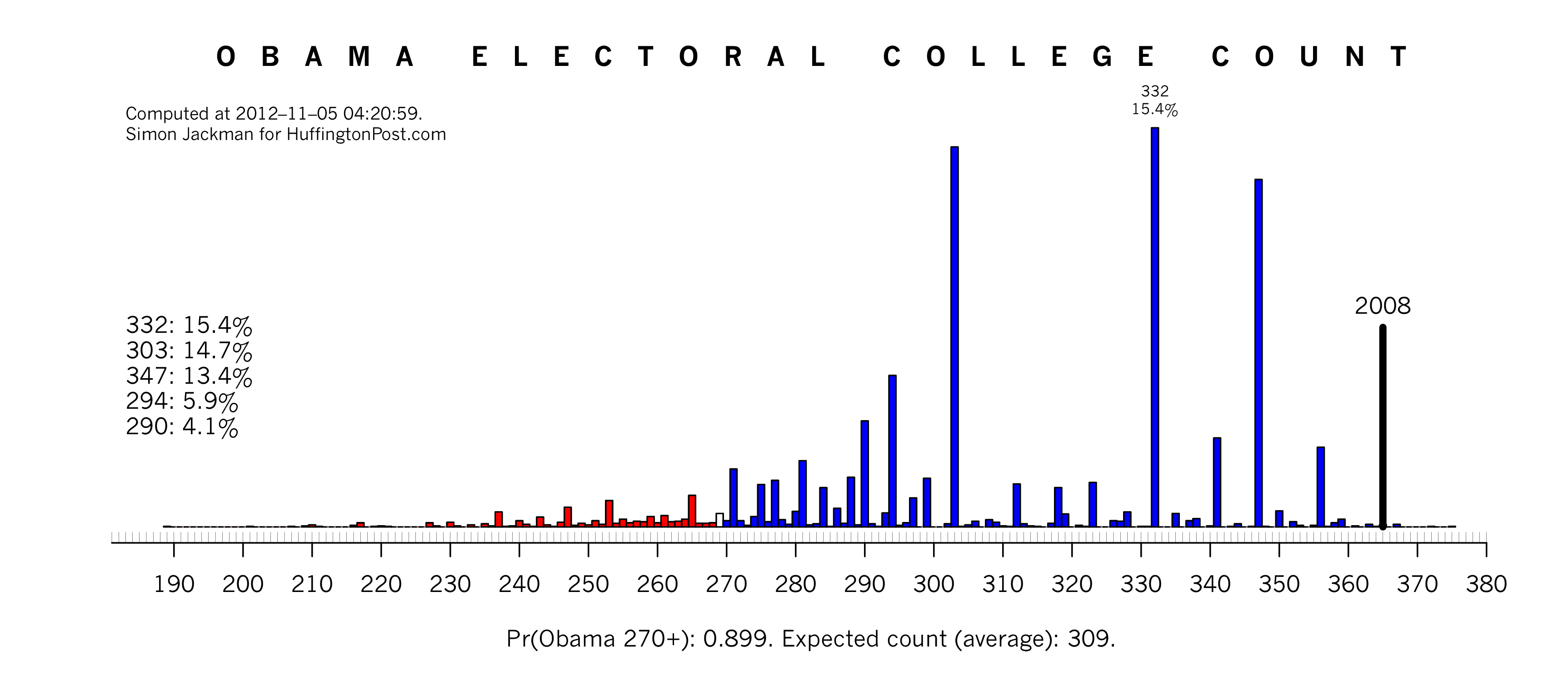
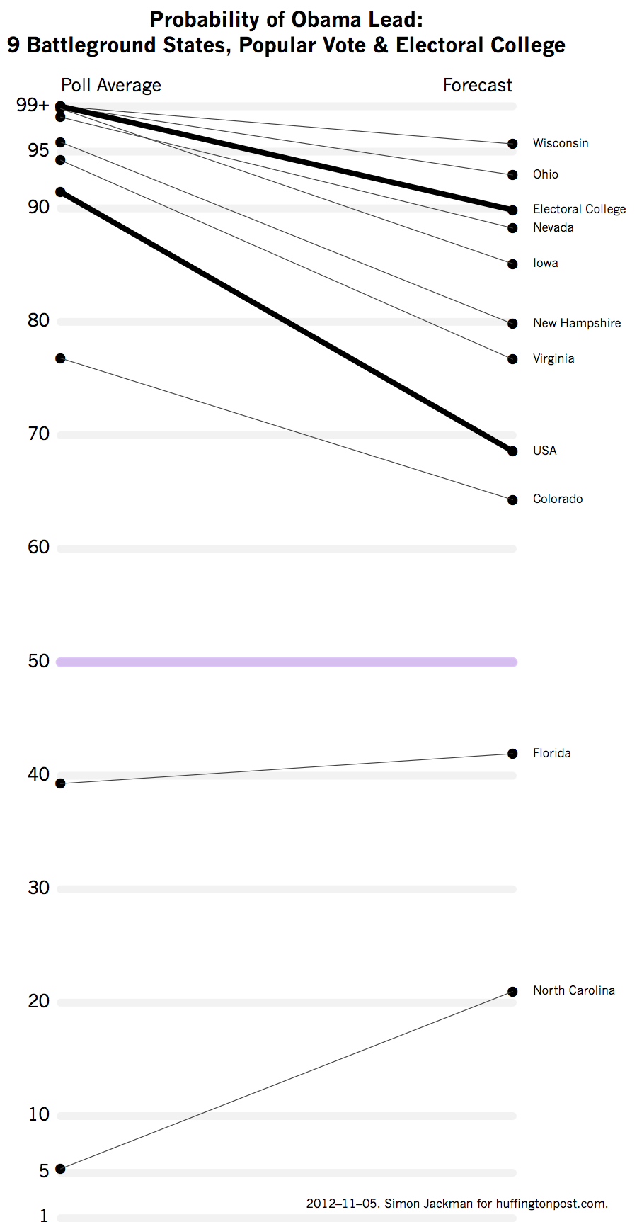
Probabilities from poll average vs probabilities from forecast. The extra uncertainty that comes from converting a poll average to a forecast weakens the confidence of the calls; note the "shrinkage" back towards the 50-50 point, moving from left (poll average) to right (forecast). Note the implied Electoral College counts from the poll averaging model has the probability of an Obama win at close to 100 percent; this shrinks back to 90 percent in the forecast model.
Uncertainty, visualized. Finally, here is a look at nine swing states plus the national popular vote. Each panel shows a series of bell-curve (normal) densities in light grey, one for each poll; the polls shown are from the last seven days. Polls are converted to Obama two-party shares: Obama/(Obama + Romney) * 100. The less spread out the density, the bigger the sample size of the corresponding poll. Yesterday's massive YouGov national poll is clearly visible in the "USA" panel (and I've actually deflated its sample size, so as to not double count the state-by-state polls that contribute to the national figure).
The purple density corresponds to a naive poll average: no house effect corrections, no modeling. The naive average treats all polls interchangeably, making most use of the information in those polls, and so typically produces quite precise estimates of Obama's standing in any given state; n.b.: no house effect correction, etc.; I did say it was "naive."
The black density is what comes out of my forecast model, usually shifted a little from the poll average, and substantially more dispersed than the naive poll average, reflecting the extra uncertainty that creeps via house effects corrections, turning the poll average into a forecast and some temporal discounting of older polls.The probability that Obama wins is the area under the black density to the right of the 50-50 points.
The panels are ordered from bottom to top by the probability of an Obama win. North Carolina and Florida are the least likely Obama retains in the set I examine here; Ohio and Wisconsin the most likely. The uncertainty associated with the Florida and even the national popular vote forecast is particularly vivid when presented this way.