Austin's dining scene is experiencing a burst of evolution and it's hard to throw a rock these days without hitting a trendy restaurant brought to downtown by McGuire Moorman Hospitality. With a team of talented people and Chef/Entrepreneur Larry McGuire at the helm, they're on a streak of buzzing successes that have become known for their alluring atmosphere as much as the food. Even when not every plate is perfect, it's fun to be there and their signature style has seemingly cracked the code on creating an "it" factor, thanks in large part to the vision realized through FÖDA Studio.
Since Lamberts opened in 2007, FÖDA has been the go-to design shop for the branding and identity on all of their projects and the only agency to work on everything from Perla's to Elizabeth Street to Jeffrey's. It's a small shop, headed by Founder/Creative Director Jett Butler, who has a degree in Architecture and taught a design class for the Art and Art History department at UT. His trademark aesthetic is born of "decadent minimalism," a-tongue-and-cheek reference to an affinity for bold visuals in restrained proportion, which is evident throughout the McGuire projects. Their clients also typically benefit from his architectural background, with respect to his regard for contextual, topographic and ethnographic research and ability to translate brands into spaces.
At Jeffrey's, for example, the newly renovated Austin landmark, the team walked around Clarksville to collect artifacts old and new and get décor ideas from the specific nature and scenery of the neighborhood. Select items are subtly woven throughout the restaurant to bring in the landscape and pay tribute to the restaurant's history. Throughout the identity they use stippling, an inherently old school and time consuming print, providing a quaint graphic as well as a nod to the popular styles of the 1970s when Jeffrey's was opened originally.
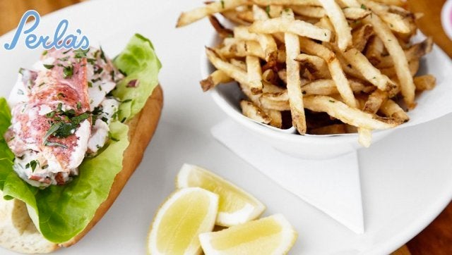
At Perla's and Clark's seafood restaurants, clever details like a sprinkling of casual language such as the word 'ahoy!' provide an undercurrent of jovial informality to the champagne and oyster bars. Colorful, salt-water aquariums, as well as the latitude/longitude address that appears on the Clark's awning and unexpectedly buried in the menu, up the charm factor. Pretty, bold yacht club-style stripes alternate with stark-white interiors and, at both places, script logos based on a font FÖDA created from Butler's handwriting are a whisper in the black and white hexagonal floor tiles. Each detail comes together with a modish, intimate feel and similarity that makes it easy to tell they are part of the same family.
At French Vietnamese café Elizabeth Street, the matchbooks come in multiple variations, as do the tiny to-go menus, and take on a collectible quality with beautiful colors and striking patterns. Macarons in delicious, unique flavors like candied lemon poppy mesh well with the kitschy custom designed condiment bottles that sit atop each table. Bright pink and blue décor makes the interior vivid, charming and lively. Custom Indie playlists and adorable uniforms, like flattering print wrap dresses, are fashioned by a one-time manager from Lamberts, who works in tandem with the group on all of the projects.
Essentially, nothing about the brand or flow is an accident and the development process is similar each time: McGuire gives amusingly ambiguous initial direction and remains heavily involved and passionate about the every detail of experience. Elizabeth Street, for example, was "Hanoi 1920" and "Grandma Chic." Lamberts was "Fancy BBQ," and Perla's at one point, "Martha's Vineyard meets Cabo San Lucas."
He isn't afraid to be direct or brutally honest and the process is no cakewalk but over time the relationship between the creative forces has become increasingly symbiotic. "We have built a good dynamic now...I no longer have to power pose before we meet," Butler joked.
With this kind polished result, brainy approach and expertise in creating elements of surprise it's no wonder FÖDA's work is becoming ever more easy to spot: they did the branding and identity for new hot spot Sway, with geometric patterned coasters so pretty they could be framed and hung on the wall. Recently they also designed a bunch of collateral for TEDxAustin creating multiple program versions - one with only words and the other with only images - intended to ignite dialogue between the lucky attendees.
Their trademark style involves an undercurrent of wit and fierce thoughtfulness. Individually perhaps minute, together these particulars artfully make brands shine, bring joy to the experience and engender the power of smart design.