
For the last 10 days, we've been watching the bouncing ball that is the Gallup weekly tracking of the generic House ballot -- the question that asks voters if they are supporting "the Democratic Party's candidate or the Republican Party's candidate" in their district. It bounced up for the Democrats in Gallup's tracking two weeks ago, and appeared to remain up last week, but I wrote two posts arguing that the apparent "jump" was most likely random noise, especially since other tracking polls did not show a similar pattern.
Well, sure enough, the latest weekly update from Gallup out yesterday shows the numbers bouncing back in the Republican direction. Republicans now have a five-point advantage (48% to 43%), roughly the opposite of the lead indicated for Democrats for the last two weeks.
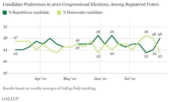
Having devoted nearly 1,400 words to this subject already, I'll keep this short: The week-to-week variation in the chart above is mostly random noise. In fact, if any real changes in vote preferences are afoot, we can't distinguish them from the random variation built into each poll. That variation, by the way, is what the "margin of error" is all about. The results above are basically a picture of 46%, plus or minus 3%.
I write this not to criticize Gallup: Their results are bouncy in comparison to some other polls because they do not weight their results by party identification, so random variation within the predictable range is inevitable.
That said, the reason we plot results from many different pollsters on one chart, as we have done at Pollster.com for the last four years, is to try to put new poll results into the larger context of all other public polls. Our national generic House ballot can be tricky, because some polls that report frequently -- especially the Rasmussen Reports automated survey -- have large "house effects" that make their results consistently different than other surveys. Sometimes results from one pollster can "fool" the chart.
However, what our chart distills from all of the available public data on the generic ballot is a slight trend in the Republican direction over the last month or so. You can see that trend even if I set our "smoothing tool" to its least sensitive setting (to minimize the impact of individual polls or pollsters):
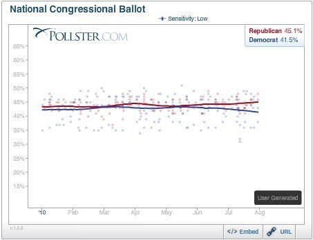
You see the same trend even if you drop both the Gallup and Rasmussen tracking:
![]()
These are relatively small changes -- just a few percentage points movement at most -- but the changes are mostly consistent across polling organizations, which gives me more confidence that they are real than any brief "jump" in an individual pollster's results.