By Catherine Mulbrandon and Matthew Mulbrandon
VisualizingEconomics.com
(Click picture to enlarge)
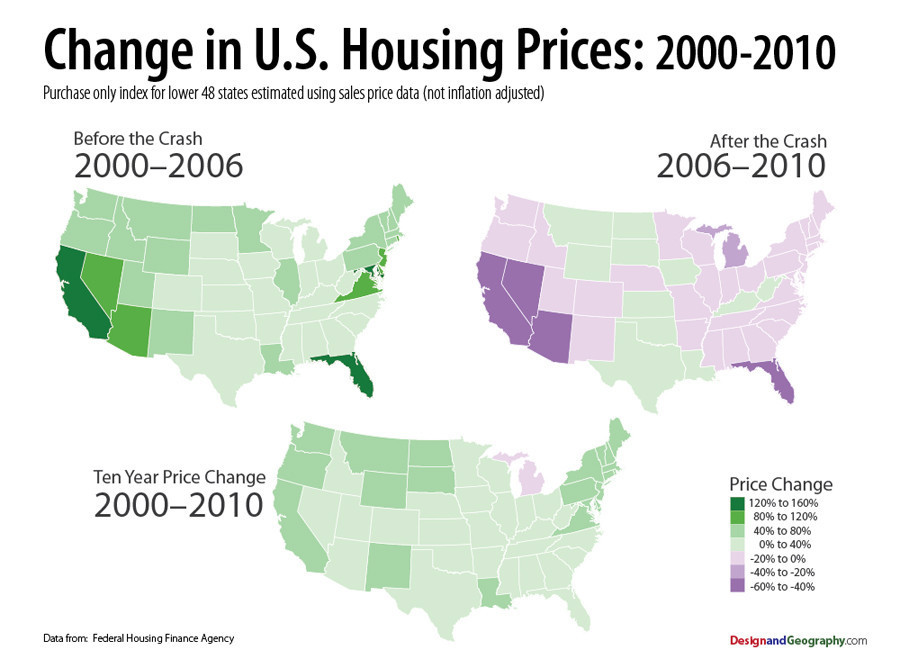
Unlike prices in the stock market, which are the same no matter where you you live, your experience of the housing bubble was determined by your location in the years 2000-2010. These maps, created with Matthew Mulbrandon, give a quick and easy glance at the change in housing prices focusing on the bubble in the United States. They show the Housing Price Index (not inflation adjusted) by state. As you have probably seen in the news, the housing bubble was largest in the West and the South East, in states such as California, Arizona, and Nevada and Florida. Those states had the largest increase from 2000-2006 (height of the bubble) and the largest decrees from 2006-2010. However, from 2000 to 2010 one can see all states (except Michigan) had more moderate price increases. You can learn more about the housing market at DesignandGeography.com.
Data source: Federal Housing Finance Agency
Visualizing Economics is a website by Catherine Mulbrandon dedicated to publishing infographics about economic data. Visualizing Economics has been featured at Slate.com, NPR.org, WashingtonPost.com, The Big Picture, Seeking Alpha and on MSNBC
Matthew Mulbrandon is an urban geographer specializing in demography, urban modeling, and transportation and runs DesignandGeography.com
Find more graphics explaining the U.S. economy at VisualizingEconomics.com