When you move into a home, more often than not you'll be inheriting a few (or more) decor flaws and outdated paint jobs from the previous homeowners. While some of these can be fixed -- like swapping out that faux Tiffany lamp for a more modern pendant -- others can prove to be a little more challenging to switch out. And by challenging we're referring to garishly-hued stucco walls, old wallpaper from the 1980s that's still intact and full-on pink bathrooms.
Although these outdated color and decor choices are not complete deal breakers in a home, a pink bathroom or a burnt umber kitchen may be making your home look, well...old and outdated. So, we decided to take a closer look at major colors and decor that dominated the home during the '50s-'80s to get a sense of how 'aging' a look can be. Check out our break down of the eras below.
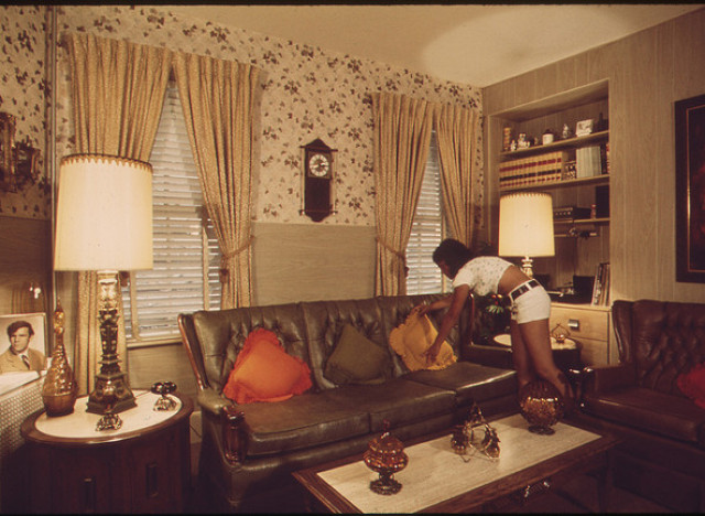 Flickr photo by The U.S. National Archives
The Decade: 1950sThe Color: Baby pinkThe Look: Pink was all the rage during this golden era. And all the thanks may go to Mamie Eisenhower, who gave rise to the pink trend, which even influenced Hollywood actress Jayne Mansfield's very own pink palace. And the soft pink wasn't just confined to the bathroom, kitchens eventually caught a bit of that blush as well. Why It's Dated: There's nothing wrong with a pink palette, but pink bathroom fixtures like toilets aren't commonly sold anymore, so they will always look like they belong in Grandma's house. And while we love Grandma, we don't have to decorate like her.How To Make It Work: If you can't replace your pink toilet, offset the color with a silvery accents and (if you can) paint the walls in gray. The stark contrast will turn the pink color into an accent, rather than a focal point. Or, if you choose to embrace the '50s look, try bringing in vintage accessories like apothecary bottles and a silver mirror.
The Decade: 1960sThe Colors: Dusty 'Historic' HuesThe Look: While the '60s is associated with mod design, the majority of homes during this decade took on a more early-American approach to decor. There was lots of wood paneling (especially faux), plaids and mustard/periwinkle/forest green hues with grayish undertones. Think: Don and Betty Draper's home. ( Or, Check out these '60s rooms.) Why It's Dated: These dusty colors just simply make a room look weathered and time-worn. How To Make It Work: Many homes still retain this '60s palette, whether it's on the wallpaper or the carpet. However, that doesn't mean you have to get rid of it. Try bringing in vintage-style seating and side tables to complement the muted palette, as seen in this living room. Or, give the room a bright update with boldly colored pillows, which will help take the "dinginess" out of these muted hues.
The Decade: 1970sThe Colors: Avocado, Burnt UmberThe Look: There was no shortage of avocado stoves and fridges and burnt umber kitchens during the '70s. Why? After the '60s, people wanted to take a breather and retreat back to more earthy, meditative tones.Why It's Dated: Although appliance manufacturers are bringing back retro colors for stoves, ovens and fridges, the original models are no longer in production and they look misplaced more often than not. See also: The Brady Bunch.How To Make It Work: One way to make avocado work in the modern kitchen is actually to paint your shelves the color. Offset the green by pairing it with a darker color such as the sleek slate tiles in that apartment or paint the surrouding walls in black and white, which will give it a more contemporary look. And instead of going umber on the walls, update your shelves with a dark umber for a fresh, polished feel.
The Decade: 1980sThe Colors: Faux Tuscan white, dark brown, wickerThe Look: The countryside-inspired look really took off in this decade with kitchens that had tile counters and a tinge of Tuscany, or a lot, like this kitchen.Why It's Dated: While spaces inspired by the country homes can have a timeless look and feel to them, it's easy to go overboard with the colors and decor. Then it becomes faux-Tuscan, which can look stuffy and outdated. Or, like an Olive Garden restaurant.How To Make It Work: If you're going for a Tuscan-style kitchen, it's important to not make it feel crowded both visually and physically. Try going with a lighter paint color for the cabinets, like the sage in this kitchen. This will especially brighten and open up a small kitchen. For a bolder approach, you can also go with yellow walls for a sunny backdrop or paint just the backsplash under the cabinets for a more subtle effect.