
This is part of an ongoing series on rejected book cover designs, in which we invite cover artists to reveal some of the rejected ideas and inspirations behind a particular project.
Stan Grinapol, cover artist of "Second Person Singular" [Grove Press]
In your own words, what is this book about?
The book was about a well-to- do Arabic lawyer, working and living in Israel, who discovers a Love Letter adressed to his wife, wedged in between the pages of an old western classic that he finds in a used book shop. It is important to note that until this day he did not know that his wife had any past relationships, this upsets him, and he sets out on a quest to find who this person is.
The book then shifts focus and gives an account of another Arabic person who came from a poor household, and held a series of menial jobs. One of those jobs was taking care of a paraplegic Israeli who was bedridden. It is important to note that in many cases Arabic residents are treated as second class citizens, but there are some Israelis that treat Arabic residents with equality. And this was one of those cases. Through working in the household he learns that the young man was going to an art school and was studying to become a photographer, this inspired him to do the same. He also develops a friendly relationship with the mother, and she helps him get into art school.
Eventually tired of her sons unchanging condition, and being tied to him, she decides to kill him off, because of the similarity in features between both men, the caretaker was able to take on the persona of the son, after his burial, and take on and Israeli Identity, discarding his past completely, and taking on the new Identity.
The book then shifts back to the Lawyer who eventually discovers the secret. In a way you could think of it as "The Talented Mr. Ripley."
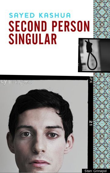
What was the mood, theme or specific moment from the text you depicted with this cover?
My focus was on showing the shift between the two individuals through the tool that led to it's discovery. The Arabic, young man reading the book and the man who he becomes on the cover of the book he is reading.
What inspires your design?
I get inspiration from books, fine art, and fashion. I constantly strive to develop my visual language so that I could utilize vernacular and visual metaphors in my work.
What is your previous design experience, with books and otherwise?
I had an opportunity to work With Charles Rue Woods for over a decade, he generally contracts me out to do at-least two books a year. My other time is spent working as a freelance designer focusing on traditional design such as corporate Identity, and interactive design such as websites, interactive advertising, and currently my focus is shifted into the world of UX.
What was the biggest challenge in designing this cover?
As with all covers the biggest challenge is to put everything you read within a book into one single page image. Make it exciting to the potential reader, and not give away too much about the book. I generally try to shy away from showing actual images of the characters, I find as a reader this impedes to much on my visualization of the actual characters. For this specific cover I felt this needed to be done but it had to happen in a natural and a compelling way. And hence lies the challenge.
Did you consider different ideas or directions for this cover?
Initially I sent three options:
Concept One: The chair was too grim.

Concept Two: The single image of a character had too many elements, gave a clue about the character, but told very little about the duality.
Concept Three: The two opposing images had the most potential from a storytelling perspective but looked too similar to something Grove Atlantic ran with earlier for a different book, that I was not aware of.

At the end I had to rethink the third concept, and find a way to present the duality utilizing a clue from within the book. And for this I used the book itself, after all it's what started the whole journey in the first place, and I was very happy with this choice.

What is the most important element of a successful book cover?
I believe there are actually three main elements to a successful book cover.
Like anything else it has to be compelling. If you go to a store such as Barnes and Nobles you are greeted by a shelf that offers you so many choices unless you are looking for a specific author or title the right cover will be the only thing that will prompt you to pick up a book. The Cover has to answer what the book is about and quickly. I believe in a 5 second rule, that is how long it takes the reader to either pick up the book or pass on. And finally it has to be fresh and original.
What are some of your favorite book covers?
There are so many but I always gravitate towards objects or typography telling a story rather than people depicted on covers here are a few examples.
John Gall: "A General Theory of Love"
Rodrigo Corall: "Super Sad True Love Story"
Gray 318: "Bed"
Do you judge books by their covers?
I used to, then I bought a Nook.