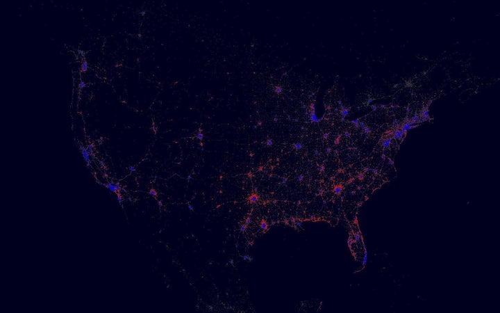
Reporters and politicians like to talk about the electorate in terms of red states and blue states, even though we know intuitively that's a far too simple story. Voters in the suburbs of Atlanta, Georgia, for instance, tend to vote Republican, as you'd expect, but the city itself is a strong blue tucked in a deeply red state. A new map makes clear just what we're missing when looking through a red state/blue state prism.
The nation's real political patterns are far more visible on a map released Monday by the Facebook Data Team, which breaks down data on political affiliation more narrowly, pinpointing Democrats and Republicans with a blue or red dot depending on whether a majority of users in an area identify with either party.
“This gives a very fine grained view of the political map beyond a common red/blue state, or even county level,” the Facebook Data Team said in the post.
The team also released maps that consider the ages of their users around the world, check-ins in New York City during the workday and the frequency of users' travel around the world, based on users checking in to two distinct areas.
The maps echo the viral visual released by Paul Butler in 2010, which mapped Facebook friendships and connections around the world.