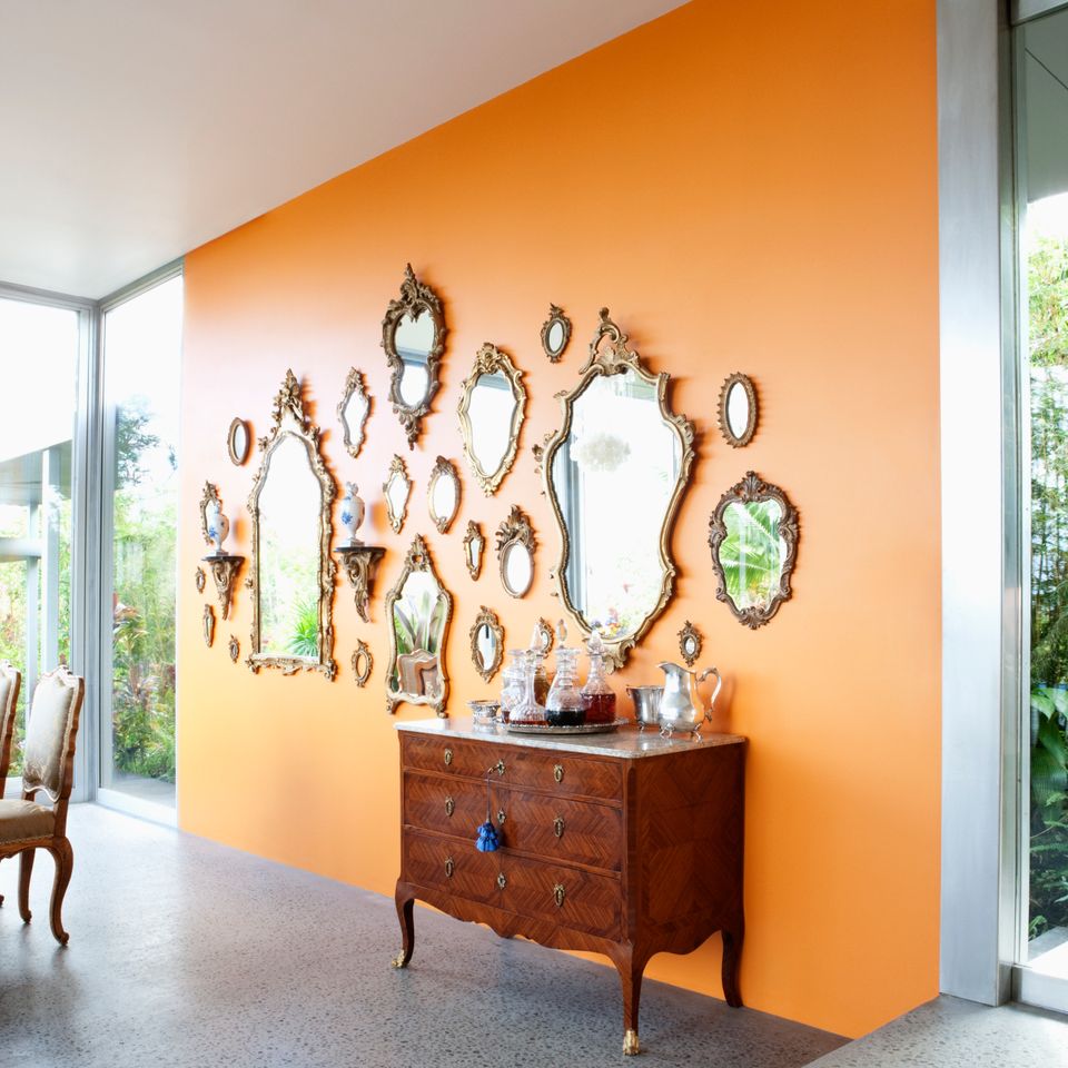
We've mused on the virtue of decorating with white and filled you in on the the shades of blue and green you need to know right now, but elsewhere on the color wheel lies one particularly underrated hue -- orange.
Yes, it does conjure images of sunny summer days (and who doesn't want more of that this time of year), but its versatility is more than apparent to the designers below and, well, to us now, too.
1

Small doses might not do it and a large-scale project could easily be too much, but this medium-size splash of the color orange hits all the right notes in a home office by designer Jill Sorensen.
2

Danny Broe Architects opted for apricot accents in this otherwise neutral kitchen.
3

Paired with navy, orange (or, as CB2 calls it, persimmon) is an instant classic.
Advertisement
4

Matthew Millman Photography
If you're going to give the fifth wall its due credit, this is the way to do it, says Jeffers Design Group.
5

And when all else fails, there's always the accent-wall approach.
**
Are you an architect, designer or blogger and would like to get your work seen on HuffPost Home? Reach out to us at homesubmissions@huffingtonpost.com with the subject line "Project submission." (All PR pitches sent to this address will be ignored.)
