

Increasing your conversion rates is absolutely crucial. An increase in conversion rate of just 50 percent can result in a 500 percent increase in your business' pocket. Think about it -- a 10 change in conversion rate can mean the difference between making a profit and suffering a loss.
Sometimes a small change can lead to a significantly improved conversion rate. Combine a few effective, small tweaks, and you've got yourself a dramatic increase in results.
Here are nine quick fixes you can make on your website to potentially increase conversions:
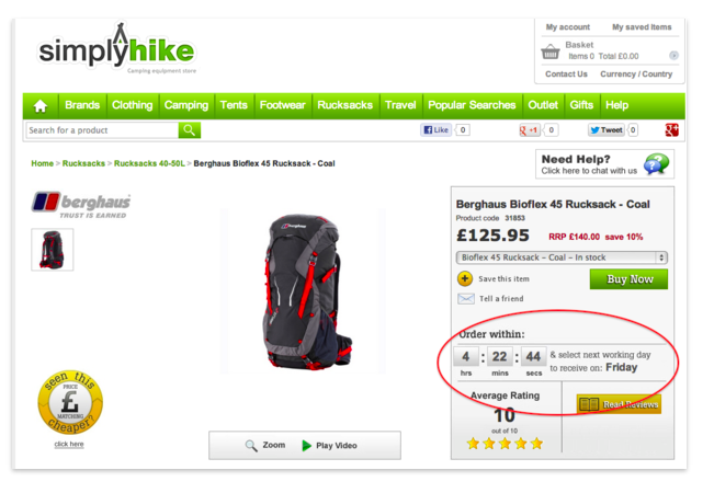
1. Add a Timer
If you want potential customers to make a quick action, create a sense of urgency. Ticketmaster does a great job of this. They have a countdown timer on every conversion page, prompting you to buy within 10 minutes.
Here, the UK-based outdoor retailer Simply Hike in countdown near the call to action which might just encourage customers with that "want it now" mentality.
2. Integrate Bullet Points
Your web content needs to be scannable. The average attention span in 2015 is 8.25 seconds, a 3.75 drop from 2010. (That is shorter than the attention span of a goldfish!) According to the Statistic Brain Institute, 17 percent of page views are less than four seconds, meaning marketers need to create pithy and clear copy.
More, a Jakob Nielson's web usability study revealed nearly 80 percent of web users scan rather than read.
Plus, many people these days access the web through mobile devices on the go, so it's crucial create content that can be skimmed over to be easily digested. Accept that people scan versus reading in detail... Change paragraph blocks to a list or bullet points.
3. A/B Test One Word
A/B testing allows you to test two variables to find the best way of converting prospective clients. While A/B testing is popular with usability and design, it can also be leveraged with content. Test two word variations -- either in the headline, call to action, or conversion button. The winner might surprise you!
4. Change the Font Color
Color evokes a range of emotions. When building a website, color must be on the forefront of your mind... how it interacts with your visitor's range of emotions.
For example green is linked to wealth and health, purple to imagination and creativity, yellow to optimism, gray to balance, and red to boldness. Each color has an impact on how potential customers consume information on your site.
ContentVerse recommends performing a simple squint test (squint your eyes, stand back and see which elements stand out) to see how colors stand out on your webpage. After doing this, it could spark ideas
Not only should you A/B test words, test font color too!

5. Remove Superlatives and Jargon
Adjectives are fluffy content. Most websites overuse adjectives. Though it's tempting to include words like "best", "leading", "cutting-edge", or "fastest", they really don't help the cause unless you provide ample evidence that the adjectives really are true. Try removing adjectives on your website, and transpose them with actionable verbs, and see how the analytics play out.
If it's your opinion -- don't say it. Stick with active verbs and remove all superlatives.
(Same thing goes for jargon. It's not universally understood, so avoid it.)
6. Keep it Simple
Google recently revealed two factors in the appeal of a website: websites with low visual complexity (are simple) and high prototypicality (represent their given industry) are most appealing to web users.
To accommodate this, use white space to emphasize what matters. Take out sidebars, keep the top navigation clean, minimize text, and use just a few powerful images.
7. Surprise Your Visitors
Unexpected copy makes web visitors read closer... Neuroscientists affirm novelty promotes better mental retention and information transmission.
People are so used to reading mundane content on the web. Why not shock your visitors by including a unique graphic, promotion, or copy?
8. Address Objections to Your Product/Service
People are naturally skeptical, especially online. Naturally answer people's objections to your product or service within your text. Be a go-to resource for your given industry by providing information. Avoid salesy content, and just go in with the mentality of being resourceful to your readers.
To start, create a list of all objections your potential customers have, then address them in your copy.
9. Proofread!
Poor spelling and grammar makes your website look untrustworthy. Attention to detail is important, especially when your website is selling something. You want to entrust your audience to the point where they make a purchase. So, take that extra step and have a professional editor proofread your content!
Image credit: Huffington Post "Psychology of Color in Logo Design"
Feature image: iStock