The Color of the Year!
Did you know that the first impression of your home is on average worth $24,000? According to Century 21, the first impression a buyer has of your home can impact the perceived value by up to 8 percent. This means that on the average home valued at $300,000, that initial first glance is potentially worth $24,000.
So what makes a good first impression? Truth is, the color of your home is often the very first thing potential buyers notice when looking at a prospective house. Paint has never been so important.
Recently, I attended a big media launch by Benjamin Moore talking about the trending paint colours for 2015. So what are the hot picks for paints? Good news! There are a few different color stories that work very well for your outdoor spaces. I also found it very interesting that all three of these color stories are based on nature.
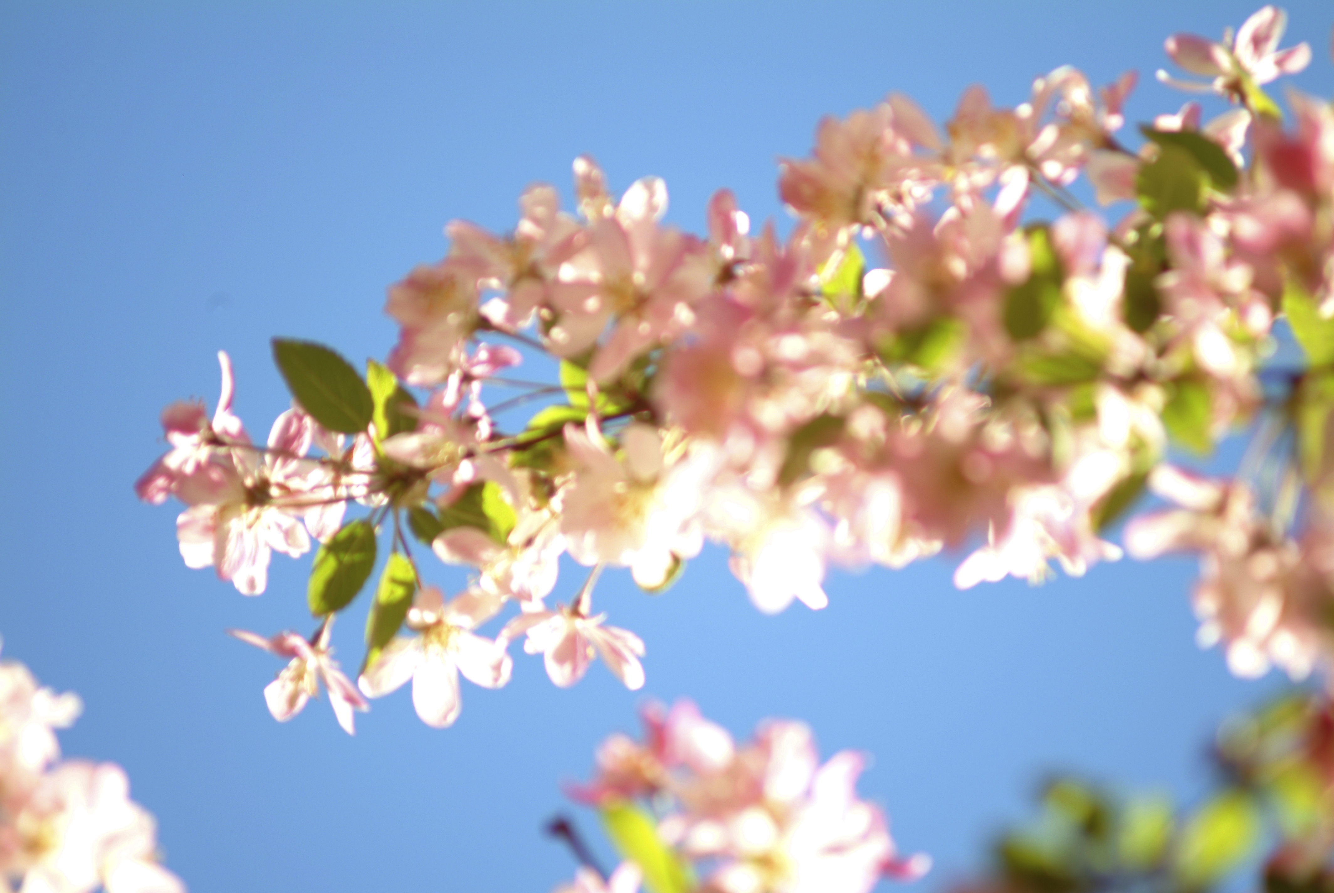
Blue's are back! For 2015, lighter and brighter shades that have lots of personality like Harbour Fog 2062-70 and Blue Hydrangea 2062-60 are being shown with crisp whites and greys to give homes visual pop! Think about a bright blue sky with fluffy white clouds; a perfect backdrop for all of your outdoor gardens and plants.
Also look for some of the deeper, darker blues like Blue Danube 2062-30 to add drama. These intense darker blues are being used as accent colors on single walls or on front doors to evoke the feeling of the ocean or deep water.
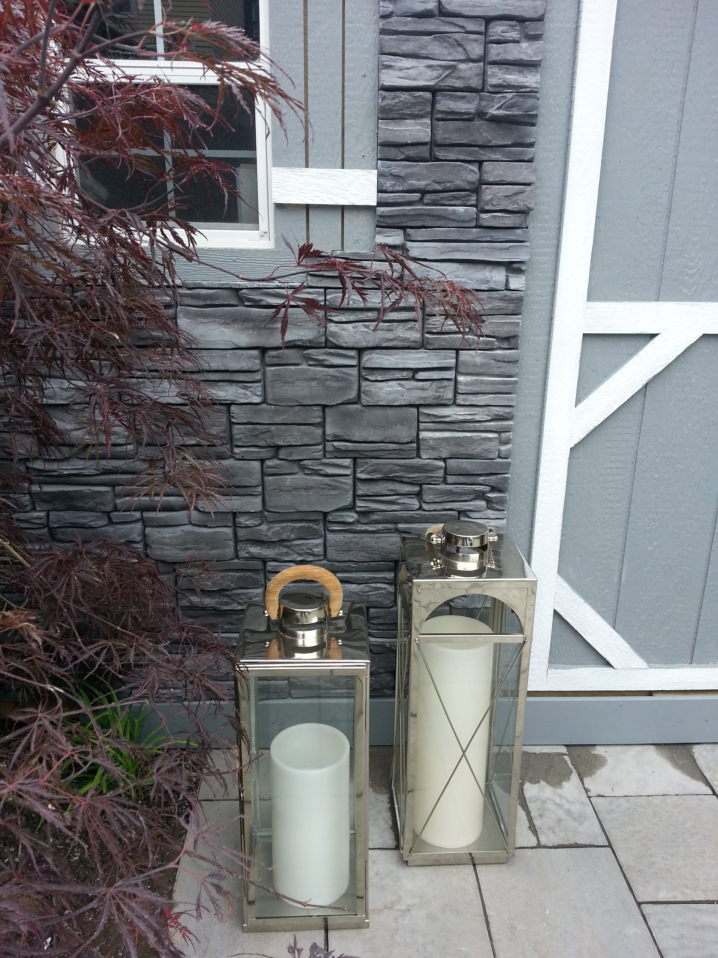
Blushes are also making their way to the outside. As a departure from tans, blush tones are the new choice for neighborhood homes. These lush taupes like Cinnamon Slate 2113-40 and Soft Sand 2106-60 are still grounded in the tan family, but have a soft undertone of pink. They work exceptionally well paired with dark grey stone pathways and patios because they add warmth to the rock. I'm pairing Cinnamon Slate with a walling veneer like Rinox's Lordana collection. It allows me to use the horizontal lines that the homeowner wants and add warmth to make the home inviting.
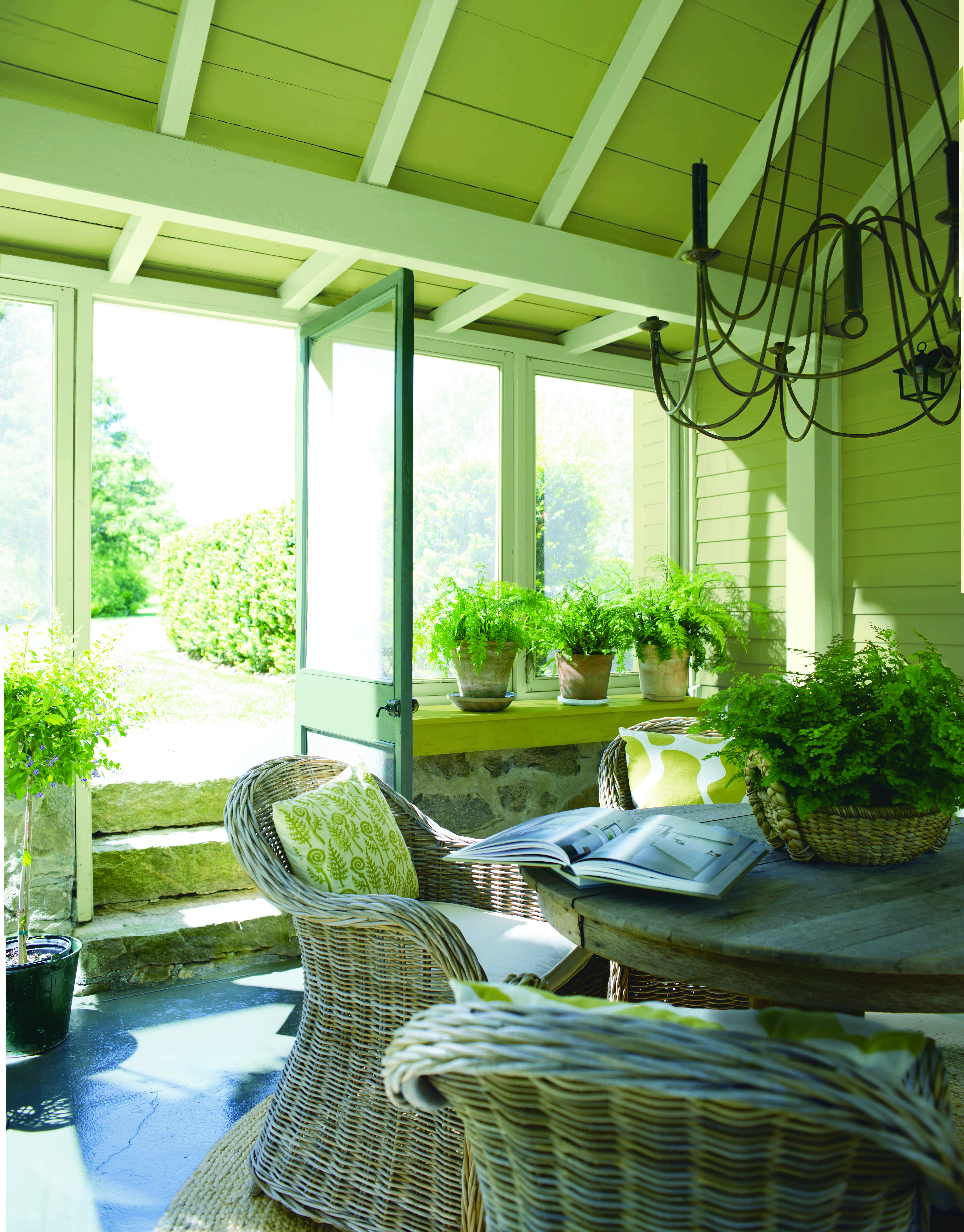
Finally, my favourite colour for the outdoors is back in the spotlight. What could be better than green for the outside? Green's are definitely Nature's neutral. The greens that are going to big popular for 2015 were inspired by botanical gardens with various shades in a monochromatic palette. These are the colors of cacti or of silver sage like High Park CC-620 and Jack Pine CC-660. They look amazing with your front yard gardens and deciduous trees all spring and summer long. Just make sure you accent these shades with silvers and greys to make your curb appeal all-season.
So what is officially the color of the year? "Guilford Green HC-116."

This silvery heritage inspired green is absolutely perfect for the outdoors because it's a color found all around us. What could be better for making your home visually feel like it belongs?