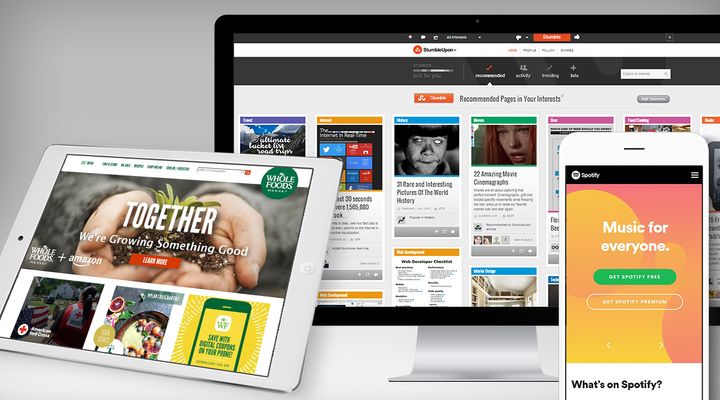
Image created by Blue Fountain Media
User experience is always advancing, and mobile user experience in particular has advanced by leaps and bounds in the last few years alone. As more and more digitally native companies have come into existence, they’ve upped the ante on what defines an exceptional mobile experience. Traditional brands have had to scramble to keep up, but many have risen to the occasion to design engaging mobile experiences of their own.
At our digital agency we’re dedicated to helping our clients meet the challenge of designing for mobile. We work with clients in all different industries to ensure that their message is effectively communicated across platforms and devices. Doing so means staying on top of the latest and greatest mobile UX trends. Below we share five ways you can improve your mobile UX to meet the demands of the modern mobile user.
1 - Incorporate motion, animation, and microinteractions
Modern mobile usability is all about making the experience more intuitive and more enjoyable. Motion, animations, and microinteractions are major components of that. Microinteractions help reinforce an action, letting users know if they’ve completed it successfully or not. They’re useful for educating the user on how to engage with the product, while simultaneously rewarding engagement, which makes users feel good about using the the site or app.
Motion and animation have the effect of bringing a mobile experience to life, making it feel dynamic as opposed to static. Motion and animation can also be used to indicate that a certain action is in progress, which helps reduce interstitial anxiety and improves overall satisfaction with an experience. Motion attracts the user’s eye, directing their attention to where you want it to go, and keeping his attention from drifting elsewhere. Together, motion, animation, and microinteractions are powerful tools to improve mobile usability.
2 - Explore alternative navigation
A lot of controversy exists regarding the efficacy of hamburger menus. Those three little lines that indicate an expandable menu have become ubiquitous in mobile design. Hamburger menus serve a clear purpose -- to house navigation without commandeering too much screen space -- but some UX experts say users may not be aware of what the stacked lines represent, and some consider the hamburger menu a lazy solution to the problem of mobile navigation.
More apps are beginning to rely on tab navigation and swiping to guide the user through the experience. Using common gestures, like swiping, to allow users to navigate harnesses the power of behaviors the user is already accustomed to. Simple iconography can also be employed in menus to minimize the amount of space needed while adding a visual element that users will connect to.

Modern navigation used by the Spotify app.
3 - Embrace bold palettes
Minimalism has been a popular design trend for a few years now, and muted color palettes have been a product of that trend. But it’s hard to design a memorable experience in shades of white and grey if everyone else is doing the exact same thing.
Many brands are now beginning to design mobile experiences that employ bold color palettes. Bold colors can be used not only to capture the user’s attention, though they certainly do accomplish this aim, but also to quickly visually differentiate separate areas or experiences within an app.

Bold color palette demonstrated by the Brevity app.
4 - Focus on personalization
Personalization is a challenge many brands are investing heavily in trying to meet. That’s because personalization is shown to improve user engagement and satisfaction with an experience. It makes sense -- the more relevant the content is to the user, the more likely he or she is to find the experience useful.
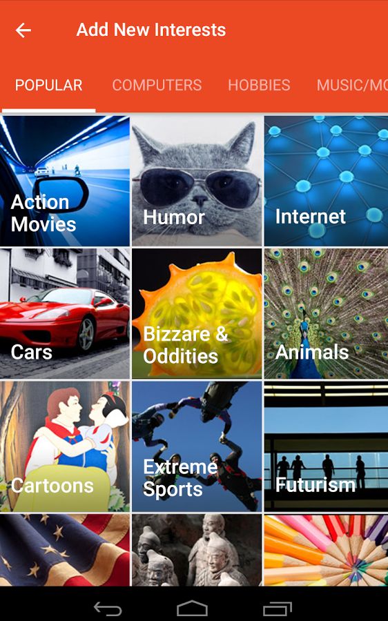
We’re seeing increased personalization showing up especially in mobile apps, where experiences are designed to be tailored to the user’s needs and interests. Many apps onboard users with a series of questions about their preferences or goals, and use the responses to refine the content or experience of the app so it aligns specifically to the preferences they’ve indicated.
To improve mobile usability, look for opportunities to personalize the experiences you’re designing, whether through curated content suggestions, personalized product recommendations, or tailored homepage / home screen content.

StumbleUpon utilizes customized interest list to curate specific content for users.
5 - Experiment with card-based design
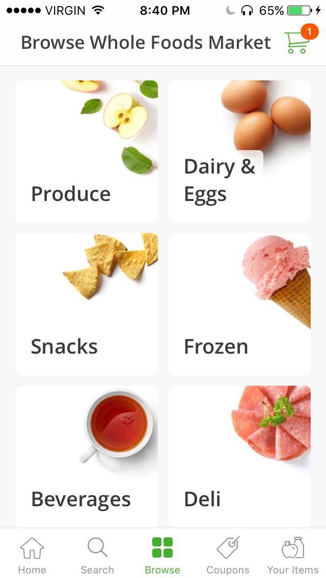
Card-based design is another way to improve mobile usability. Cards are pretty much exactly what they sound like -- content that’s grouped together onto a rectangle or square that resembles … you guessed it, a card. The grouping of information is key to the card’s function. Cards allow us to take various pieces of content -- an image, a title, and a line of text, let’s say -- and visually associate them as part of a single topic or idea. Cards also act as conduits to further content, so they’re great for segmenting information and helping users discover the topics or features they’re most interested in.
It’s easy to see why cards make sense for mobile -- they’re big enough to be accessible with fingers and thumbs, and they’re perfect for scrolling. But beyond mobile, cards can also be seamlessly adapted to desktop layouts, which makes it easy to adapt experiences across devices.

Whole Foods demonstrates the clean card-based design for their app.
The Wrap Up
Designing for mobile means keeping pace with standards that are constantly shifting and evolving. Staying on top of what others are doing and being informed about the latest trends is essential if you want to keep your mobile experiences fresh and engaging. Experiment with different ideas to find usability improvements that work for your site or app, paying particular attention to what resonates with your site’s audience.