Bet you didn't think you could learn anything (aside from which candidates want which of their family members on the $10 bill) from the Republican Party's presidential primary race. I thought this too until I started perusing the candidates' websites and realized that small business owners can learn a lot from how political candidates lay out their campaign websites. When I started writing this article, there were 15 GOP candidates and 15 candidate websites. Admittedly, all of the websites look pretty similar. (Just try to find a dominant color that isn't red, white or blue. I dare you.) Yet, I still think there are some good lessons to learn here.
Before we get to the lessons, though, it is important to understand why people go to these websites. It isn't just to get hair-styling tips from The Donald. Based on an informal survey, I found that most people visit these websites to find out more about a candidate's views and positions, meaning that visitors are not yet supporters. The websites' most important job is to seal the deal.
Keeping this background in mind, what lessons can candidate websites teach us.
1. I won't be reading your website.
Want people to read about what you have to say? Write a book. Visitors aren't going to read through text on your website. I bet you aren't even really reading this article. You are most likely scanning the numbered headings and only when one piques your interest are you focusing on each word. The best websites are laid out and designed so visitors can easily identify information relevant to them. As an example, take a look at how easy it is to scan Chris Christie's homepage and find donation buttons, recent news, volunteer forms, and videos of him discussing his stance on issues.
2. Show me the issues.
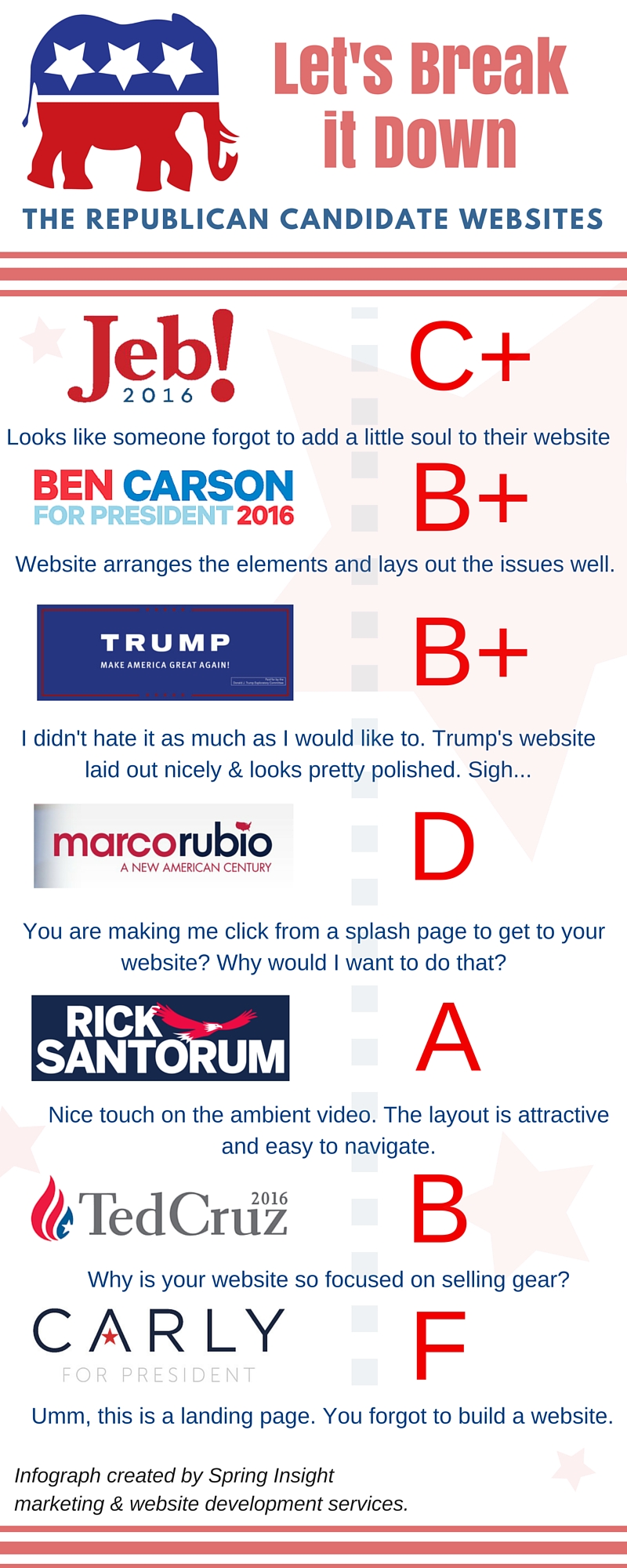
If most people go to a candidate's website to figure out his or her views on issues, then "issues" should always be an item in the site's primary navigation. Of the 15 websites, ten had issues as a primary navigation item. Five candidates (Jeb Bush, Ted Cruz, Carly Fiorina, George Pataki, and Rick Santorum) either don't highlight a page about the candidates view on issues or bury them in the navigation. What a missed opportunity!
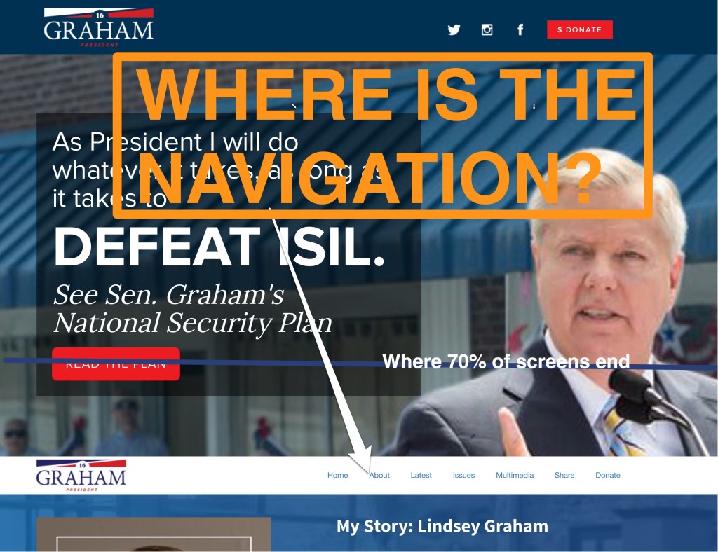
3. Where is the navigation?
Lindsey Graham and John Kasich both decided to position their navigational bar under a huge picture that vistors have to scroll past. Both Mike Huckabee and Bobby Jindal use a "hamburger" style navigation menu. This symbol was created specifically to provide responsive menu design without taking up too much real estate on small screens. But Huckabee and Jindal use this symbol on their full websites, which actually hides the menu for those quickly looking at a website. All of these navigation hijinks assume more patience (and digital savvy) in users than many have. Never overestimate how much attention visitors will devote to finding information on your site.
4. Differentiation is great! Clutter is not.
Whose website would you guess would have the most interesting functionality? My guess going in was either Carly Fiorina (whose background is with a technology firm) or Rand Paul (who, of the GOP candidates, has the most support from young voters). Imagine my surprise when I found it to be Mike Huckabee! His site has a really interesting frame that on the left-hand side links to social media channels and shows his event calendar. Then, on the right-hand side, it shows faces of his supporters. When a visitor mouses over a supporter, they see a statement of support. So cool! The only downside is that it makes the page feel pretty cluttered and the frame is on every page. If being easily scannable is the goal (and being easily scannable should always be the goal) then clutter is the enemy.
5. Don't give me a splash page when I am looking for a website.
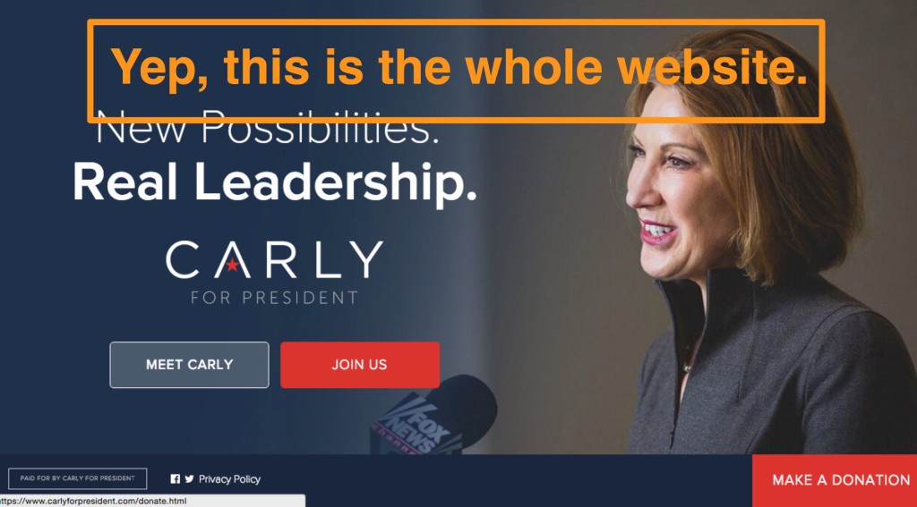
You know what I hate? Extra work. When I go to Marco Rubio's homepage, I find it isn't a homepage at all, but a splash page with a news posting and an email collection tool. I have to click a button to continue to the actual website. When I go to Carly Fiorina's homepage, I find she forgot to actually build a website. It is just a landing page. If I click the "Meet Carly" button, I go to another landing page. Where precisely is your website, Carly? A splash page with no depth and no additional content is not a website.
6. Some design trends are worth trying.
I first noticed ambient video (video that plays silently on a website to set a tone) earlier this year and have been noticing it more and more. Rick Santorum uses this technique. The short clips on his website show him walking with his wife, playing football with his sons, and giving a speech. These silent clips add vibrancy to the webpage that static pictures don't. It is a great way to make a website seem fresh. Bravo Rick!
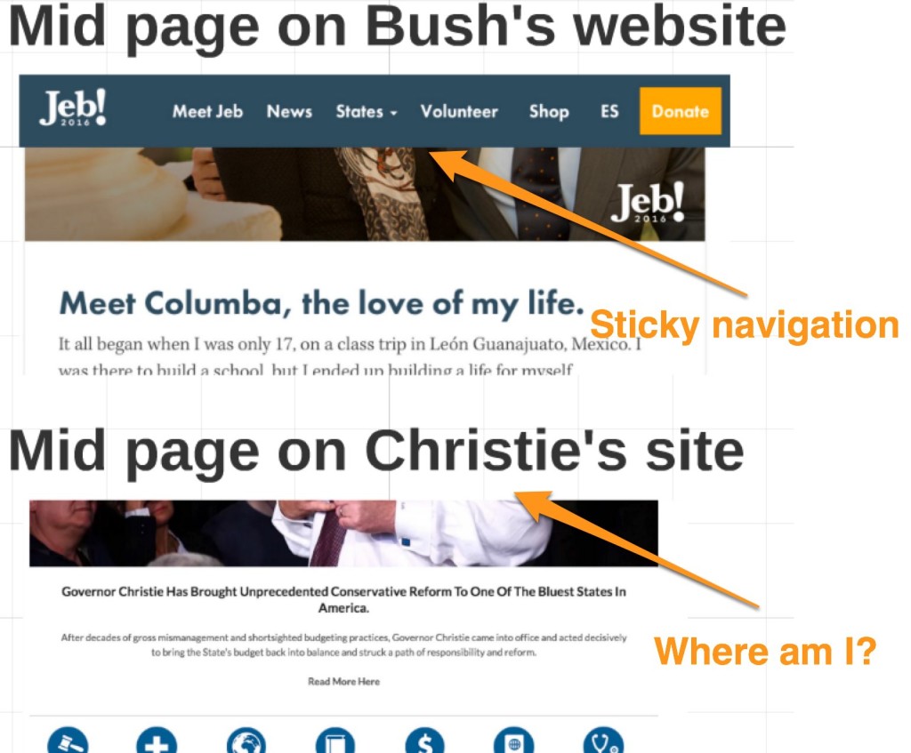
7. Scrolling is fine, but make the navigation bar sticky.
I get it, candidates. You're politicians and you have lots to say. But if your page goes on-and-on, please use sticky navigation so I can easily get from where I am on the page to other parts of the site without having to scroll anywhere. Compare Chris Christie's page with that of Jeb Bush. Which would you rather find yourself in the middle of reviewing?
So there you go, seven lessons learned from the Republican presidential candidates. And here I thought politics just made us stupider.