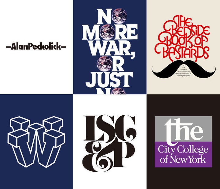
Alan Peckolick, the revolutionary typographer and “graphic expressionist” painter who developed typefaces for brands like New York University and Revlon, died on Friday after suffering a severe fall in his Connecticut home. He was 76 years old.
Although he was diagnosed with Parkinson’s disease 15 years ago, Peckolick was able to do the things that brought him joy ― namely, traveling, designing and painting ― through the final days of his life. “Our mantra was ‘life is not a dress rehearsal,’” his wife Jessica Weber told HuffPost on Monday. “We really packed in and were blessed with a rich, full life. His disease never got so bad that he wasn’t able to do what he loved.”
Peckolick was born in 1940 in the Bronx to what he described as a “blue-collar family.” His father was a letter carrier, his mother a housekeeper. As a kid, he wasn’t exposed to many cultural institutions, but he did love to draw. In an earlier interview with HuffPost, he recalled doodling on the bags of groceries he’d pick up at his mother’s request.
“He was the most originally creative person I ever met,” Weber said. “He was a kid from the Bronx. No one could have predicted he had this enormous talent within him.”
Peckolick’s mother eventually realized her son’s knack for drawing and suggested he apply to art school. After submitting a portfolio scribbled on various scraps and surfaces, he was accepted to Pratt Institute on a trial basis. However, three months into his tryout with the illustration department, Peckolick was asked to leave the program when he fell behind.
The departure led Peckolick to discover graphic design, a field that interested him in part because drawing skills weren’t a necessity. So, still at Pratt, he switched his area of study and immersed himself in the language of typography, learning about the shapes that make up letters and words and their visual effect on the reader.
Peckolick quickly fell in love with typography’s peculiar logic. “If a word was a beautiful word,” he told HuffPost, “it wasn’t the sound of the word that intrigued me but the look of the word. I saw each letterform as a piece of design. Cat is not ‘cat,’ it’s c-a-t [...] Letterforms themselves can support the visual idea of what the message is.”

After graduating from Pratt in 1964, Peckolick entertained a brief stint in advertising before becoming an assistant to legendary designer Herb Lubalin, who would become his mentor and lifelong friend. Through Lubalin, Peckolick was introduced to typography’s preeminent pioneers: Saul Bass, Lou Dorfsman, George Lois, all of whom he befriended and learned from with zeal.
“I got lucky,” Peckolick said. “Through a bunch of icons you meet a bunch of icons, and if you’re not careful you’ll become an icon yourself.”
And so he did. At the time, lettering was traditionally understood as being subservient to graphics ― the caption beneath the image ― but Peckolick embraced the visual nature of the letters themselves, allowing them to speak up and talk back. Inspired by graffiti, hand-painted signs and text from other languages around the world, Peckolick crafted conceptual fonts without precedent, always imbued with style and a sense of humor.
Weber met Peckolick at a meeting of the art director’s club. They were both married to other people at the time. A few years later, they weren’t, and so they reconnected. “We were best friends first,” Weber said.
At six-feet-four-inches, Peckolick had an imposing presence that sometimes intimidated strangers upon first meeting. But his personality, Weber said, was incredibly modest and even shy. “His looks belied the softness and the sweetness of him,” she said. “There was a little boy inside that frame.”
The two wed in 1984 and celebrated their 33rd wedding anniversary in Dublin last month. “Every year we’d buy each other a tree or a plant, something that was forever,” Weber said. “I have all these trees that remind us of our time together. Alan was’t the kind of guy you bought sweaters for.”

Later in life, Peckolick transitioned from graphic design to fine art, incorporating his love of letters into large-scale paintings that combined text with texture, color and composition. His work was exhibited at institutions like the Atlantic Gallery and the University of Baltimore in Maryland.
“He always had creative balls in the air,” Weber said. “When he didn’t have a project going, he would surprise me with an 18-foot fresco in our apartment. Frankly, it was challenging living with someone as talented as he was because there was always paint all over the house. It was like living in Jackson Pollock’s studio. He was a creative force, a hurricane in my midst.”
In the last few years, Peckolick’s physical shaking increased as a result of his Parkinson’s, and, as a result, he moved away from painting the fine details of type. Still, he worked constantly. When he died, he was in the middle of working on a children’s book and a poster celebrating the 100th anniversary of Herb Lubalin’s birth.
In his interview with HuffPost, Peckolick addressed his illness with humor and strength. “It’s a hard disease,” he said, “but I always say to people, if it really gets bad I can become an abstract painter.”
Following Peckolick’s death, many have reached out to Weber, some of whom knew Peckolick personally, others who were inspired by his work from afar. “The incredibly creative way that he used type will hopefully inspire generations of designers to come,” she said. “I think he was one of the great typographic designers, there is no doubt about it. That’s his legacy.”
Peckolick, described by his wife as “a delicious ice cream soda of stuff,” was a brilliant mind, a tireless creative spirit and a warm, generous person. He will be missed.

