
Retailer Anthropologie has a myriad of holiday gift suggestions on their website: "brrrilliant" polka-dot gloves, misshapen mugs made of blown glass and at the bottom of the page, three classic novels with bright, jaunty covers.
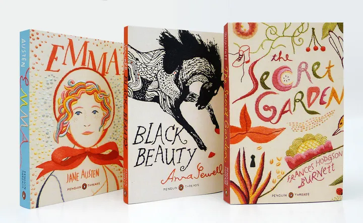
It makes sense that newly released editions of "Emma," "Black Beauty" and "The Secret Garden," published by Penguin, should be sold alongside almost-too-precious critter candles and snow owl saltshakers. Their covers feature images of hand-embroidered artwork that took nearly three months to complete. They are beautiful objects.
But why would publishers invest so much in reprints of novels that are available in the public domain? And do wonderfully designed covers make the books more accessible, or do they generate a new breed of shoppers who prefer collecting to, well, reading?
"To be honest, I don't really like the idea of books just becoming design objects," says Jillian Tamaki, the illustrator behind Penguin's needlework covers. In addition to designing classic and young adult books, she created the cover for her own 2008 graphic novel, "Skim." She says a cover should convey mood, tone or small plot details not outlined in a synopsis, and she always tries to read an entire novel before conveying it aesthetically.
"It's like visiting a place," she says. "You can think you know a place through photos or stories, but it's an entirely different thing to visit that place."
Penguin's Executive Creative Director Paul Buckley echoes the sentiment that design without awareness of an author's style or intent doesn't suffice. He grew frustrated while working on the series that preceded the current embroidery collection. Called "Penguin Ink," it featured the work of artists from another archaic craft: tattooing.
"With some of the tattoo artists, I was like, did you even read these novels? So we had to stop doing that project," he says.
Buckley's aim when recycling a previously published series is to create books that are engaging both for the stories they contain and for the quality of their physical construction. Otherwise, he says, it isn't worth the cost. Much more optimistic than Tamaki about novels sold alongside retail, he says, "Commerce is commerce. I don't see any benefit in being snooty and sort of white-gloved with the classics. Whatever gets people to read, I'm all for it."
Dennis Johnson, the co-founder of independent publisher Melville House, agrees. "There are lots of evil geniuses at Ikea and Crate & Barrel placing books around the store," he says. "They're meant to class up the joint, and say 'there's something smart and good here.' I love it. Classic books should be part of the conversation of qualitatively evaluating objects."
Johnson's latest repackaging project, "The Art of the Novella," is a decidedly minimalist -- or as he puts it, "mid-century modern" -- take on designing oft-ignored short classics. Mary Shelley's "Mathilda" and Leo Tolstoy's "The Death of Ivan Ilych" are among 42 books with text-only covers in pantone colors such as "Aqua Sky" and "Honeysuckle."
At first, the imageless collection had a negative response from Melville Houses' sales department.
"They were catcalling, like, 'Where are the girls? Where are the sexy pictures?'" Johnson recalls. "But it's Tolstoy. What else do you really need to say?"
Ultimately well received, the collection was referred to by NPR as "the anti-Kindle," as it combines portability and colors that pop.
Five of the novellas in Melville House's series come with a bar code that, when scanned, allows access to maps, historical anecdotes and the authors' letters. These "illuminations" are meant to give the books context and fuse the tactile and digital reading experiences.
Johnson says he has seen his company's novella-inspired tote bags, printed with a quote from Herman Melville's "Bartleby the Scrivener," worn near The Occupy Movement. "A scrivener is this early accountant, and the book is about the first revolt on Wall Street," he says. "The quote is 'I would prefer not to,' which is what Bartleby says when he quits his job."
Visual Editions, an exceptionally small, UK-based publisher with three completed works focusing on what they refer to as "visual writing," is also all about context.
"There's got to be a reason why you want to introduce an old book to a new audience," Co-founder Anna Gerber says. Aiming to breathe new life into dusty stories, the company adds fresh design perspectives to the classics. Gerber chose to "re-imagine" Laurence Sterne's "The Life and Opinions of Tristam Shandy, Gentleman," because, though it was published in 1759, she said it has punk rock elements that make it relevant today. Their take on the story includes vibrant, pink-orange images peppered throughout.
Another of Visual Editions' re-releases, "Composition No. 1," is a loose-leaf novel with single-page, self-contained stories the reader can choose to experience in any order. Originally published in the 1960s, Gerber says the book, which is sold with an accompanying iPad app, "raises all the questions we ask ourselves today about user-centric, non-linear screen driven ways of reading."
Megan Wilson, a designer who works frequently with Vintage Classics, abides by more traditional principals. Her staples include close crops on old oil paintings or fonts that indicate the period in which the book was written (bulky lettering for the retro "An Education," tactile-looking calligraphy for "The Canterbury Tales," for instance).
"I don't like covers that are clever for cleverness' sake," says Wilson. A self-proclaimed specialist in "dead authors," she designed a cover for "The Beautiful and the Damned" featuring a simple sketch of a flapper from The Illustrated London News. Perhaps her most recognizable piece is that bow-legged, saddle-shoed "Lolita" cover that has become synonymous with the book itself.
The timelessness of her designs aligns with the less selective approach of the publisher. The frequency with which Vintage constructs new editions of classic works suggests a disinterest in relevancy, and an adherence to the idea that, if it's a classic, it should always be relevant.
When she isn't reimagining the visual imagery of renowned novels, Wilson runs Ancient Industries, a quaint shop selling "useful objects which have been in production for decades, centuries and millennia." According to the website, the store's goods are "both classic and modern because of their enduring mix of form and function."
And sure enough, among the teakettles and neck scarves is a worn copy of "I Capture the Castle," a 1949 novel by Dodie Smith.
