The recent unveiling of Starbucks' new logo brings conversation about branding to the mainstream. The new, simplified cup design eliminates the name and focuses solely on the iconic mermaid; once revealed, the design incited a blaze of comments across the blogosphere.
Recent market reports indicate that food packaging will be $11.7 billion business in 2011. Although the container holding your latte is a different case (as you'll see the design after you've committed to buying it), there's no question that brand and design plays a big role in the products we encounter--and purchase--daily. Consider such iconic examples as Wonder Bread; is it any wonder the primary colored circles remained despite a brand redesign? These images are embedded in our subconscious.
Food packaging designs have the power to capture our attention, present a lifestyle, express a brand's mission, steer us toward healthier choices and, ultimately, compel us to buy a product. In seeking clever packaging designs, I found 10 examples that offered that something special, whether it was a unique functionality element, a sustainable component or just a bit of fun. (Click through the slideshow and then see below for explanation about what makes each distinctive.)
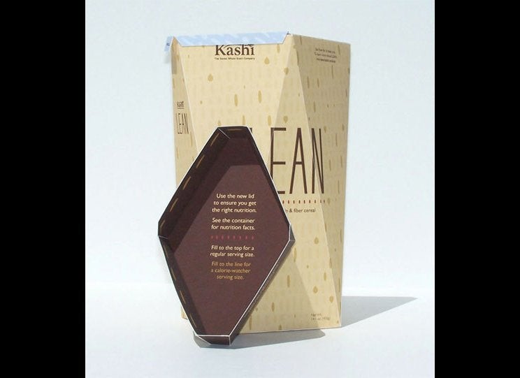
A Kashi Lean container that features a lid instructing users to "fill to the top for a regular serving size" is a brilliant example of design that serves dual functions (in this case, portion control--arguably essential given our nation's diet). The student design, by Patrick McKeever, won a 37th Annual UCDA International Design Competition Excellence Award. Similarly, Neal Fletcher's spaghetti box pre-portions six servings for ease of use when prepping pasta, emphasizing the value of utility in design.
Also encouraging healthier eating habits, albeit in a different way, is the charming and whimsical packaging from Swedish brand ICA Gott liv (literally--good life). Klas Fahlen's illustrations of gymnasts, mountain climbers and cyclists on the bags, boxes and cartons promote a healthy lifestyle, which is a key component of the company's mission statement. A more literal expression of health is the innovative fruit juice packages by Japanese designer Naoto Fukasawa. Actual embodiments of the fruit contained in the juice, the tactile fruit-skin designs are perhaps the purest form of branding: what you see is exactly what you get. Taking a different approach was a clever campaign by advertising giant Crispin Porter + Bogusky that aimed to position baby carrots like junk food--desirable, addictive and fun for kids. One package design touts the contents as "crunchier than chips, orange-ier than cheese puffs." Marketed as the "ultimate extreme snack," on oft-overlooked carrot has potential to influence kids' eating habits. See the whole campaign here.
Packaging, like the Water Well bottles from Denmark, can also communicate social responsibility initiatives. This series of bottles with clear icons depicting different causes might spur customers to shop with a conscience by telling them where their money is going, creating a simple, but effective connect through straightforward package design.
Telling a cultural story is BOS tea, which is made in South Africa and comes in candy-colored cans reflective of the country's spirit. The design, featuring the Lion, the "striking emblem of Africa and first sign of the Zodiac" pays homage to African mythology; BOS says the packaging "represents the purity of purpose as well as the energy and insouciance of the BOS brand." An elegant container for organic honey also takes a storytelling approach. Marcel Buerkle's packaging concept features a copy-heavy label that speaks to the honey's creation. The luxurious presentation--much like that of a fine bottle of wine--is evocative, activating multiple senses.
Brooklyn Fare's packaging engages in a dialogue with its users by featuring simple, in-your-face graphics with cheeky messages. Mucca Design's straightforward branding offers smart, playful humor (a cup design with "It's a medium, not a grande") that perfectly hits its target audience.
What packaging round-up nowadays would be complete without a sustainable example? Biodegradable and recyclable containers are nothing new, but what about simply making the package reusable--and, more importantly, telling consumers how to reuse it? (Let's face it; sometimes you need to make it really simple.) A U.K. graphic design student's private brand prototype for Tesco does just that. Chris Cavill took the retailer's existing soup container and positioned it as reusable with graphics like "Use Me!" and "Place Bread Here," indicating its functionality as a sandwich container.
Food packaging should marry form and function for best results. With innovations in the industry, talented designers to offer new ideas, and diversified product offerings, a brand is wise to think beyond the basic box shelf life and position. These aren't just containers after all; they're opportunities to express a brand's style, mission and values.
