(First published in Crafts magazine, May/June 2016)
Underground: 100 Years of Edward Johnston's Lettering for London
Ditchling Museum of Art + Craft,
Hassocks
12 March - 11 September 2016
As part of a recent design brief I was asked to present some fonts that were representative of London. An obvious example was Albertus, the typeface of choice for the Corporation of London. It can be seen on plaques, road signs and buildings, and even used alongside the coat of arms of the City of London itself. Yet still more prevalent across the capital is the typeface for the London Underground. So much so its design by Edward Johnston remains as much of an icon of London as the red double-decker bus, but remarkably has barely changed in over 100 years in service.
An exhibition to celebrate this centenary is being held in a quiet East Sussex village where Johnston began to hand draw the first letterforms for the metropolitan underground System. He was encouraged to move to Ditchling in 1912 by his friend and former student, Eric Gill. Gill had previously relocated there with the hope of establishing something of an artists' commune, and indeed the village did become a centre for a group of artists and craftspeople who transformed art and design through rediscovering forgotten craft techniques.
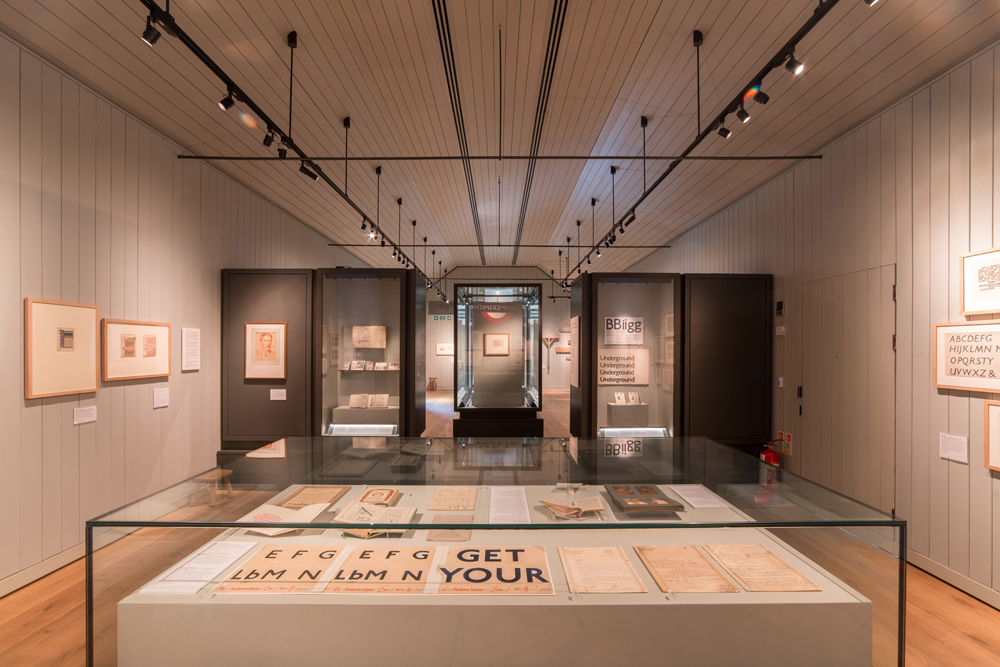
The Underground typeface was one of the most iconic developments to emerge from this, and alongside Johnston's early work as a calligrapher, and this small exhibition charts the fascinating development of the design process through a series of original exquisite drawings and prototypes that led to a new and ground-breaking typeface.
Frank Pick, commercial manager of London Underground Railway, proposed the project that initially led to the typeface in 1913. It was a time when disparate companies that had made up the tube network were being merged into a single organisation. Therefore a new and modern identity was required for the Underground system.
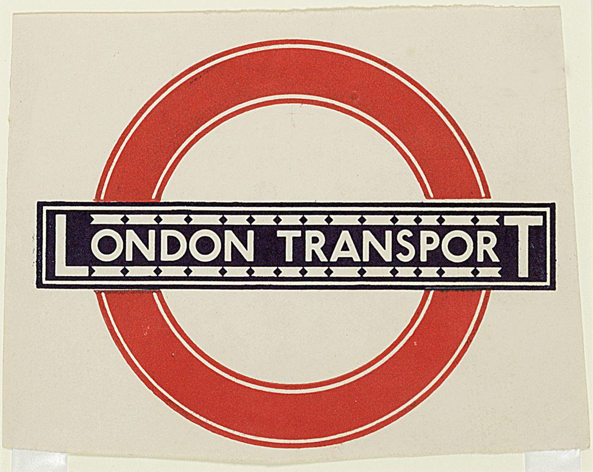
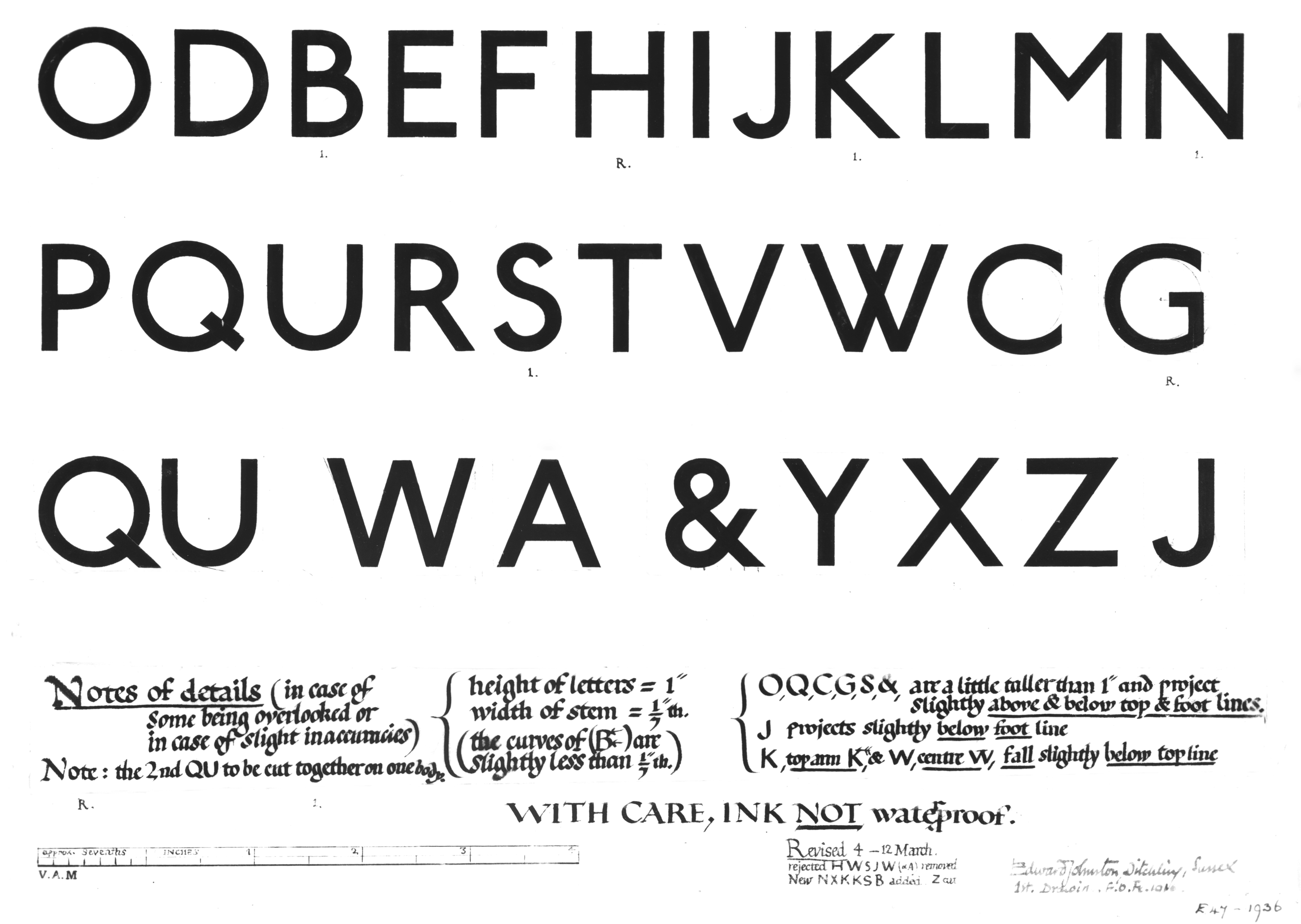
Johnston responded to this by designing an alphabet that is simplicity in itself and radically modern for its time. However its design is rooted in the traditional proportions of Roman capital letters. He took inspiration from as far back as Trajan's Column, with its precisely carved stone cut lettering. Gill had travelled to Rome in 1906 with his new wife Gladys, and there are some photographs on display showing him looking at the Trajan letterforms that also inspired his typeface designs (Gill was so enamoured that there were many photographs in the honeymoon album of Roman lettering, but only one of Gladys).Johnston reduced the traditional Roman capital to a modern sans serif letterform, and continued to simplify it but without sacrificing its character. A distinctive feature is the diamond-shaped full point that is also repeated above the lower case 'I' and 'j'. The typeface is known as Underground or Johnston Sans, and is considered the basis on which Eric Gill designed Gill Sans, which was later released in 1928.
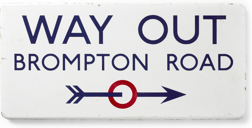
Central to the exhibition is a London Underground sign that hangs above the jewel-like displays. Taken out of context, it encourages the viewer to look at the familiar roundel with fresh eyes. Memorable yet almost invisible in daily use, it reminds me of the first time I saw a full sized British motorway sign hung on a gallery wall in a previous exhibition about graphic design. The national road signs by Jock Kinneir and Margaret Calvert introduced in the 1960's are still in use today and also have a classic design status. To take the time to view what is normally seen in passing allows for a new appreciation of the craft involved. By visiting Underground you are given a similar opportunity to enjoy Johnston's designs in a different and unique setting.