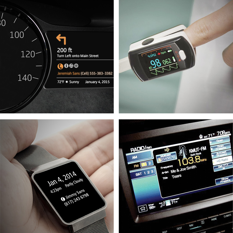
The way we perceive the world is changing, at least in how we deal with information. According to a December 2014 Deloitte survey, nearly 90 percent of us check our phone in the first hour of being awake, and 23 percent of us look at our phone up to 50 times a day. Information is bombarding us at a pace that would've overwhelmed our grandparents and even our parents. Thanks to mobile devices, computers, signage everywhere, advertising in countless forms, in-car displays, wearables, consumer appliances and now the fast-expanding Internet of Things, we've got many screens demanding our attention. There's no question that screens are becoming more pervasive, connecting you -- at a glance -- to the things you care about. So, how can we be sure that information is consumed accurately and effectively even in the briefest of glances? It's one of the biggest challenges for the creators and engineers behind all that information, like graphic and interactive designers, system engineers, developers and device manufacturers.
Is it possible to strike a balance in designing information that not only looks good but also is highly legible? Can we enhance a designer's ability to empower a brand and deliver information clearly and consistently in an increasingly mobile world? The answers may lie, in part, in something that may surprise you -- the typefaces that these devices use.
A closer look at type in our glance-based world
Let's start with the displays in our cars, where the need to process information accurately and quickly is well understood. In 2011, Monotype, one of the world's largest providers of fonts and font technologies, reached out to me with a straightforward set of questions. Could the typeface used in automotive displays measurably impact driver attention? Could specific typeface selections enhance the ability of car manufacturers to meet industry guidelines for reducing driver distraction?
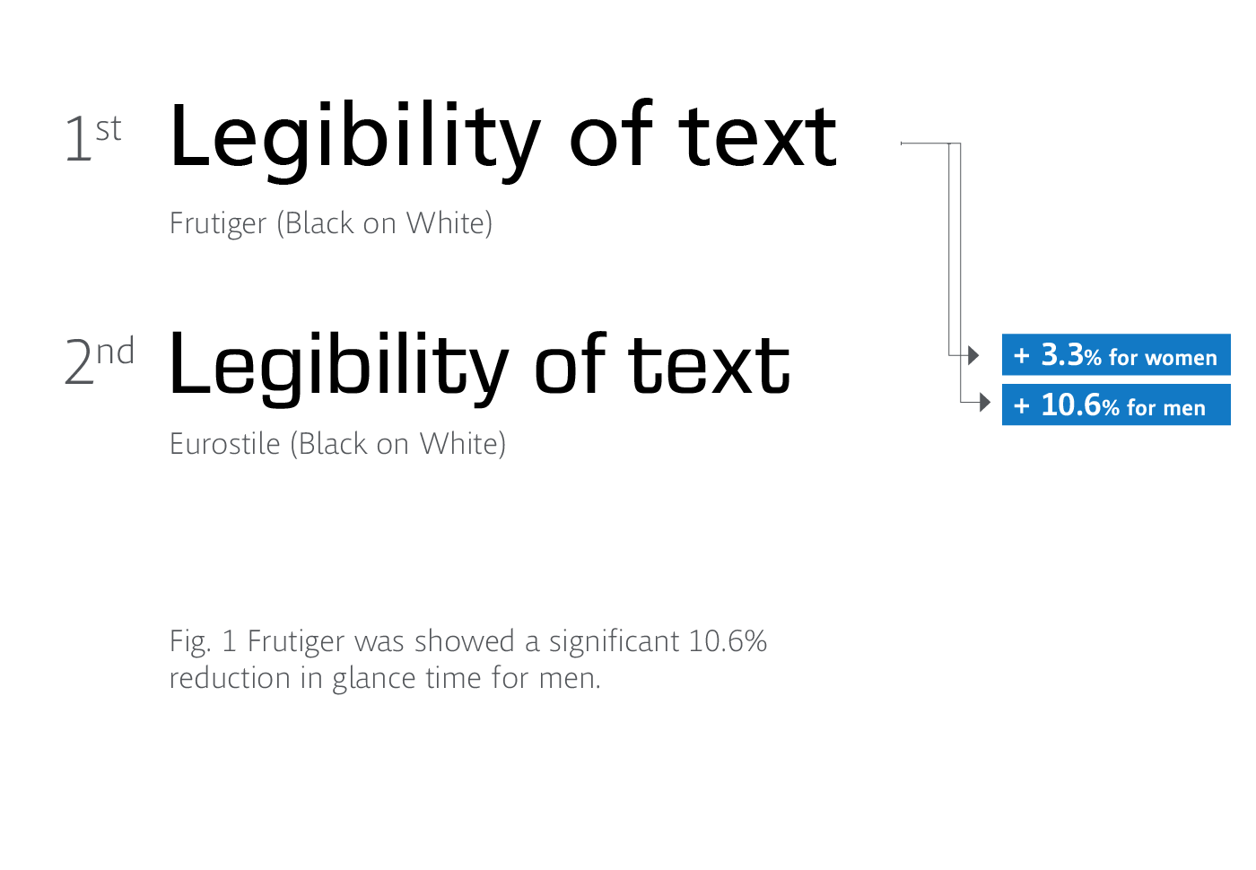
Our first study, Reimer et al. 2014, placed drivers in a car simulator, where we asked participants to select choices from a menu designed in either of two typefaces -- the Frutiger typeface, characterized by open, distinguishable shapes, and the Eurostile typeface, with its rectangular, similar shapes. We found that Frutiger could reduce glance time -- the time away from watching the road when driving while interacting with an in-car display, and even more so for men (see figure 1).
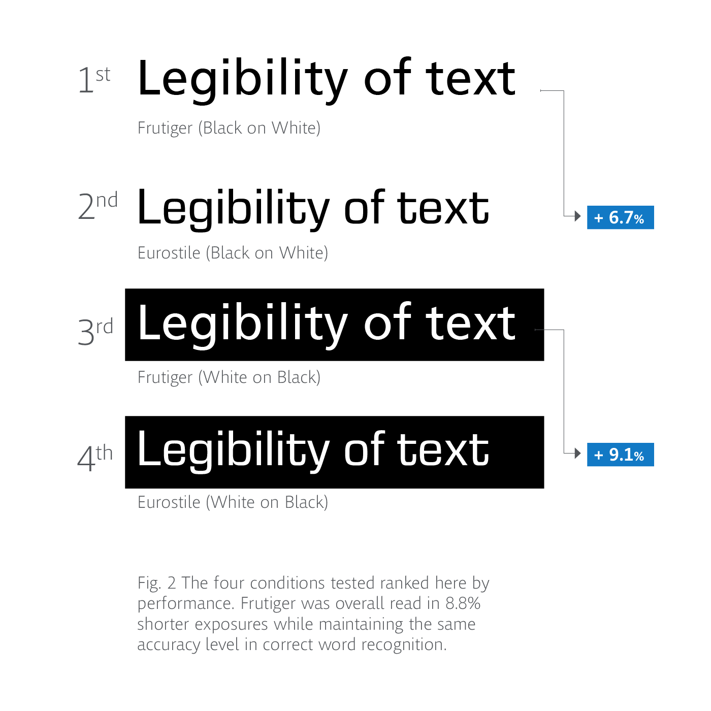
Since that study, we again worked with Monotype to create a simple, glance-legibility test that could be done with a standard computer. After conducting our second study, Dobres et al. 2014, using this new methodology, results showed the same legibility benefit of Frutiger but did not show the gender difference (see figure 2). Although both studies focused only on Frutiger and Eurostile, we saw how a typeface's design could influence a person's ability to read text quickly and accurately.
At Microsoft, legibility research is conducted as part of designing the user experience for Microsoft products. "We study the speed of recognizing each letter while creating new typefaces, retesting the letters in each new design to make it easy to read," says Kevin Larson, a researcher on Microsoft's Advanced Reading Technologies team who works with type designers, psychologists, and computer scientists on improving the on-screen reading experience. One of Larson's research projects was the Sitka typeface, designed by Matthew Carter that's part of Microsoft's Internet Explorer version 11 and the Windows 8.1 operating system. The design process included rounds of legibility testing, where various options for each letterform were designed and tested, thus marrying legibility testing with design.
It's no secret, now, that legibility is becoming a top priority for devices intended for quick glances, like the Apple Watch, which uses a typeface designed by Apple to maximize legibility on the watch's small display. Companies such as Google have also been a legibility proponent with typefaces like the Open Sans design, created for Google to be beautifully legible in a wide range of applications. Open Sans is a hugely popular open source font, garnering tens of billions of views on Google Fonts on a weekly basis.
Balancing the art and science of typographic and visual design
Of course, legibility is not simply something that can be achieved with just a "legible typeface" itself. Over the centuries, typeface designers and typographers have not only developed best practices for crafting a beautiful set of letters but also how to arrange those letters in the design process. It was a process generally limited to experts, much different than today, where designers of all skill levels have access to type choices, sizes, colors and layout with the click of a mouse. While options like these bring freedom, they make it easier to fail at creating effective, glance-based communications that optimize information accessibility.
Current research suggests that the ultimate balance between typeface design and legibility in glance-base settings depends on a lot of factors including typeface size, style and weight, as well as the color conditions in foreground and background elements. Dr. Nadine Chahine, typeface designer and legibility expert at Monotype says, "Designers will often say, it's not just the choice of the typeface that matters, but also what you do with it.
"For example, setting text in a regular weight will be more legible than in bold, but this applies mainly for large blocks of text such as paragraphs. But when a single word is displayed briefly, setting it in bold increases its visibility, bringing with it legibility advantages. Designers already practice this when setting headlines and titles. They often go for heavier and beefier weights, thinking they're more appropriate for these short bursts of text. But there are also grey areas where the role of typeface weight is not yet clear and it is becoming increasingly more important to quantify the advantages or disadvantages of our typeface decisions.
"The legibility of type, then, is a moving target. It depends on several factors, like the size of the text; the distance from the eyes; the lighting conditions in which one is reading; the amount of text to be read; the density of the text information on screen; and the personal characteristics of the reader such as age and reading skills. Add to that aspects like the size of the screen space on the device, as well as screen resolution. All these factors combine to create different settings and requirements that ultimately add up to achieving a comfortable, legible, user experience."
Looking forward
Today's connected world is bound to become even more complex, as devices with screens become even more pervasive. Brands and advertisers will need to work harder to grab your attention -- and legible type is key.
We're likely to see glances becoming more valuable and potentially, even one day, traded much like a precious commodity. Maybe through sensor technology that monitors eye movements, digital screens could draw glances in real time to an area of text (such as ads) that bids a higher price for the reader's attention. Conceptually, this is quite similar to the methods used to sell digital advertising today. New best practices need to be devised to ensure that designers and developers are able to make the best typographic decisions to successfully balance aesthetic appeal and performance -- and make the most of consumers' darting attention. The consumer, designer and system engineer all strive for interfaces where messages are quickly read and not easily dismissed or misunderstood. New research will play a pivotal role in helping to understand how type can be used to manage precious attentional resources.
As the designs of digital content become more elaborate, it's clear that glances will play an increasingly important role. We need to ensure, glance by glance, that the power of a brand, the consumer's thirst for information, and other aspects of messaging all get through the ever-increasing volume, velocity, and viscosity of information flowing past us at light speed.