
The Environmental Protection Agency (EPA) recently released the EJ Screening and Mapping tool -- and it is amazing. Five years in the making, Gina McCarthy, EPA administrator said,
"EJSCREEN has been a valuable resource for EPA to advance our commitment to protect Americans most vulnerable to pollution. I'm excited to share this tool with the public to broaden its impact, build transparency, and foster collaboration with partners working to achieve environmental justice."
The tool will not only empower what the EPA terms "stakeholders" -- such as state governments, educational researchers, and grant writers -- it will be a game changer for grassroots activists at the hyperlocal level.
The premise is built on using data gathered from Environmental and Demographic Indicators, which is then overlapped to yield an Environmental Justice Index. The result shows areas of vulnerable populations juxtaposed with hot spots of environmental concerns.
Vulnerable populations are defined as residents that have more stress in their lives and less resources to cope with them. An example would be no hospitals in their neighborhood.
There are twelve Environmental Indicators. They include air pollution factors such as inhalation of particulate matter and ozone, which leads to cancer, respiratory disease, and neurological damage. Also accounted for are the exposure to lead paint, proximity to traffic, and geographic relationship to hazardous sites.
Demographic Indicators are breakdown stats that look at the percentages on low income, minority communities, receipt of high school diploma, language spoken in the household, and population numbers for those under 5-years-old and over 64.
Kevin Olp, an Environmental Protection Specialist with the EPA walked me through a primer on the tool. (There is a page devoted to a step-by-step guide.)
"There's a lot of functionality," Olp said, "as well as a learning curve." He emphasized that the tool was best at getting an overview of "conditions on the ground," but was clear that it wasn't possible "to capture everything. "You have to have a balance between complexity and accessibility," Olp pointed out.
Aware of the ongoing call for environmental justice, Olp said, "This is an easy to use tool to identify areas where we [the EPA] can direct benefits and take a closer look in our work." He gave the example of pinpointing a "block group" shown to be "linguistically isolated." Based on these findings, the EPA would be alerted to the need for "outreach in translated material."
I had Olp look at some of the areas that I have written about. "You can get really granular information by just putting a dot on the map or creating a user defined shape," he said.
We checked out Salt Lake City, which is in the 80th percentile for ozone when compared on a national level. Then we mapped West Port Arthur, Texas, an environmentally overloaded hot spot that has twice the national poverty level. Olp said, "More than 50 percent of its residents are African-American and Hispanic, and most of those populations live near many facilities including chemical plants, refineries, and a hazardous waste incinerator."
Finally, I had Olp draw a 2-mile radius to drill down on Mott Haven in the Bronx, where Fresh Direct is siting a facility at East 132 Street that the community doesn't want. We were able to pinpoint and document overlapping concerns.
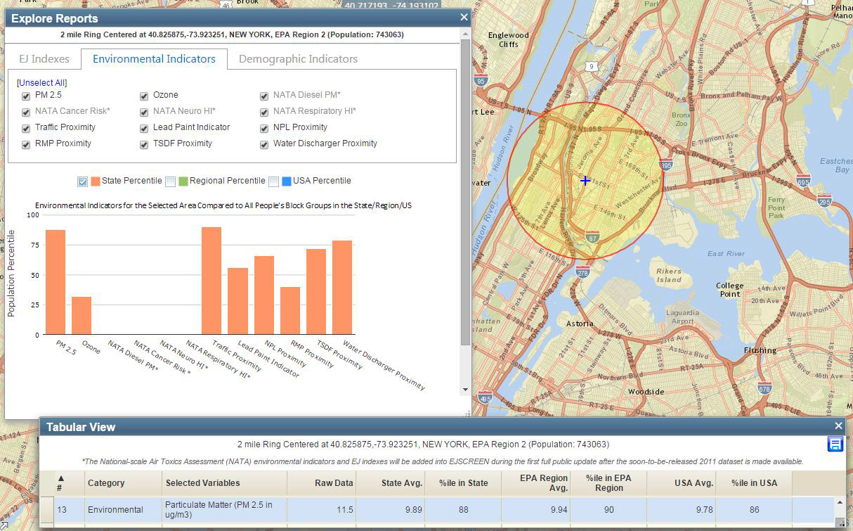
The section we examined is 95 percent minority. Low income households are at 63 percent (Two times the state average), and for one in five homes -- no one over 14 years of age has English as a first language. The "traffic proximity and volume" (cars and trucks) identifies that 450 vehicles pass by the average household daily. For the rest of New York State, the number is 180 vehicles. Particulate Matter Standards are currently set by the EPA at 2.5. For this area, it is at 11.5. The mapping tools make clear that toxic pollution is present.
In building the tool, the EPA reached out to leaders in the Environmental Justice space. I wasn't surprised to learn that Dr. Bob Bullard, the "Father of Environmental Justice," had been involved in the process. I contacted him by e-mail to get his thoughts.
Bullard responded:
"Kudos to the EPA for sticking with its commitment made to environmental justice leaders in early NEJAC (National Environmental Justice Advisory Committee) meetings way back in the mid-1990s to develop a user-friendly tool to identify EJ 'hot-spot' neighborhoods. It is important to note that the idea of an EJ screening tool came from community leaders. As computer-mapping technology advanced over the years, EPA forged ahead in developing EJSCREEN, which displays environmental and human health risks borne by populations identified by race, national origin, or income. Armed with high-quality data from EJSCREEN, community stakeholders are better able to present their case for action and remedies."
A four-minute video can be found on YouTube. One of the pointers was a definition of interpreting percentiles (rankings) as opposed to percentages.
The EPA has a lot invested in this tool and wants feedback from users as they move to
their next iteration due out Spring 2016. You can e-mail them with questions at: enviromail_groups@epa.gov or Tweet them at @EPAJustice.
Thank President Obama for America's Clean Power Plan!
This article originally appeared on the website Moms Clean Air Force