
We interviewed Pete Dyer about his cover art design for Charles Fernyhough's book Pieces of Light for our ongoing series Under the Covers. :
In your own words, what is this book about?
Pieces of Light is a fascinating guide around human memory, blending beautifully told stories and case studies with findings from the new science of memory. Charles Fernyhough shines light on how we reconstruct our memories like a collage, each time we recall them - and how easily they can be contaminated by the present. He makes the point that memory is made up of sounds, smells, images, colours, and describes how any one of these things can trigger a vivid memory or bring the past into the present. It made me rethink the way in which I remember.
What was the mood, theme or specific moment from the text you depicted with this cover?
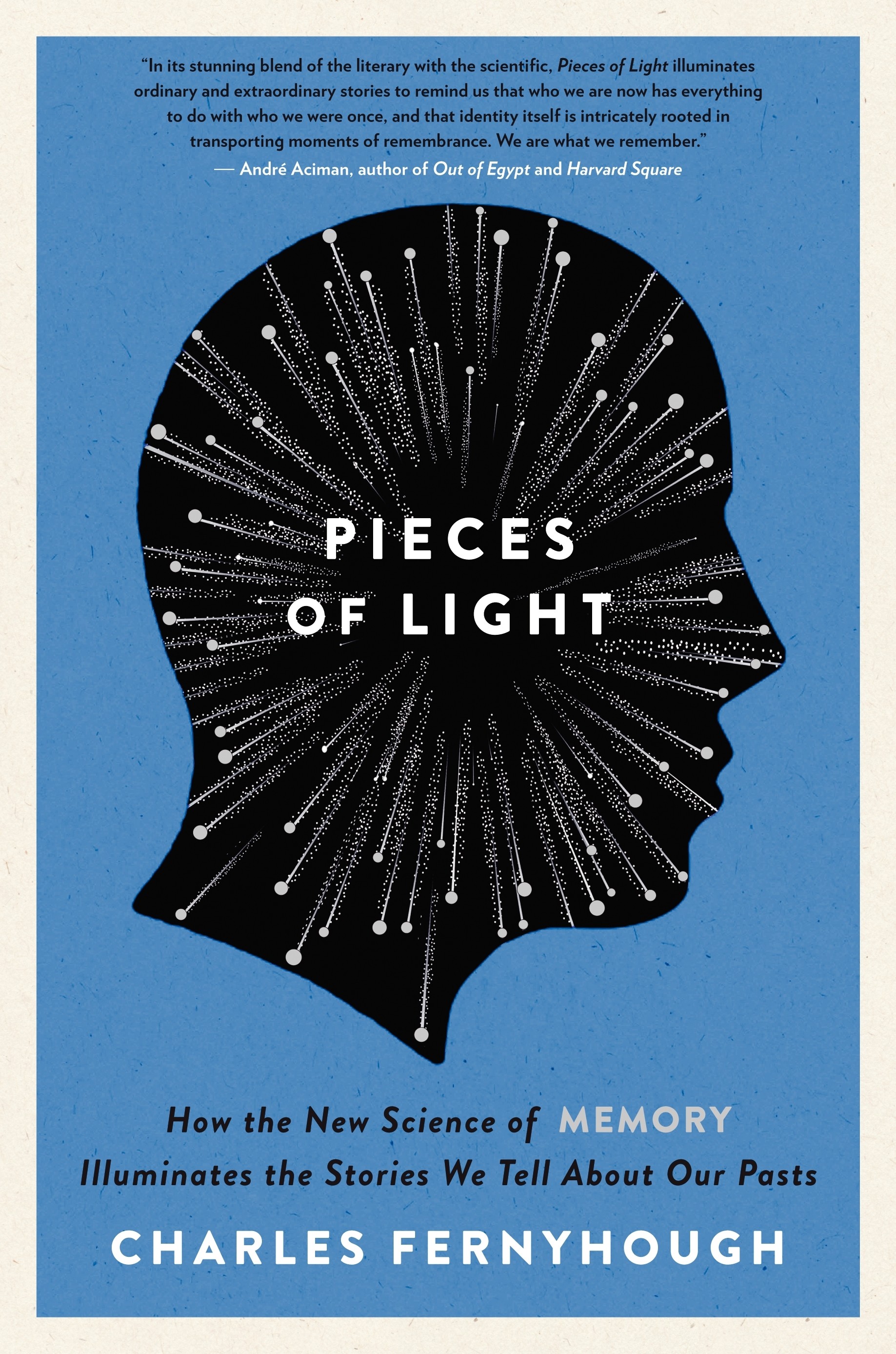
The title made me think of light and how it fragments, and how that relates really well to the abstract idea of memory.
The author talks about memory as a collage, coming from lots of different places in the brain. I liked the idea of using silver foil to illuminate some of the dots on the cover design – it gets across the idea that some memories burn really bright in our heads, while others are more blurred. As the book catches the light, the dots either shine or fall back – just like memories at certain points in our lives.
What inspires your design?
I find most of my inspiration comes from contemporary art.
The vibrant area of London where I live is in walking distance of the Tate Modern and other major galleries which are a constant source of visual stimulation.
If I was asked to name designers that have inspired me - two of my favorites are Alvin Lustig and Paul Rand. Both worked in the 1950s and 60s. Their work looks as fresh and relevant now as it was then.
The DADA book jacket designed by Paul Rand in the 1960s is one of my favorite covers - one that I wished I had designed.
What is your previous design experience, with books and otherwise?
I’ve been designing book covers for over 20 years as Art Director of various literary publishing houses. I was in a design partnership called React that undertook publishing and other art based projects including film, opera, theatre and dance. I now work as art director of Profile Books which includes the imprints, Serpent’s Tail and Clerkenwell Press.
What was the biggest challenge in designing this cover?
Depicting memory is almost impossible because the subject is so wide and subjective. Photographic approaches could have started to look clichéd or give a wrong message about the content. We didn’t want it to look like a book about regret or bereavement. It was also important that it didn’t start to look like a novel.
Did you consider different ideas or directions for this cover? IF SO: Why were these rejected? Do you have a favorite amongst them? Are you happy with the final decisions as it ran?
Initially I explored many photographic approaches - nostalgic pictures of childhood, people slightly blurred by bright sunlight, family photograph albums. I drew some inspiration from David Hockney’s polaroid compositions. I liked the idea of photographs being pieced together like memory. We rejected this idea because it felt too specific to reflect the range of the book.
I was very happy with the impact of the final cover and the response to it. I don’t think there is necessarily any one particular element that makes a successful cover, rather than how all the elements hang together - the composition and the balance. It needs to draw you in. That can be as simple as some hand-drawn lettering. I tend to believe less is more.
What are some of your favourite book covers?
Some favorite recent covers I’ve either commissioned or designed: Gone to the Forest designed by Jon Gray, Confronting the Classics designed by Two Associates, Familiar designed by Dan Stiles, The Middlesteins designed by Peter Dyer, Tequila Sunset designed by Estuary English, Peace Love & Potatoes
designed by Telegramme, and Petite Mort designed by Peter Dyer.
Do you judge books by their covers?
Of course, as a book cover designer it would be a bit crazy if I didn’t judge a book by its cover. It’s the designer’s responsibility to entice/intrigue you to pick the book up amongst what can be a sea of books all fighting for your attention. After that it’s all down to the writing. Because of the challenge of e-books it’s more important than ever that book cover designers keep exploring new ways to make the physical book a desirable, collectable object you want to own.