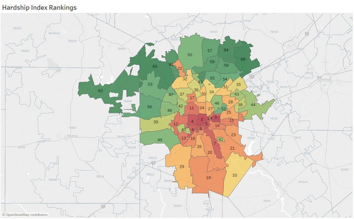
A “Hardship Index,” constructed from six factors and first popularized by the Brookings Institution in the 1970s as a way to compare major U.S. cities, shows San Antonio’s highest-hardship ZIP Codes at a glance. The set of maps (an interactive #DataViz) is located here.
In the 1970s, the Brookings Institution developed something called a “Hardship Index” to compare and contrast major American cities. For reasons of their own at the time, San Antonio — currently the nation’s seventh largest city — wasn’t included on that list. But what they did established a precedent for how to determine and then rank factors that contribute to hardship in a city, and they used U.S. Census Bureau data to create it.
Fast-forward to two years ago, when urban researchers at the Great Cities Institute, part of the University of Illinois at Chicago, revived the Brookings formula, and used it to quantify hardship in their city, but this time by neighborhood.
After creating a series of dozens of maps about various population characteristics in San Antonio by ZIP Code, I used the original Brookings formula to create a comparable hardship index for San Antonio, then ran it by the Chicago researchers to make sure I had it right. The result is above, and it confirms what I had been seeing in map after map of population characteristics. The hardship index is based on these six metrics:
- Percent of population age 25 and over below the poverty level;
- Per capita income;
- Unemployment levels for those 16 and over;
- Educational attainment for those 25 and over, which equates to having a high school diploma or a GED;
- Crowding level, which is the percentage of housing units with more than one occupant per room; and
- Dependency amount, the (combined) percentage of the population under age 18 and above age 65.
Previously extensive data mapping of population characteristics by ZIP Code, which won Tableau’s “Viz of the Day” award, had demonstrated clearly how much overlap there was in both high- and low-hardship areas, but finally I had a better metric to quantify this with.
As described in the previous article in this series, an obvious “crescent of comfort,” or zone of comparative well-being, had become apparent on almost every data map of San Antonio, to the north of the city — with a concentration of much more difficult living to the south, particularly to the immediate west and east of the city center.
Tableau’s inclusion of “sliders,” or movable rangefinders, allows the viewer to quickly drill down into overlaps of interest. Want to figure out which highest-performing ZIP Codes for income ALSO have the highest levels of educational attainment? Just use the sliders to show you where these high-performing ZIPs are located.
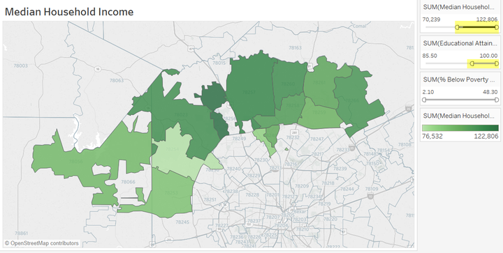
Want to see where median household income is high and so is the level of educational attainment (percent of population who graduates from high school or has achieved a GED)? Use the sliders to find they’re essentially the same ZIP Codes.
Similarly, want to see if there’s any obvious relationship between percent below poverty and low educational attainment? Set the sliders and watch higher-performing ZIP Codes drop out until you’re left with just the same few areas, at the bottom of both ranges.
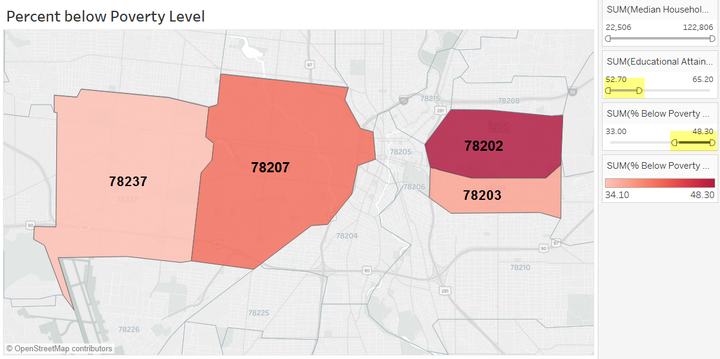
Using the sliders, ZIP Codes emerge that are both high in percent below poverty level and low educational attainment (percent who graduates from high school or has attained a GED). ZIP Code labels have been added for convenience.
In earlier work with the data, pulled from the U.S. Census Bureau, the American Community Survey estimates for 2015, and many other sources, it became clear that this persistent overlap constituted a true “geography of poverty.” As much as I liked the phrasing, it wasn’t anything original — academic seminars and conferences are held on it, and Congressional testifying as well.
The areas of overlapping poverty characteristics that the hardship index identifies are something sociologists call “concentrated disadvantage.” (There’s more about that in the previous article in this series.) In the public health world, which relies heavily on data mapping to communicate areas of high need and distress, the topic fairly jumps off the page. The irony is that “no matter how many maps you look at in public health,” jokes one local expert, “sooner or later you realize that you’re looking at the same map.”
The point is made when pulling up what are known as redlining maps from the 1930s, maps the federal government put together for real estate investment purposes, but which served to institutionalize racial and ethnic discrimination in cities across the U.S. Today, not just in San Antonio, some of those same areas have stayed depressed.
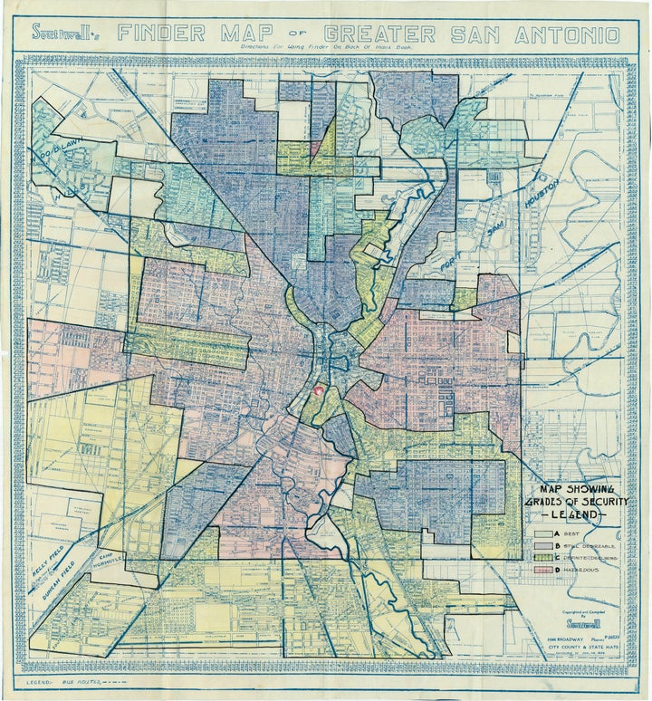
A hand-colored map from the 1930s shows “red-lining” of San Antonio’s near downtown area for real estate investment purposes. (Note the areas marked as “hazardous” and “definitely declining.” The map, created by the Federal Home Loan Bank Board, part of the Home Owners’ Loan Corporation in 1933, was digitized from originals located in the National Archives and Records Administration (NARA), and is part of the University of Texas at San Antonio’s (UTSA) digital library collection.
(Several redlining maps from San Antonio’s history are available through the University of Texas at San Antonio’s (UTSA)’s library collection online. A side-by-side comparison of the map from 1933, and the hardship index of today, shows the persistence of hardship over time.)
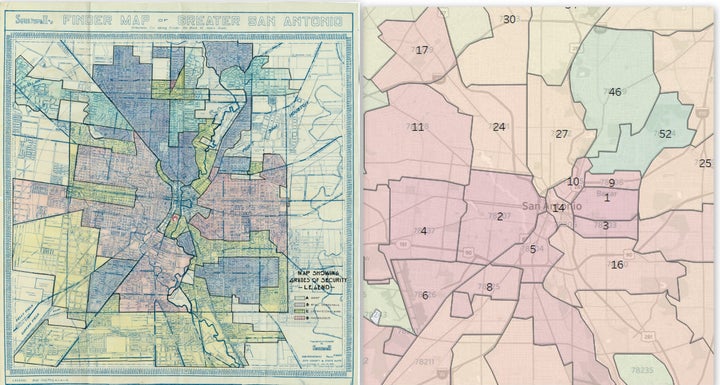
L-R, Yesterday’s redlined neighborhoods, circa 1933, can become today’s highest-hardship ZIP Codes.
While the concept of looking at San Antonio through an “equity lens” seems promising, introduced as the focal point of the $2.7 million 2018 budget just passed by the city, the problem has been that “there are no good frameworks to explain urban politics and poverty,” according to St. Mary’s University associate professor Arturo Vega, Ph.D.
Vega contemplated “justice” as the lens, but ultimately discarded it. Justice issues do abound in the high-hardship ZIP Codes, as other maps in the Tableau series show. Health disparities are also a measure habitually associated with chronically disadvantaged neighborhoods, as the “place matters” segment of the acclaimed PBS documentary “Unnatural Causes" indicates.
For San Antonio’s highest-hardship ZIP Codes — 78202, 78203, 78207 and 78237 — the overlap in concentrated disadvantage across multiple sectors is astonishing, bordering on the staggering. With a combined population of less than ten percent of the city’s 1.4 million population, according to recent U.S. Census Bureau data, these four ZIP Codes lead the city in:
- Low educational attainment (we’ll address that in the next article in the series);
- High percentage of population below poverty;
- Low median household and per capita incomes;
- Low median home values (roughly a tenth of those in higher-performing parts of the city);
- High levels of reported incidents of child abuse and neglect, family violence, juveniles on probation and parole; even registered sex offenders (although where they are able to live is also related to poverty);
- High levels of various health disparities, including deaths from various health conditions — heart disease, diabetes, stroke, COPD — plus homicide, suicide and overall lower life expectancy;
and so much more.
The downside, though, will be if we manage to “see” these inequities — but still somehow end up looking past them, says futurist Anab Jain, who was recently featured on the TED Radio Hour. (Jain is a professor, TED fellow, and the founder of the London-based design lab, Superflux.) The more data we have around us, she says, the greater the risk we’ll just end up practicing what she calls “data spectatorship.”
“So we look at the data, and we look at beautiful visualizations, and we look at graphs, and we look at metrics. (But) if we just become spectators, we don't understand the deeper stories that need to be told around that data that actually connect directly to our lives.”
“There’s a disconnect there,” Jain points out, one that seems well worth overcoming. Paul Brodeur, a longtime science writer for the New Yorker said something similar when he wrote that statistics “are just human beings with the tears wiped off.”
Clearly, there is something to this “geography of poverty” concept — and my hope is that by examining it more deeply through the hardship index, we can start a conversation about overlapping, concentrated disadvantage that can broaden the meaning of the “equity lens” for San Antonio.
Next up: Taking a look at crushingly low rates of educational attainment in San Antonio’s four highest-hardship ZIP Codes.
