Show houses by nature are places for designers to highlight their talent and capabilities. Over the years of both attending and participating in them, I've found that like fashion shows, sometimes participants create concepts and over-the-top themes to stand out in the crowd. The result is often a series of rooms with a certain "wow" factor, but little cohesion. This year's Kips Bay Decorator Show House, however, was a world apart from the norm. For the first time, I can say that the house really felt like a home.
More specifically, it felt like the home of a wealthy, worldly artistic couple. As history typically repeats itself, it turns out this home was originally built for such people. Completed in 1909 for Arthur Sachs (of Goldman Sachs fame), his wife and infant son, the Beaux-Arts limestone beauty boasts five floors connected by the original sweeping oval staircase and a custom elevator. It's also got five original fireplaces, restored and fitted for electric gas ignition, a rooftop deck and a pool.
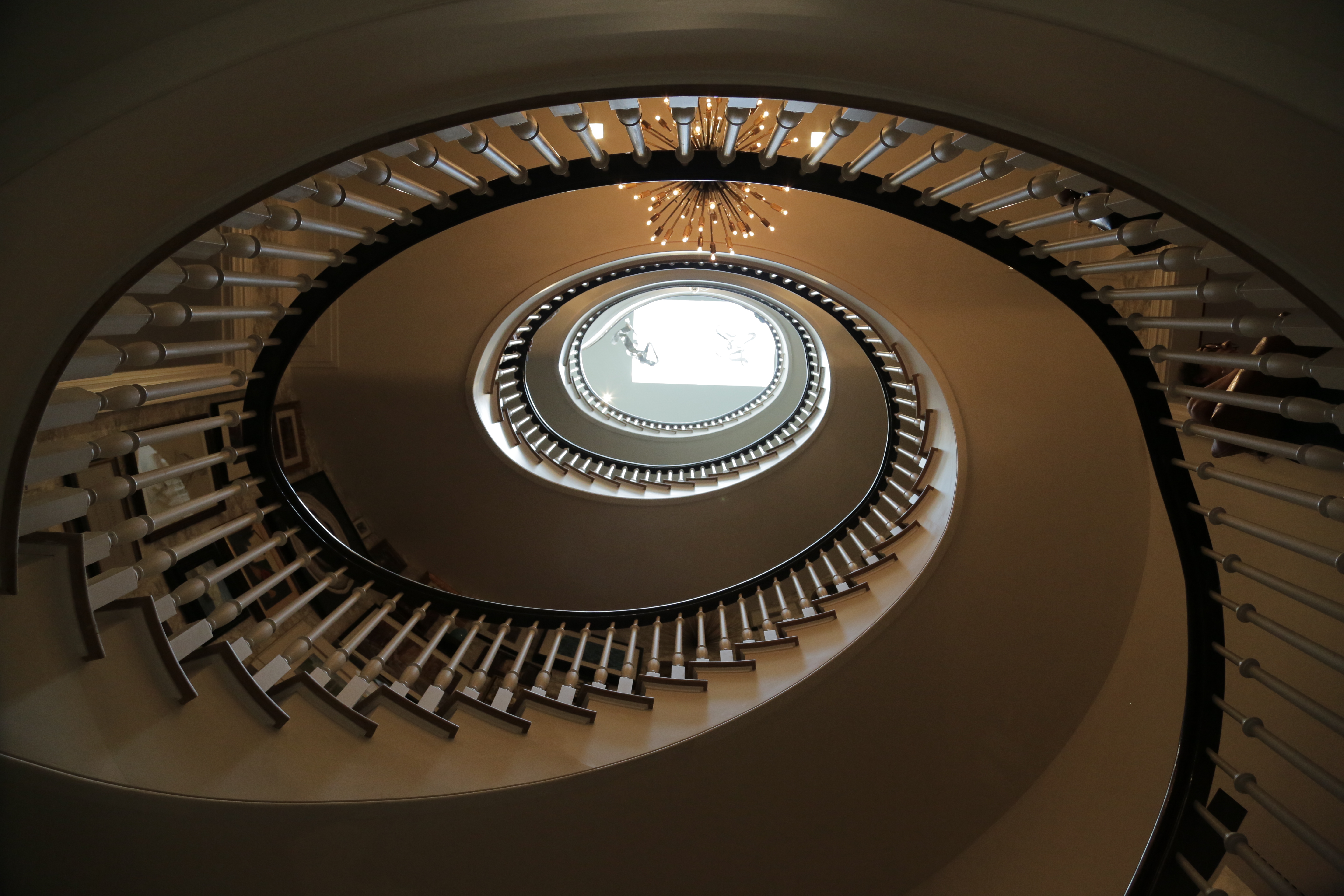
The Sweeping Oval Staircase at the Arthur Sachs Mansion
I'm told the Kips Bay designers are randomly given rooms to furnish and don't consult each other in regards to color, theme or style, but there was a cohesive quality about the house. The balance of contemporary and traditional design elements made it feel move-in ready.
It's this homey cohesion I'm betting Brown Harris Stevens will want to leverage as they offer this mansion for sale at a cool $35,000,000.
That said, the price tag doesn't include the Show House furnishings--with the exception of the kitchen and bathrooms, which are pretty extraordinary. I had the great fortune to meet each of the designers while touring their rooms. While I don't have space to mention everyone, I've attempted to provide a glimpse at what is a one of the finest show homes I've seen in a very long while.
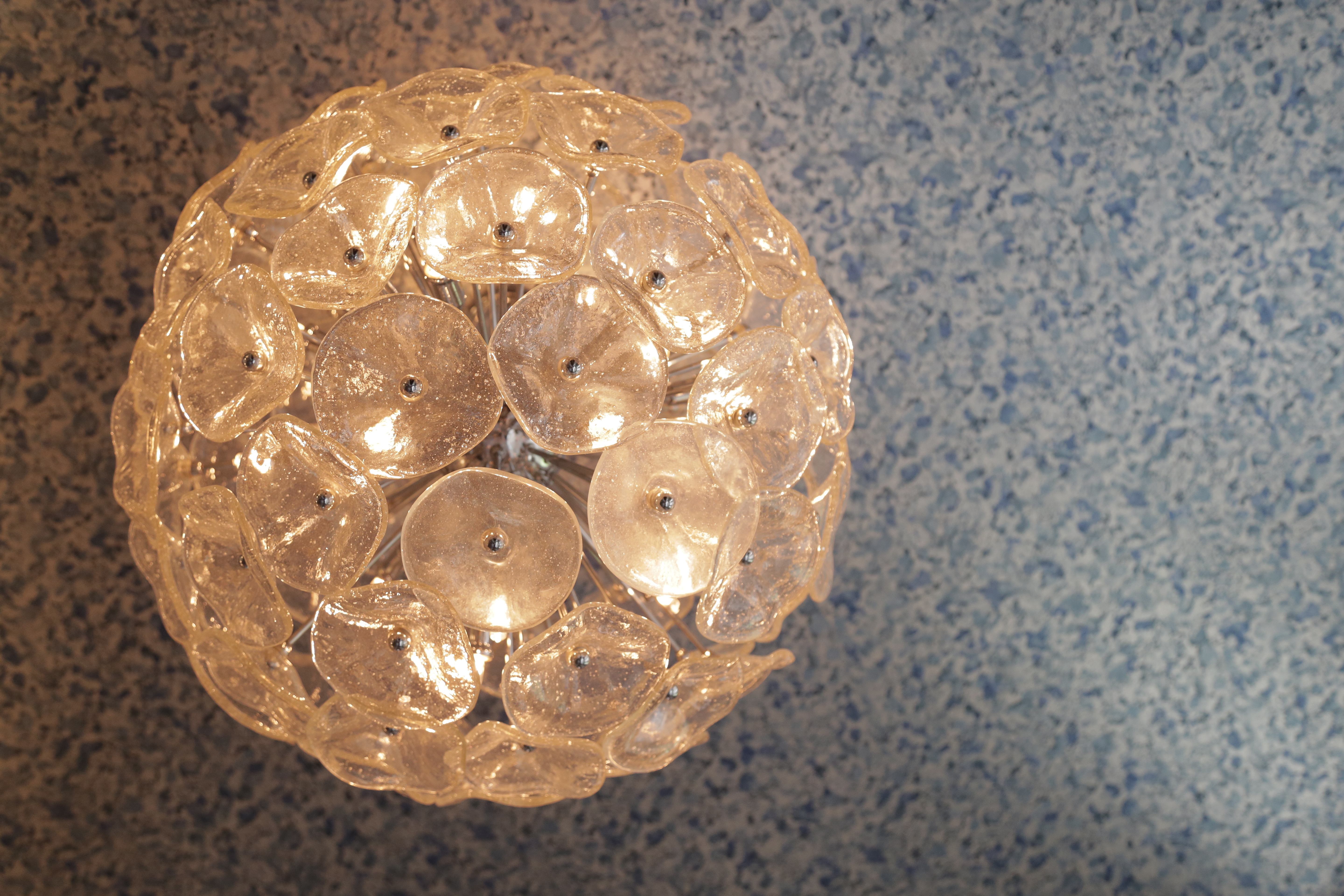
Jamie Drake created a sparking entryway.
A Glittering First Impression
Designer Jamie Drake knows how to make an entrance. His foyer feels exciting without being over-the-top. With clever choices for paint, lighting and accents, the space feels Salvador Dali inspired. At the same time, it is restrained enough not to feel gimmicky. The custom cloud-like ceiling light fixtures are nothing short of an art installation, and the curious objects on the mantle are fun, without being funny. The walls are a deep burgundy peppered with silver mica flakes, which creates a bit of a celestial feel. The fireplace screen, artwork and high gloss console add to the feeling of excitement and refinement.
The tailored look Drake created made me feel I was entering the home of an artist, and that feeling played out for me as I stepped into the next space, which was literally the landing of the staircase where Ronald Bricke made bold, yet minimal choices to maximize the impact of his small space. A lineup of ancient fertility gods lined a glass shelf over the door, and seeing Drake's cloudy light fixture behind them created a rather ethereal look that made the spaces blend easily.
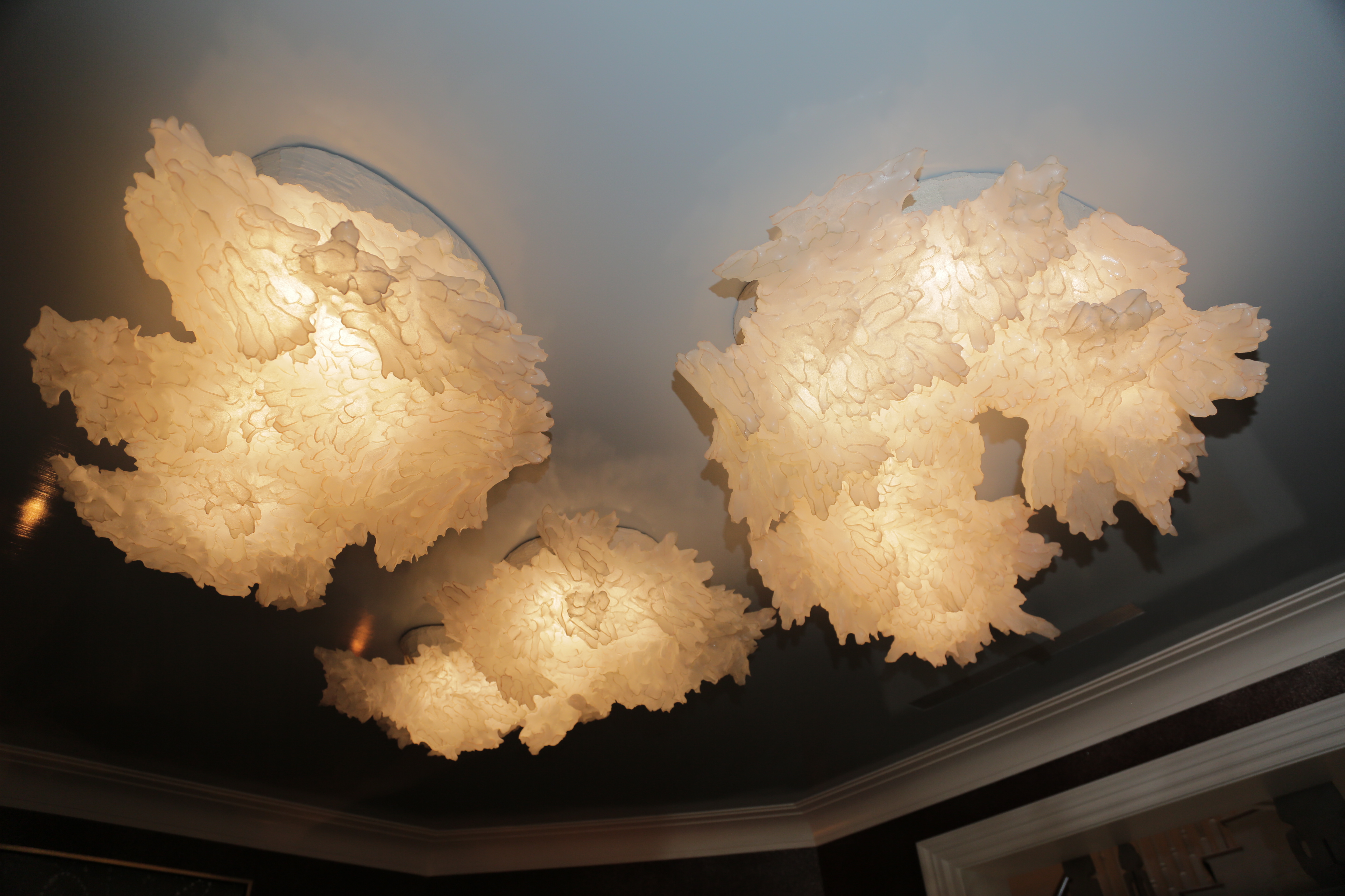
Jamie Drake chose custom cloud-like celling light fixtures.
Bricke also chose a hand carved cement vase and a bronze sculpture, which added regality and importance to his space, without making it feel ostentatious. Another tasteful accent was his simple mural with metallic touches that also drew my eye from Drake's silver flecked foyer paint. As a finishing touch, a mirrored tray resting on a Biedermeier-style chair offered a stunning reflection of the majestic oval staircase.

Ronald Bricke strategically arranged a mirrored tray to reflect the grand staircase.
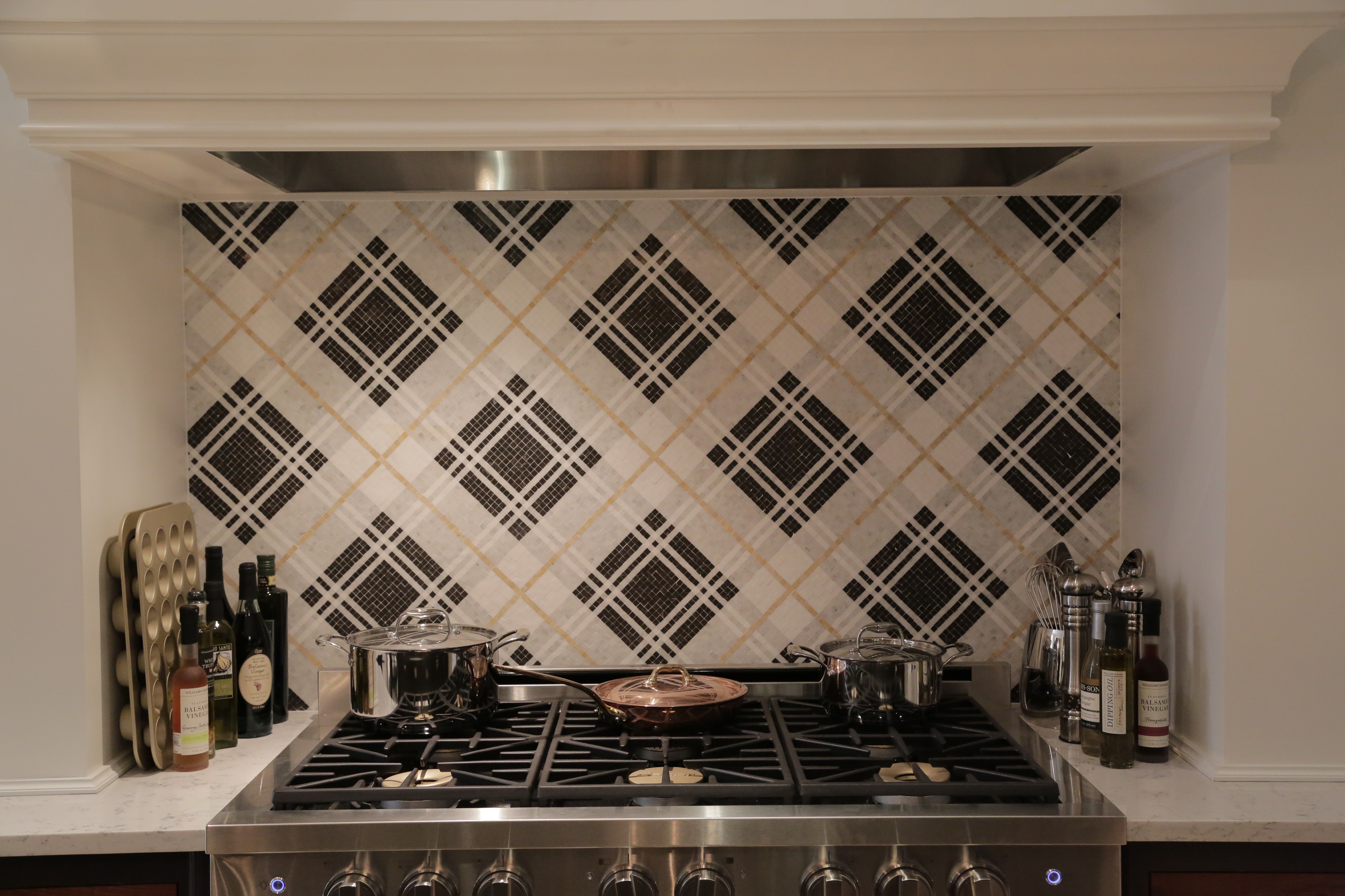
Christopher Peacock created a handsome argyle mosaic tile pattern in the kitchen.
The Heart Of The Home
It's true, the kitchen is the heart of the home, and this one had my heart filled with inspiration. The masterpiece of a space designed by Christopher Peacock was masculine, warm and inviting. The dark custom cabinetry was a perfect juxtapose to white walls and white marble countertops. The mosaic tile-work behind the range was in a mocha argyle pattern unlike any I've seen before in a kitchen. Peacock chimed in "think Burberry." (this was all the more effective given Peacock's British accent and overall sensibility).
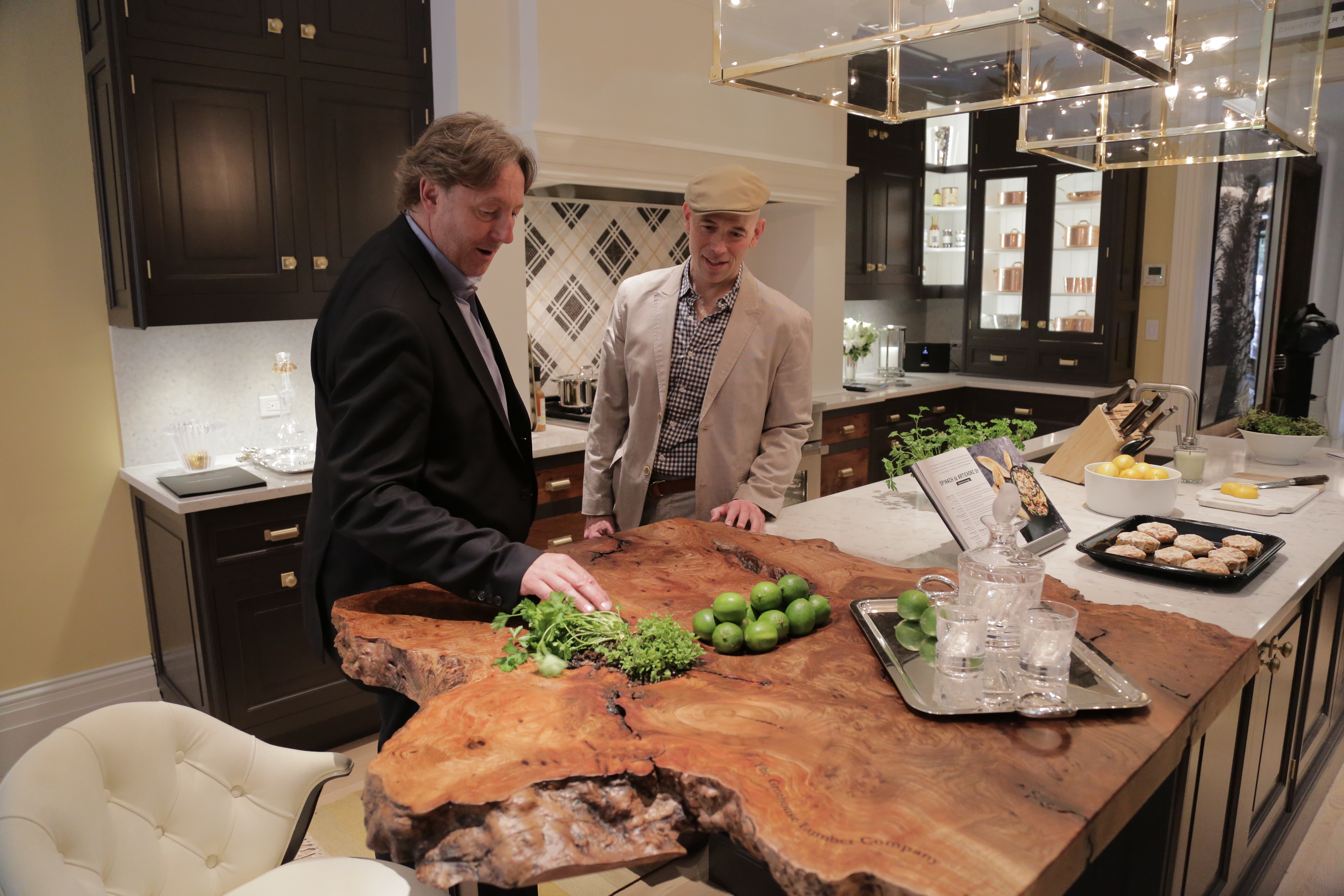
Christopher Peacock gave a nod to the outdoors with organic touches in the kitchen.
Another outstanding feature of this kitchen for me was the burled wood bar which is an organic, seamless extension of the marble countertops. It speaks to the outside space, which is a stone's throw away, and it also adds an organic feel that is also very modern and sophisticated. I particularly liked that in one deep crevice of the wood, he planted an herb garden. Brilliant! With some leftover pieces of the burled wood, Peacock fashions some drawer fronts, which added even more depth and visual interest to the cabinetry.

The burled wood bar featured an herb garden.
When I asked Peacock who he designed the space for, he told me he thought the client was male, and perhaps a banker. This made sense to me as I continued to scan the room with its large polished brass light fixtures, practical, high-end appliances and touches of luxury everywhere--- with Lalique and Christofle accessories in the cabinets, on the countertops and at the breakfast table.
Beyond the bling, however, the room was quite practical, with great details inside and out. Some of my favorite touches were not visible to the naked eye, like special drawers for espresso pods and spices. To complete the picture, freshly baked scones were on display. I resisted the urge to help myself to one, but like everything in the room, they were perfectly placed and effortless. Of course I know to achieve this look, it required a great deal of effort.
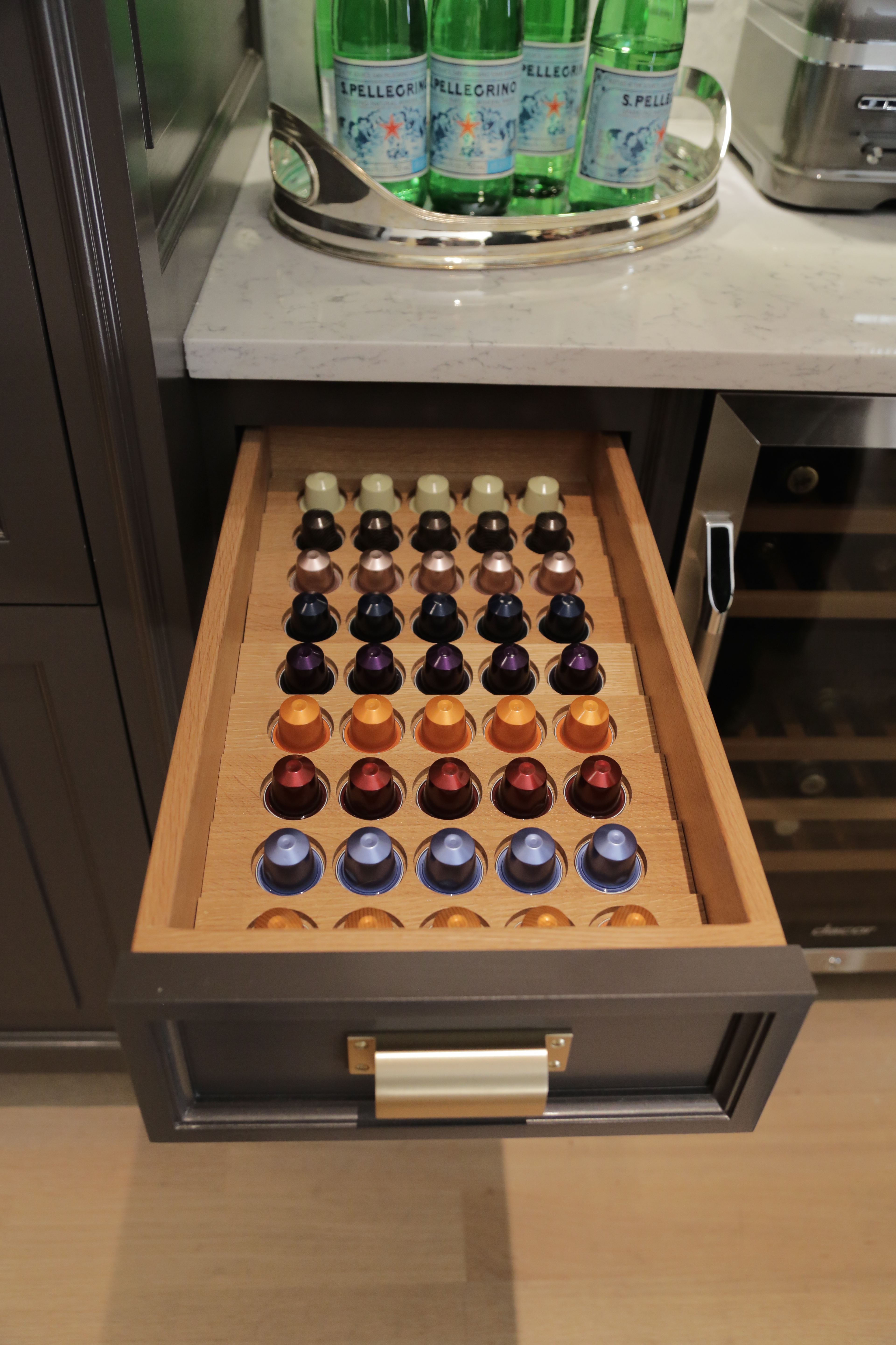
Possibly my favorite drawer in Christopher Peacock's Kitchen
The Great Outdoors in a Small Space
Even in the grandest of Manhattan homes, green space is often quite limited. Such was the case with this mansion, as I stepped out into the small backyard where Landscape Architect Janice Parker greeted me. Parker took the small yard and created a relaxing oasis, even amidst typical urban noise pollution like the sounds of construction crews and sirens.
At the epicenter of Parker's garden was a rather groovy suspended chaise lounge she told me hailed from New Zealand. It actually reminded me of a vintage piece I enjoyed a few summers ago at a "Leisurama" home I visited in Montauk where all of furnishings screamed Midcentury Modern.
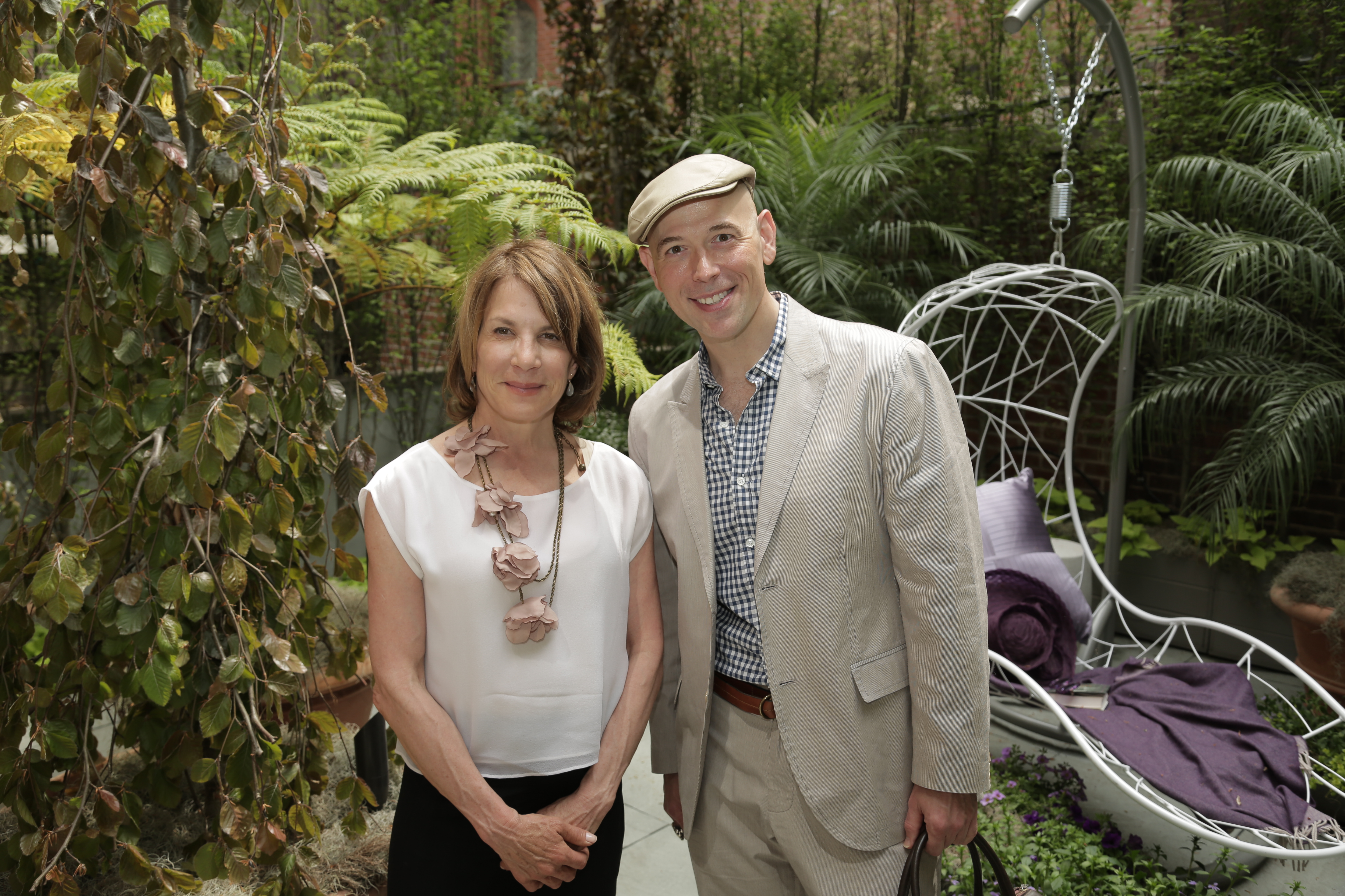
Janice Parker created an inviting outdoor space.
Around the chaise were potted palms and a sea of varying shades of green with hints of plum and lavender flowers and even fruit. Soon the sounds of the city dissipated as I eased into the relaxed environment she'd created.
Like Peacock's kitchen that preceded it, in addition to feeling high end, it also felt practical. It seemed with a bit of routine watering and little maintenance, even those without green thumbs could keep this space looking and feeling great.
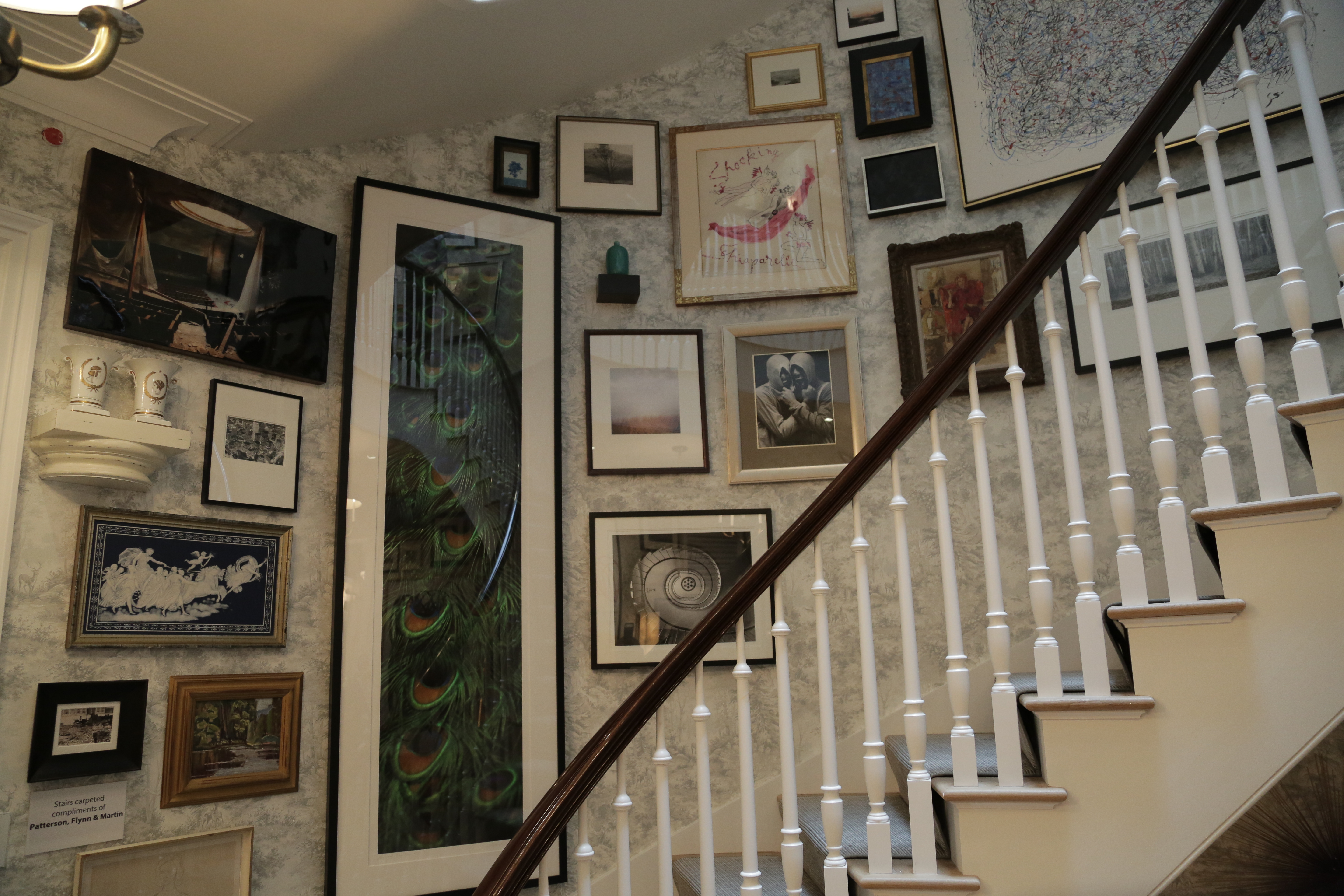
Phillip Mitchell hung eclectic artwork salon-stye.
An Artistic Stairwell
As I walked back inside, the grand oval staircase was calling me, and as I ascended I felt like was climbing my favorite back staircase of the Bergdorf Goodman Men's Store. What I saw was a symphony of artwork hung salon style and a smiling gentleman at the top of the landing with a sweater draped over his shoulders. In fact the only difference between this and Bergdorf's is that my interaction with him would not wind up costing me money.
The gentleman was Phillip Mitchell, who, like the other designers in the house, was warm and welcoming. My photographer, Blake chuckled because he knows my style and my own home, and let's just say I'm no stranger to salon-style artwork installations. As an anti-minimalist, I felt I was in the presence of kin.
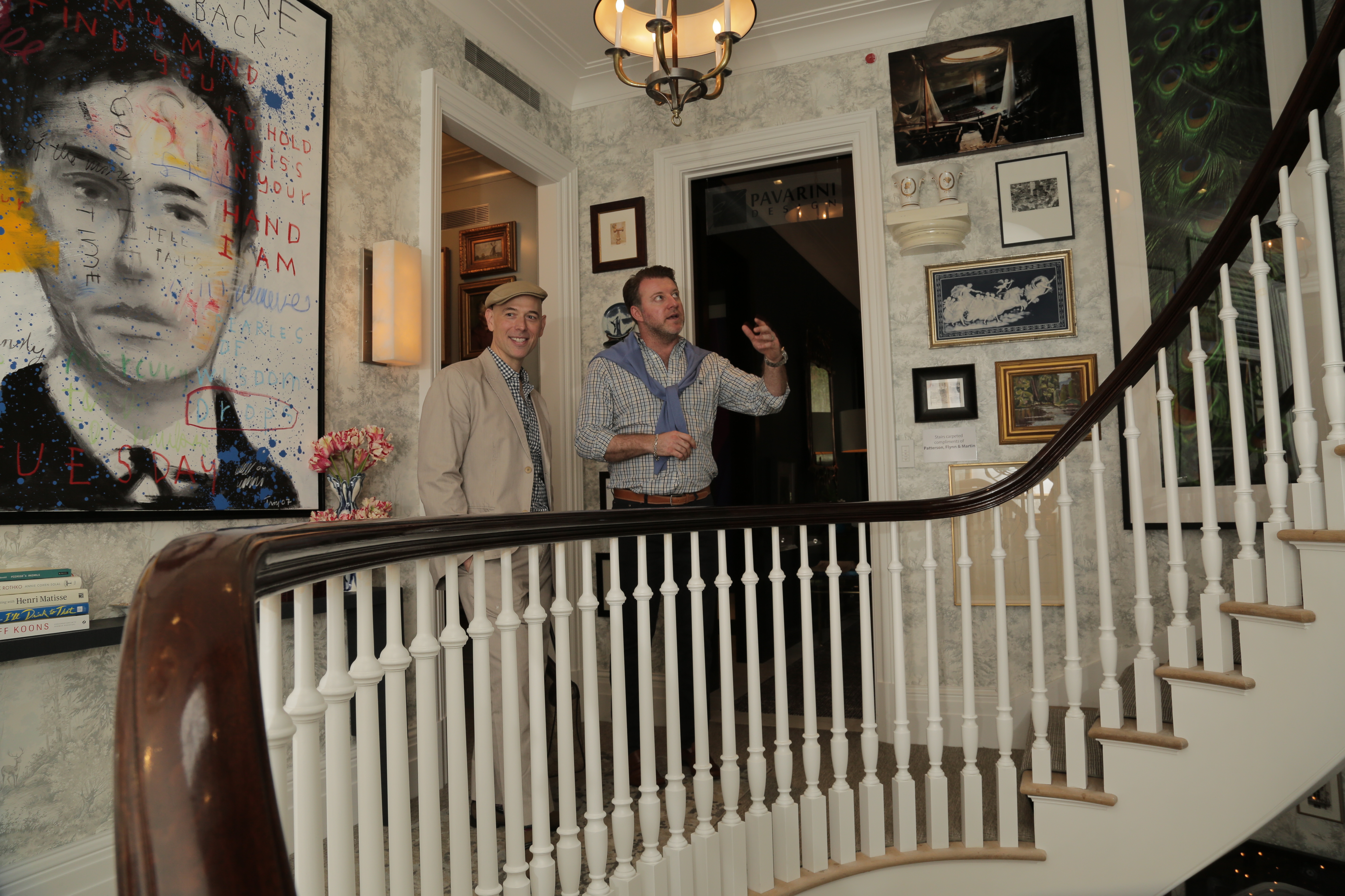
Phillip Mitchell's maximalist art display was a joy to behold.
As it turns out, Mitchell culled over 250 pieces of art from his own collection, including modern, traditional, and even a portrait of his own dogs. Like my own sensibility, Mitchell seems to choose what he loves and makes it work. It feels like a collection that has been assembled over time, and clearly it is. While not a typical room, per se, this space did more than its share to make the house feel like a home.
In the immortal words of Diana Vreeland, "The eye has to travel," and as you're traversing this staircase, there's no way your eye cannot be in constant motion.
A cozy nook of Mark Sikes' dining room
Plantation Style Dining
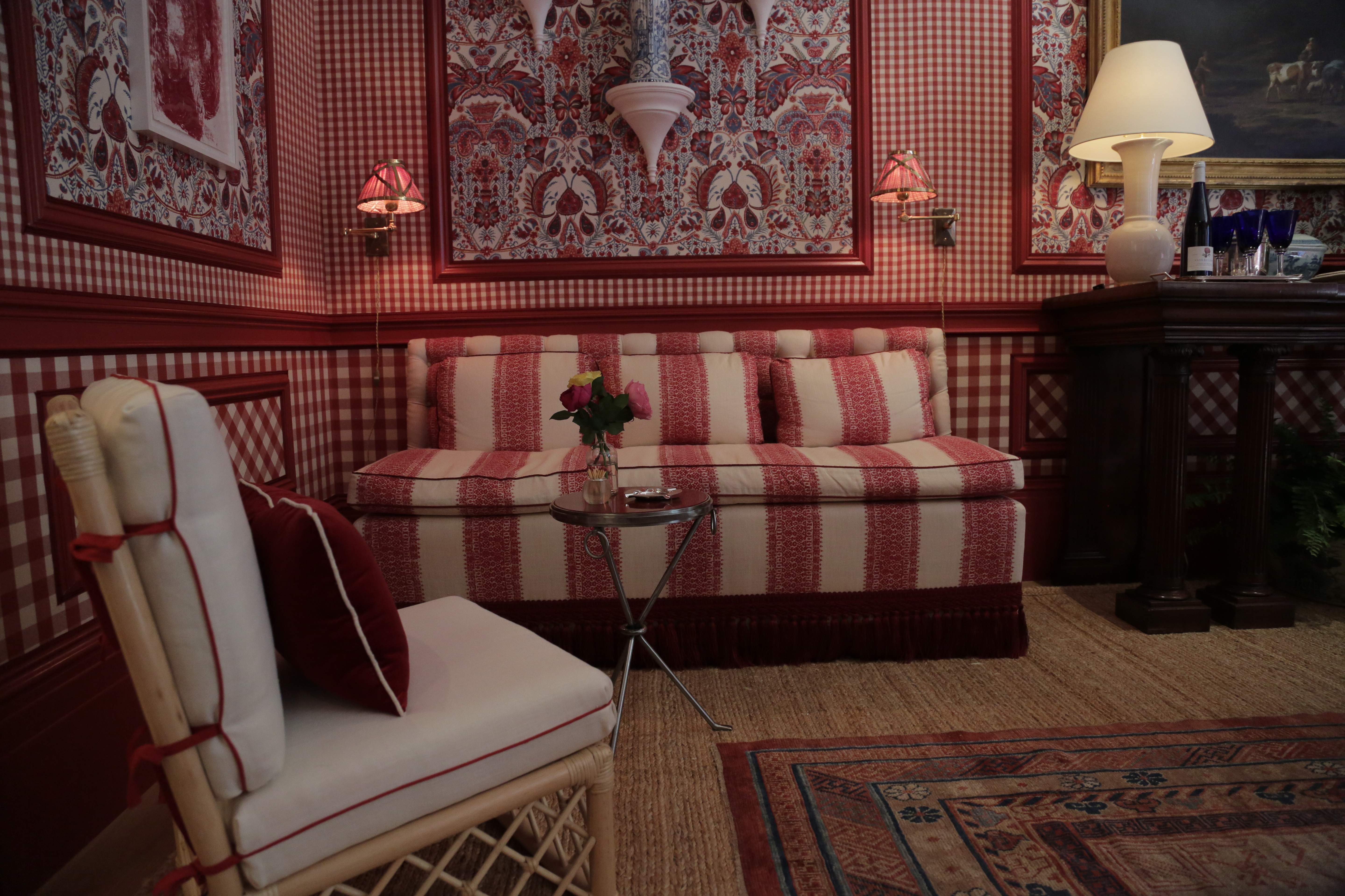
As I walked into the formal dining room with its red gingham walls, blue and white porcelain Chinoiserie vases and rattan furniture, I felt more like I was in Savannah than New York. It's one of the things I love about the world of interiors---they can evoke a feeling and transport you to another place. Of course, I was shocked to learn when I met him that designer Mark Sikes is actually from Los Angeles.
The room is about as un-L.A. as I could imagine. Did I mention the walls were covered with red gingham fabric?!
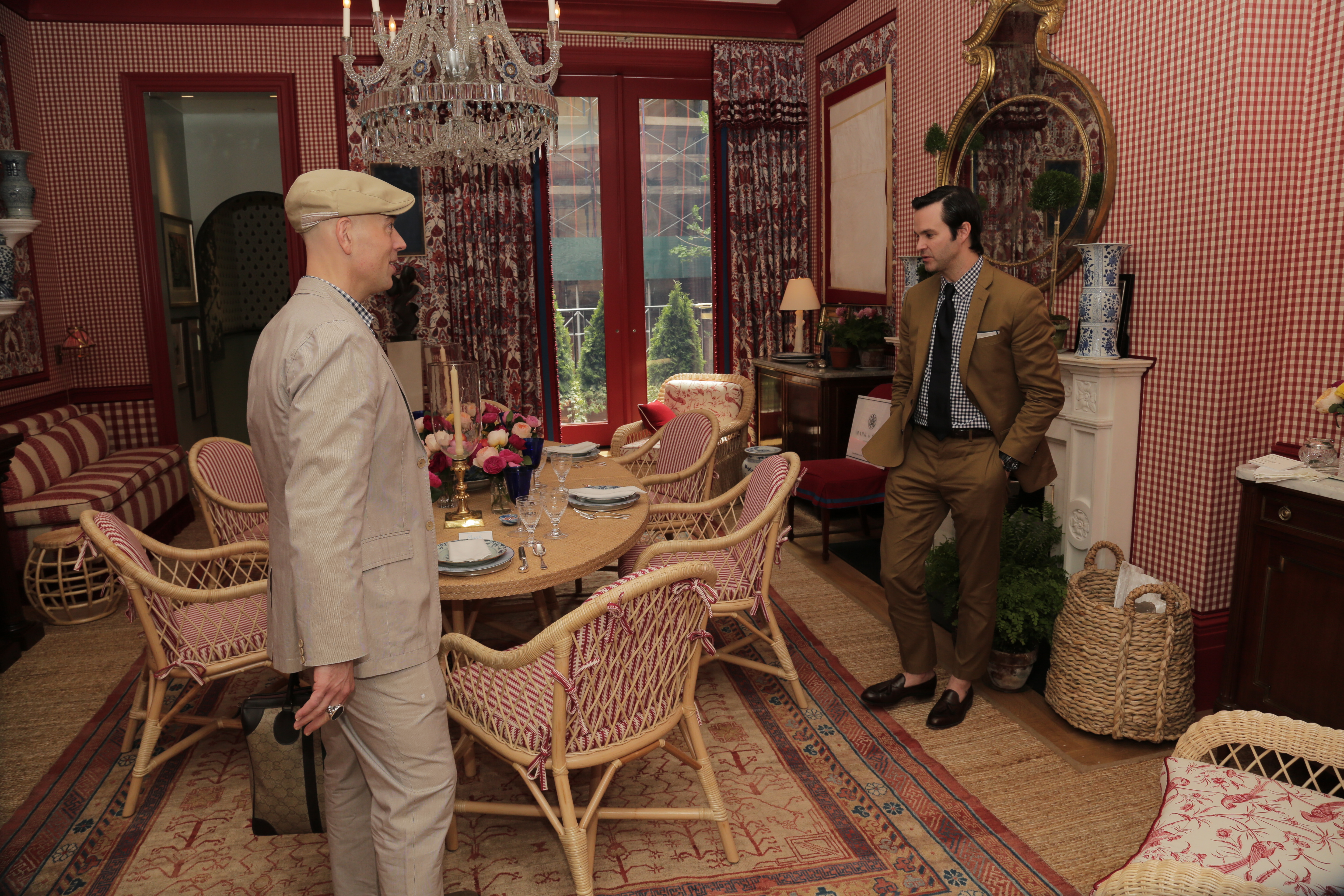
Mark Sikes chose red gingham fabric for the walls of the dining room.
The look Sikes created is one of casual elegance, mixing formal pieces like a crystal chandelier and Empire style sideboard with rattan and sisal. It looked as if it was pulled from the pages of Veranda magazine. Its homey vibe would be nice change of pace from the bustle of New York City.
I love red dining rooms and admired his bold choices. Like so many other spaces, it felt both welcoming and sophisticated.
A stately sideboard in Mark Sikes' dining room
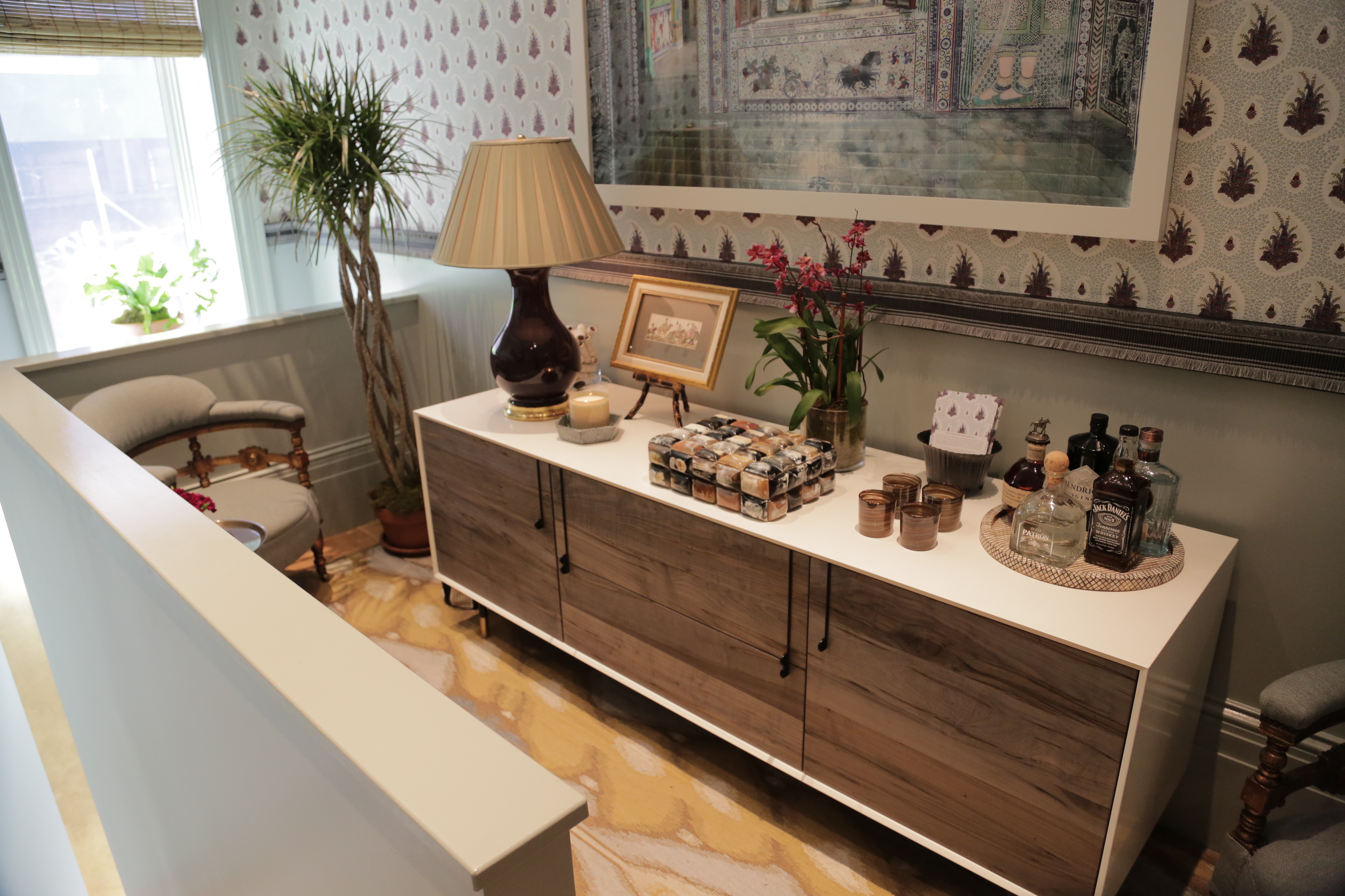
The Butler Did It
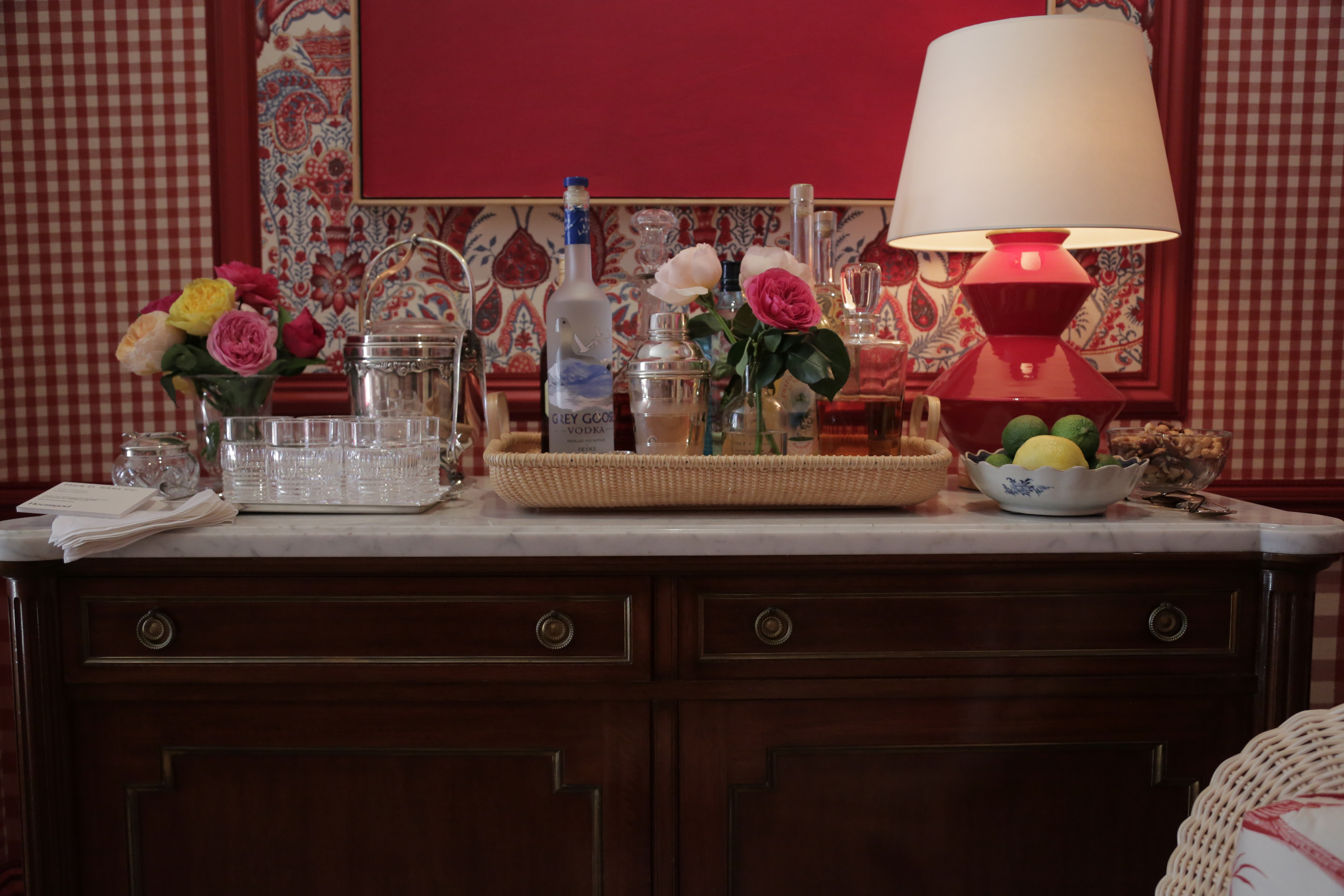
As I walked into the small butler's pantry behind the formal dining room, I was immediately taken with the choice of again using fabric on the walls. This time it was paisley in cool, soothing hues.
The duo Behind Tilton Fenwick, the lovely Anne Maxwell Foster and Suysel dePedro Cunningham took this very small space and created a room that I, for one, would often frequent if it were my home. They envisioned the space as a 'dining lounge' meant to host a casual grouping of three or four for pre or post dining conversation.

Anne Maxwell Foster and Suysel dePedro Cunningham of Tilton Fenwick
They were delighted that I admired the fabric right away since it was their own design. I also admired their choice to use coordinating silk passementerie around the arched entryway to the room and wrapped around the room in lieu of molding.
A modern sideboard in Tilton Fenwick's dining lounge
There was also a large photograph titled "Shakti" by Karen Knorr that evokes a Zen vibe, which was ever-present in the space. I also admired the choices of mixing Victorian chairs and a side table with a contemporary credenza.
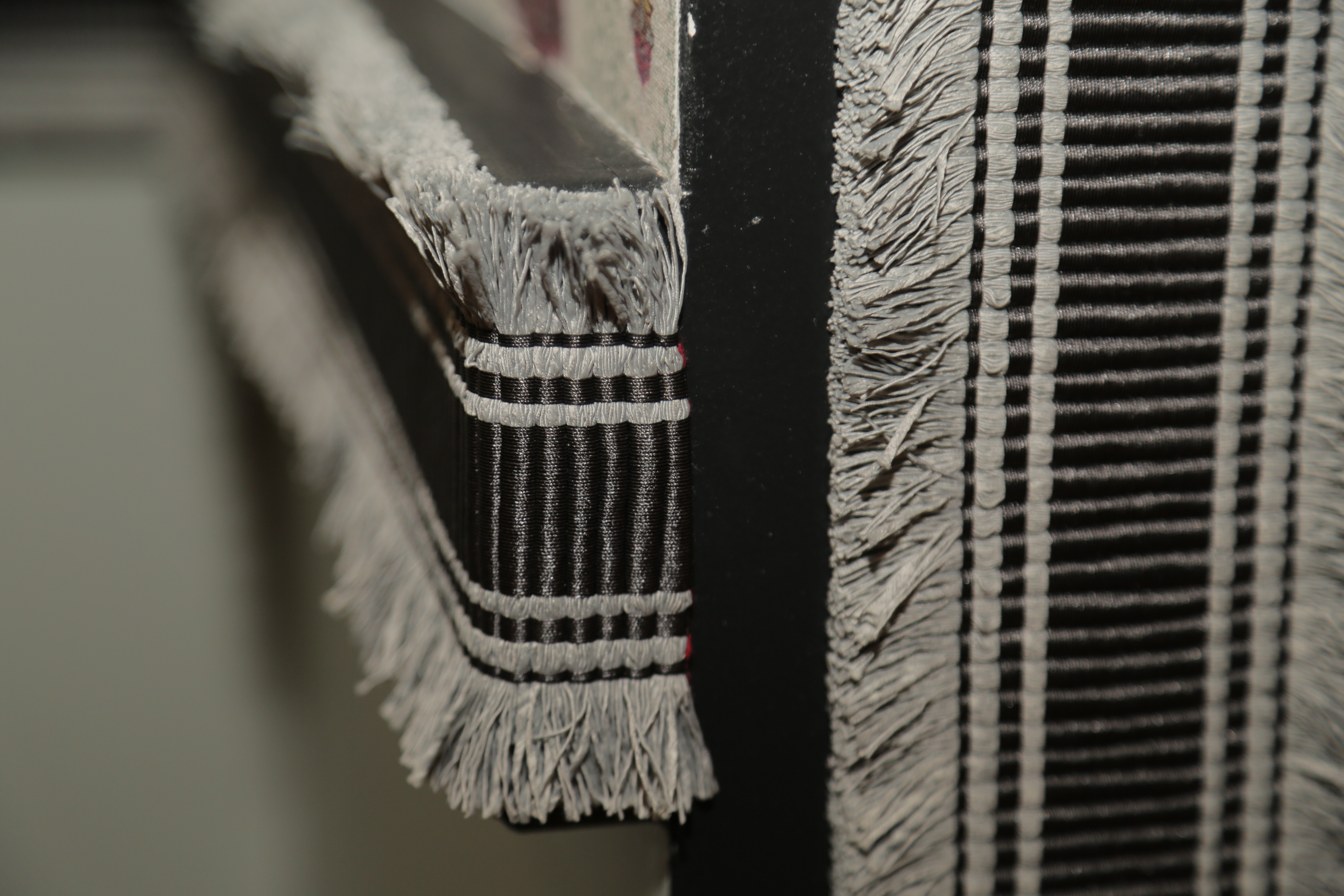
Passementerie touches added richness and interest to Tilton Fenwick's dining lounge
I can only image the challenges this space presented given its size, but Tilton Fenwick rose to the occasion and created a lovely, memorable space.
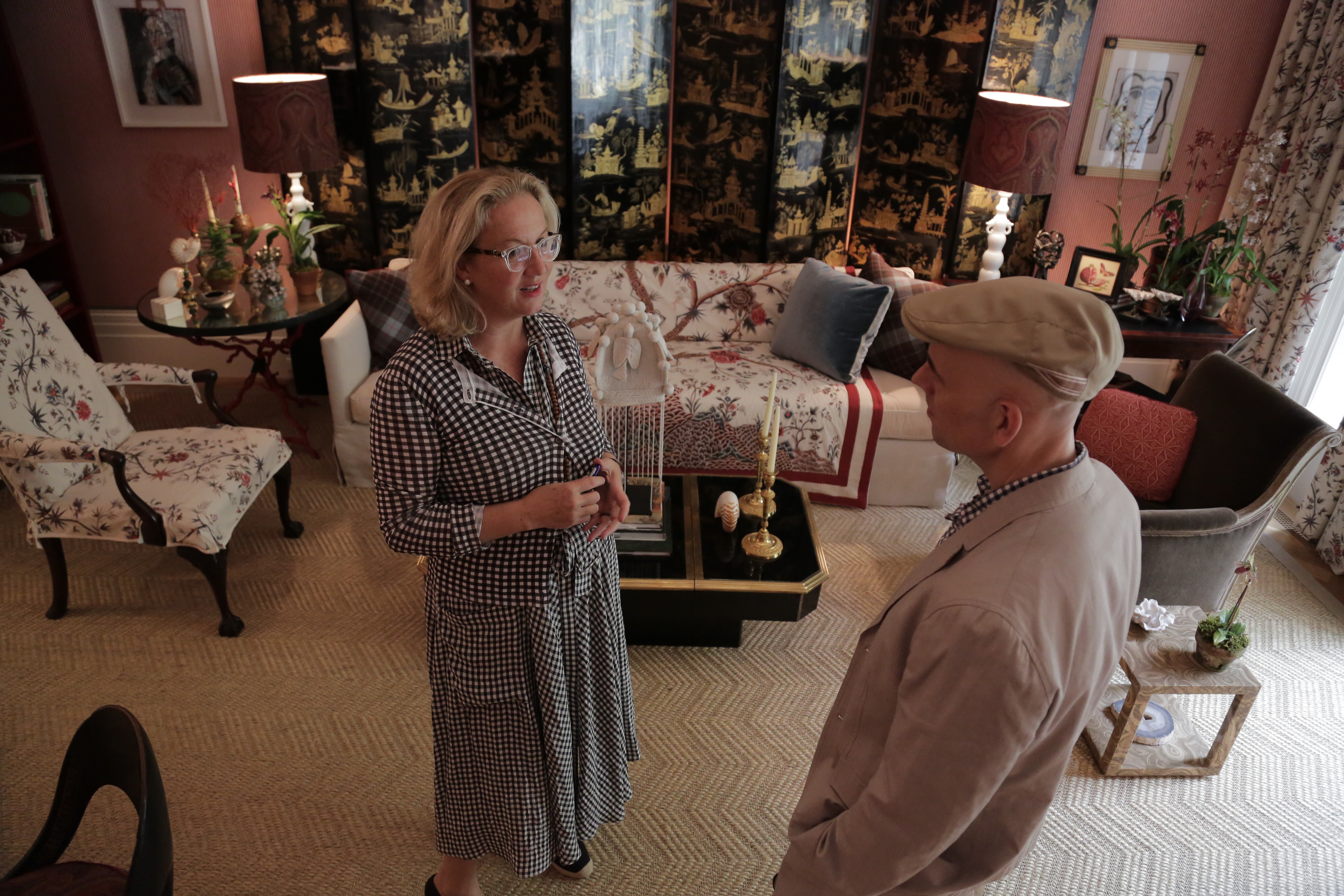
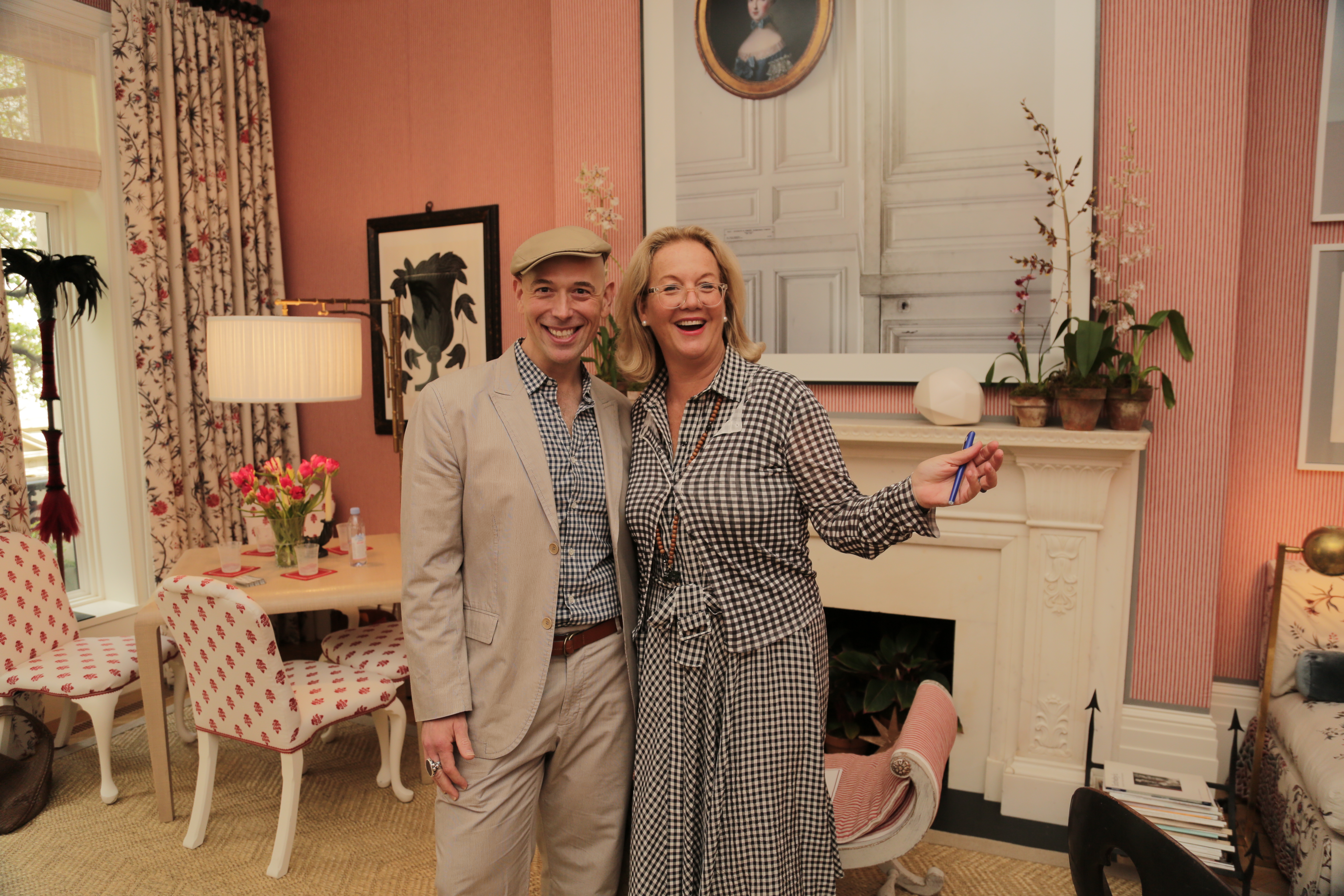
I was completely charmed by Alessandra Branca and her living room.
A Warm and Welcoming Living Room
Speaking of lovely and memorable, Alessandra Branca, who designed the rose-colored living room created the same feel in her space. My favorite spaces are ones that don't feel decorated---but instead feel personal---like an extension of the people that live there.
As with the gals at Tilton Fenwick, I felt that Branca designed the space for herself. It's how I imagine her own living room might look. There was a mix of vintage and new, classic and contemporary. Of course the pieces I loved the most (a 19th Century Chinese lacquer screen, a 19th Century Swedish bench and an opaline and brass coffee table by Jansen) were from her personal collection (aka Atelier Branca).
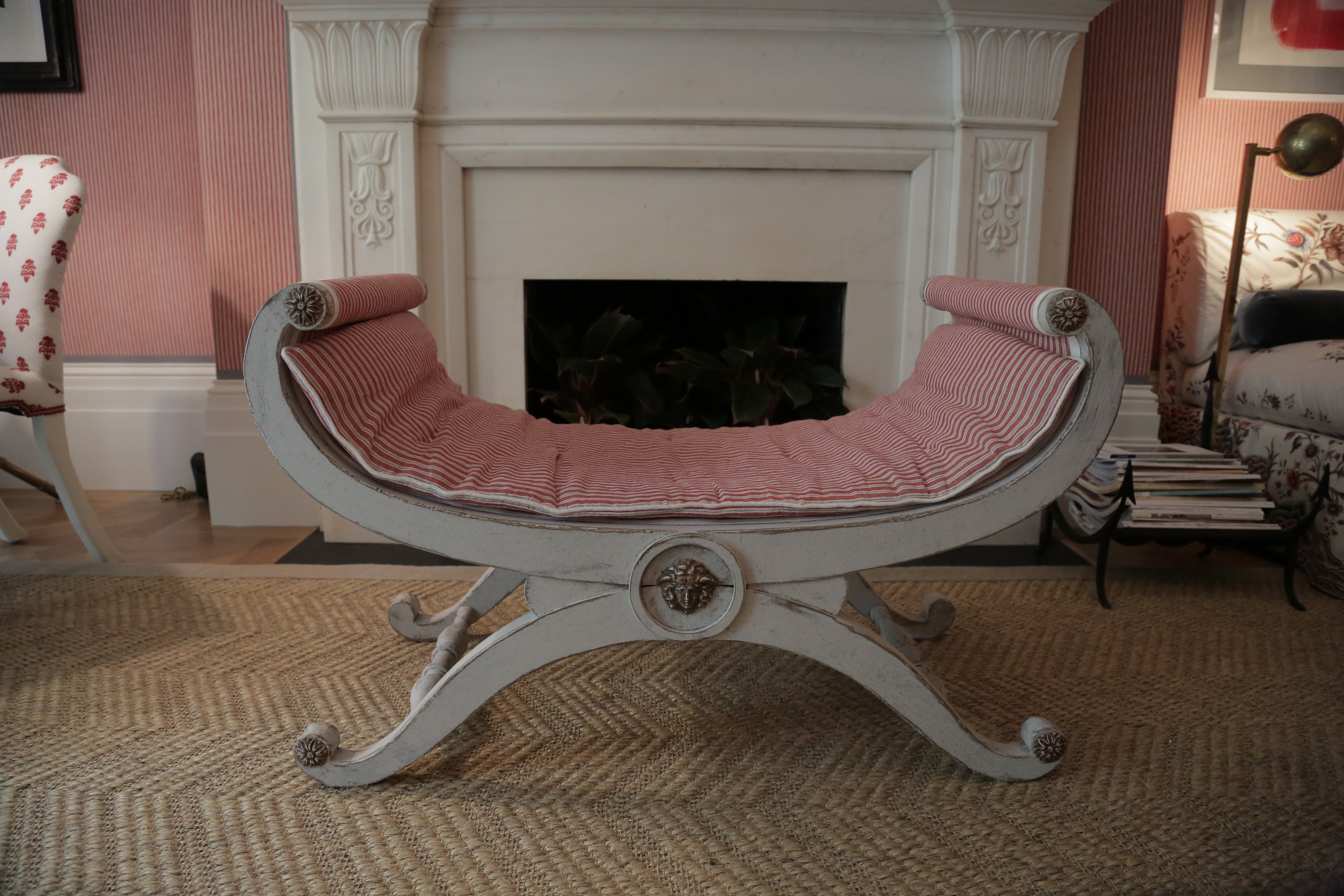
A 19th Century Swedish bench in Allessandra Branca's living room
As I admired both the woman and her room, I detected a bit of an accent and asked her about it. "I'm from Rome," she said, as she leaned over, plucked a piece of lint off of the Swedish bench and went on to say that Italians don't believe in decorating.
It's easy to feel at home in Allesandra Branca's living room.
What I got from that aside was that in her experience, people buy things they love and create a space that is both personal, comfortable and sophisticated---but not 'decorated.' I share the same philosophy, even though I'm not Italian.
Branca and I shared the same gingham pattern in our ensembles as well. Shortly after we made that connection, I asked her if she'd adopt me. That request is still pending.
In this homey show house Branca is certainly the mother figure---warm, welcoming and total Sweetheart. Her space reflects this energy with its eclectic mélange of pieces that are inviting, curious and fun.
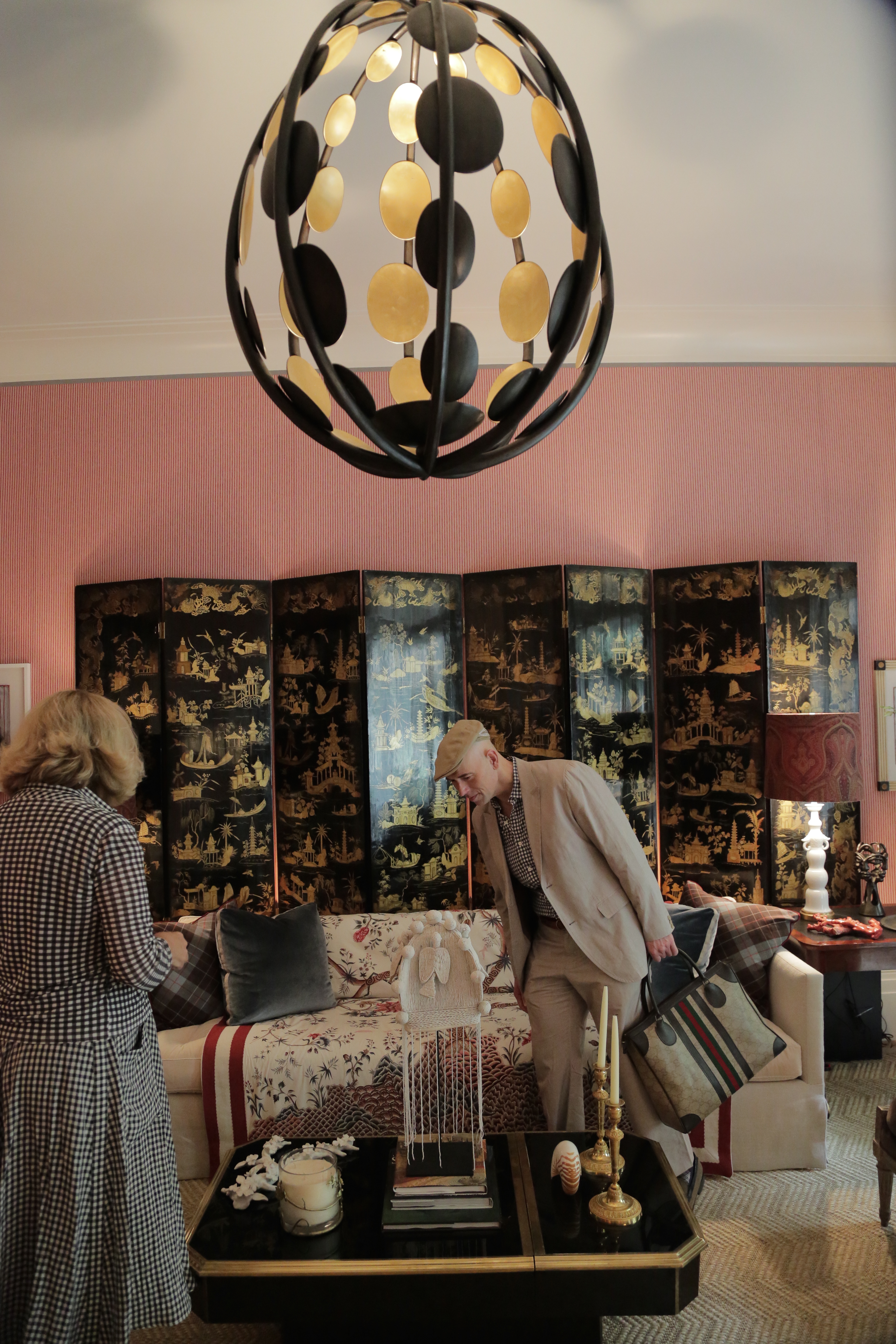
The orb light fixture, Chinese screen and opaline coffee table worked together in harmony in the living room.
A Blue Lounge with a Cosmetic Surprise
As I walked into Charles Pavarini's midnight blue lounge, I felt enveloped by texture and depth. After I shook his hand, Pavarini revealed to me that his lapis ring---which he happened to be wearing that day---inspired the entire room. As he showed me the ring, he gestured towards the walls and told me that in order to achieve the effect, he actually used women's blue eye shadow as a final finish.
Charles Pavarini created the brilliant finish on the walls of the lounge with eye shadow.
Then he gestured to the window treatments and told me they were shagreen (sharkskin) and horsehair. I told him I'd just seen walls covered in horsehair in a house I visited on my recent trip to Brussels.
Of course eccentric and entertaining conversation like this is always deeply enjoyable for me, and is often the sort of banter I have at flea markets while I'm co-mingling with dealers and shopping for my clients.
Speaking of flea markets, I pointed to a large Midcentury Italian lamp and remarked that it must be vintage. Pavarini nodded and told me he purchased it at a flea market and knew he'd use it at a show home someday.
Charles Pavarini's lounge included a vintage Midcentury lamp he found at a flea market.
I totally related and understand the inspiration that one piece can create. His lamp found its show home, and the gentleman's blue lounge would be a place I'd hang my hat any day. The only thing missing was a record player and some vintage vinyl.
Michael Herold's small reading nook was a masterpiece of pattern and color.
A Well-Appointed Reading Nook
Like Tilton Fenwick, Designer Michael Herold received a challenging space at Kips Bay. His room, which was originally a small laundry nook, was not much larger than a walk-in closet.
What he did with it, however, was nothing short of majestic. His smartest choice was to add a gilt mirror to open up the space, which included lots of pattern and eye candy. There was also a sensational nautilus chair, which made me want to get his upholsterer's name, because its striped fabric was perfectly seamed and showcased.
The nautilus chair in Michael Herold's space was perfectly upholstered.
As with Phillip Mitchell's space, I was reminded of Bergdorf Goodman, but this time it wasn't the Men's Store, but rather the Home Department. The limed oak torso lamp, Milo Baughman brass drum table and other décor looked as if they were curated by Kelly Wearstler for Bergdorf's. But the truth is that all of the vintage pieces were pulled from Herold's own store front on 1st Dibs. Shoppers, take note!
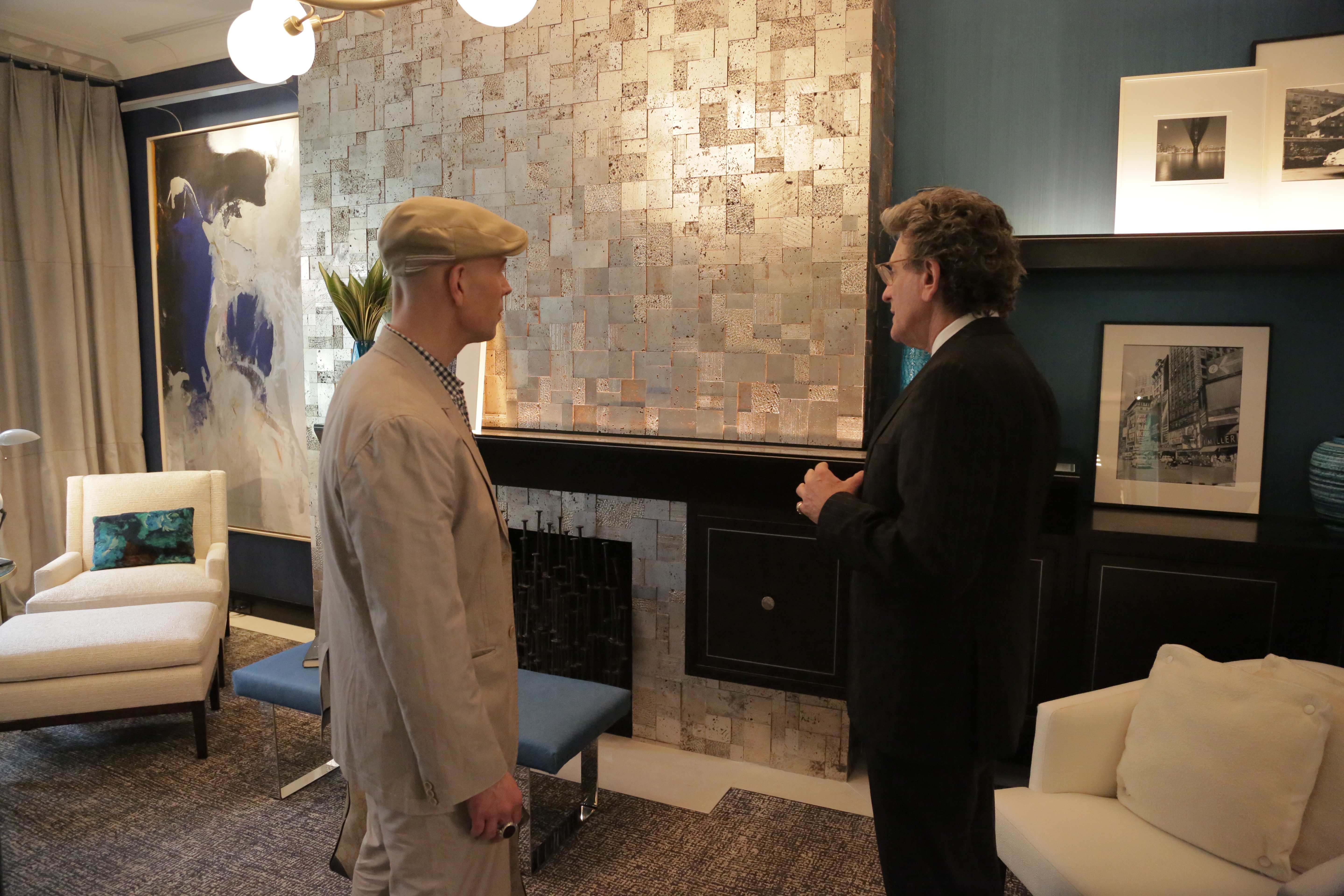
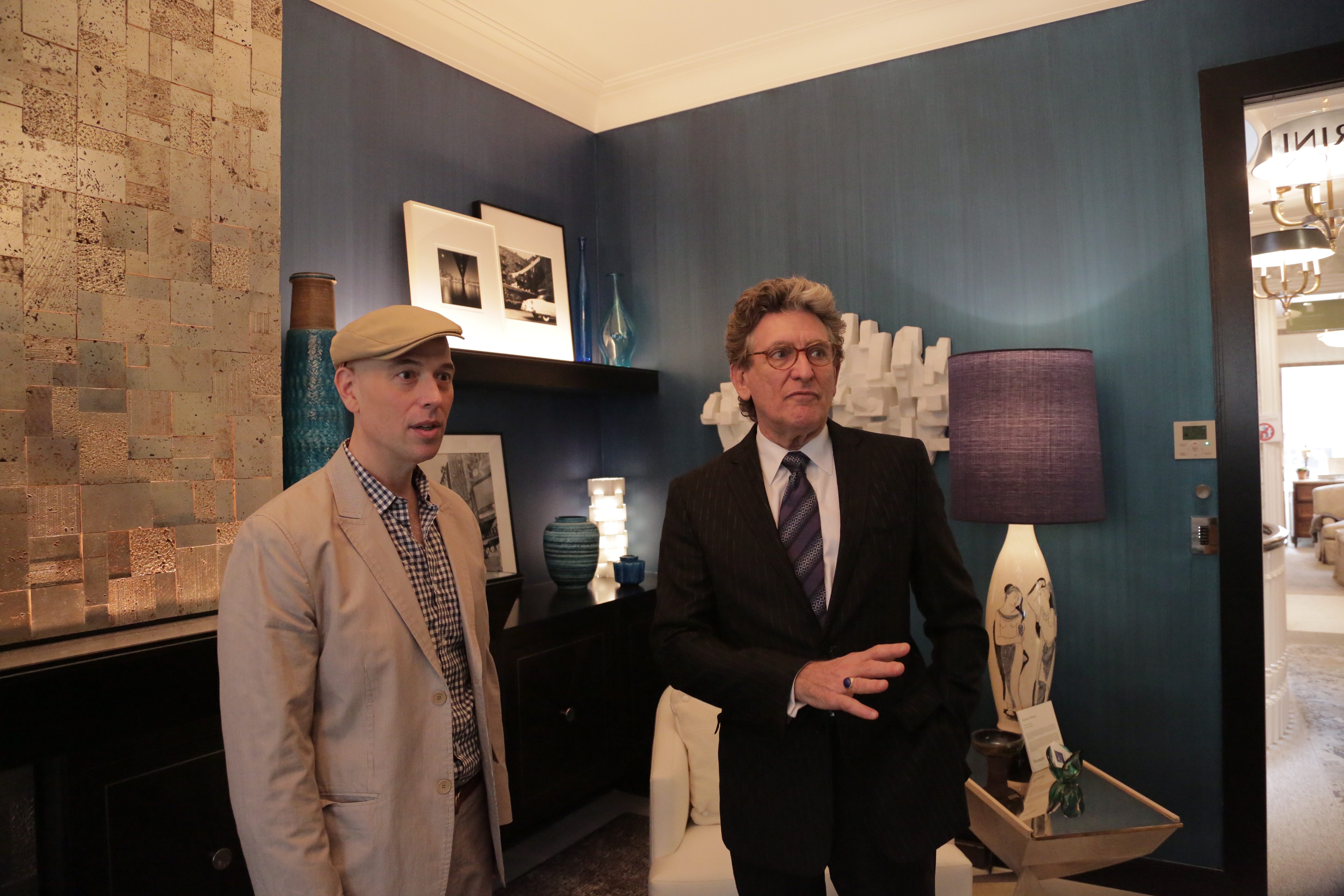
Thom Filicia chose cool, masculine touches for the study.
A Silver Study
More metallic touches were present in Designer Thom Filicia's study. Decidedly cool and masculine, it felt like the place where the gent who was lounging in Pavarini's room might go to get his work done. Highlights included especially well-chosen pieces of art, including a great sculpture that appeared to be made of clothespins and a regal antique desk.
The neutral tones were calming and artwork added a feeling of sophistication. The chandelier, coffee table and other accents were polished brass and felt dignified rather than showy. Filicia's choices for textiles (again on the walls) and in the curtains, upholstery and floor coverings created depth and interest but also generated a feeling of calmness.
In all honesty, it seemed like a space that would be quite conducive to productivity.
This sculpture was a great addition to Thom Filicia's study.

The majestic bed in Cathy Kincaid's master bedroom was well appointed.
A Four Poster Dream
Like Branca's living room, Designer Cathy Kincaid's bedroom seemed as if she designed it for herself. It was stately yet welcoming, peppered with comfortable hues of cream and taupe, and featured objects that looked as if they had history.
I was told that every piece of furniture was from John Rosselli & Associates. Certainly the most impressive piece was the four-poster/canopy bed with inlaid bone finish. The custom-embroidered canopy and crisp bedding was awfully inviting. There was even a breakfast tray to complete the idyllic scene.

Cathy Kincaid was as warm and inviting as her room.
In addition to the bone detail on the bed, there was taxidermy and other touches that spoke to a more masculine vibe. That masculinity, however, was balanced with blue and white porcelain accents and some pieces of diminutive furniture that had more of a feminine sensibility.
It was one of those rooms that just felt as if it has always been there. And when Kincaid walked in, everything made even more sense. The truth is I've never met a Texan I didn't like, and she ensured that streak is unbroken.
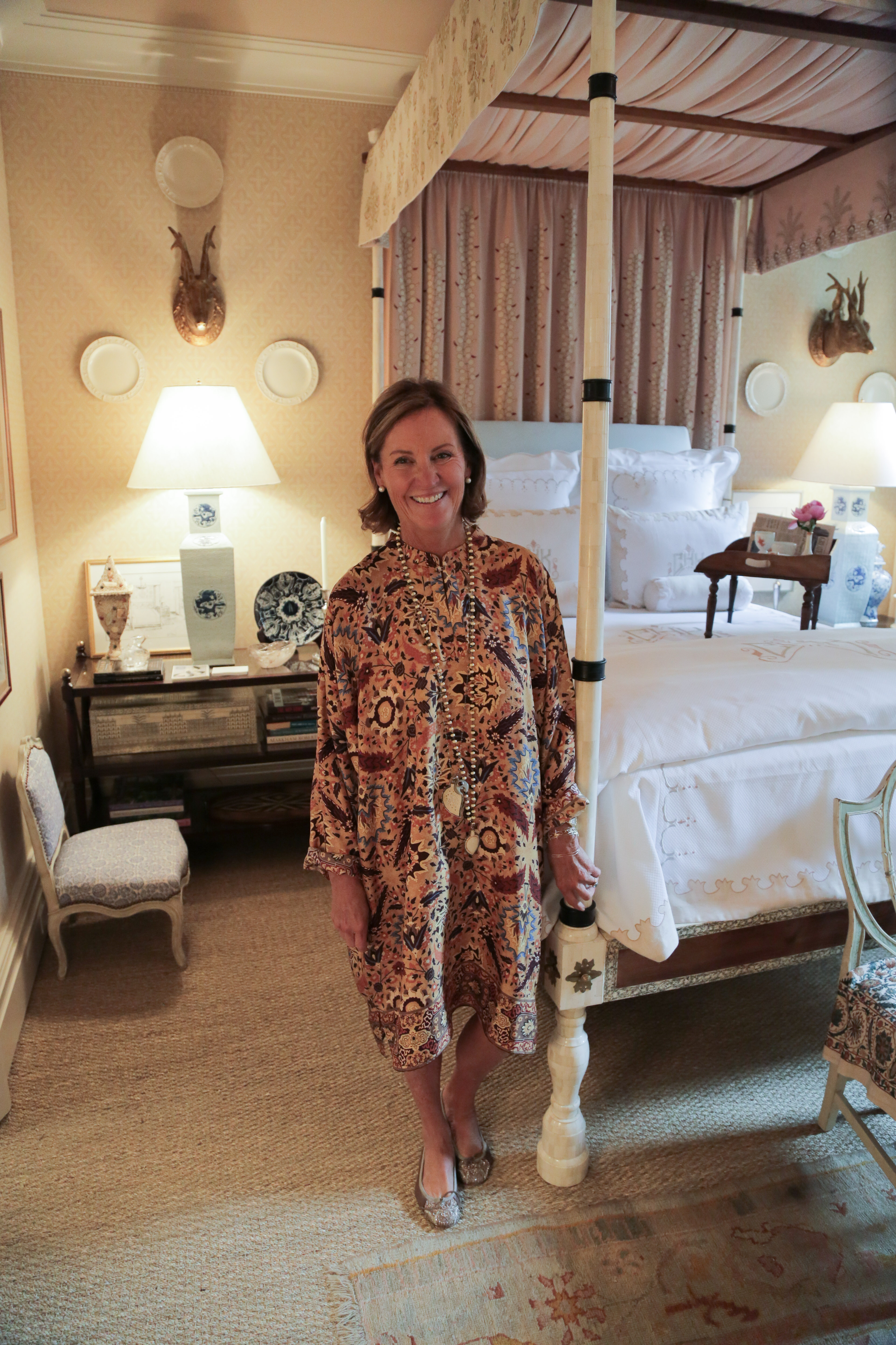
When Cathy Kincaid walked in, the room felt complete.
I immediately complimented Kincaid on her dress, which felt as if it, too, just belonged in the room. She told me she picked it up on sale at Neman Marcus for the event. Like most Texans I know, Kincaid appreciates luxury and wears it as casually and comfortably as her room does.
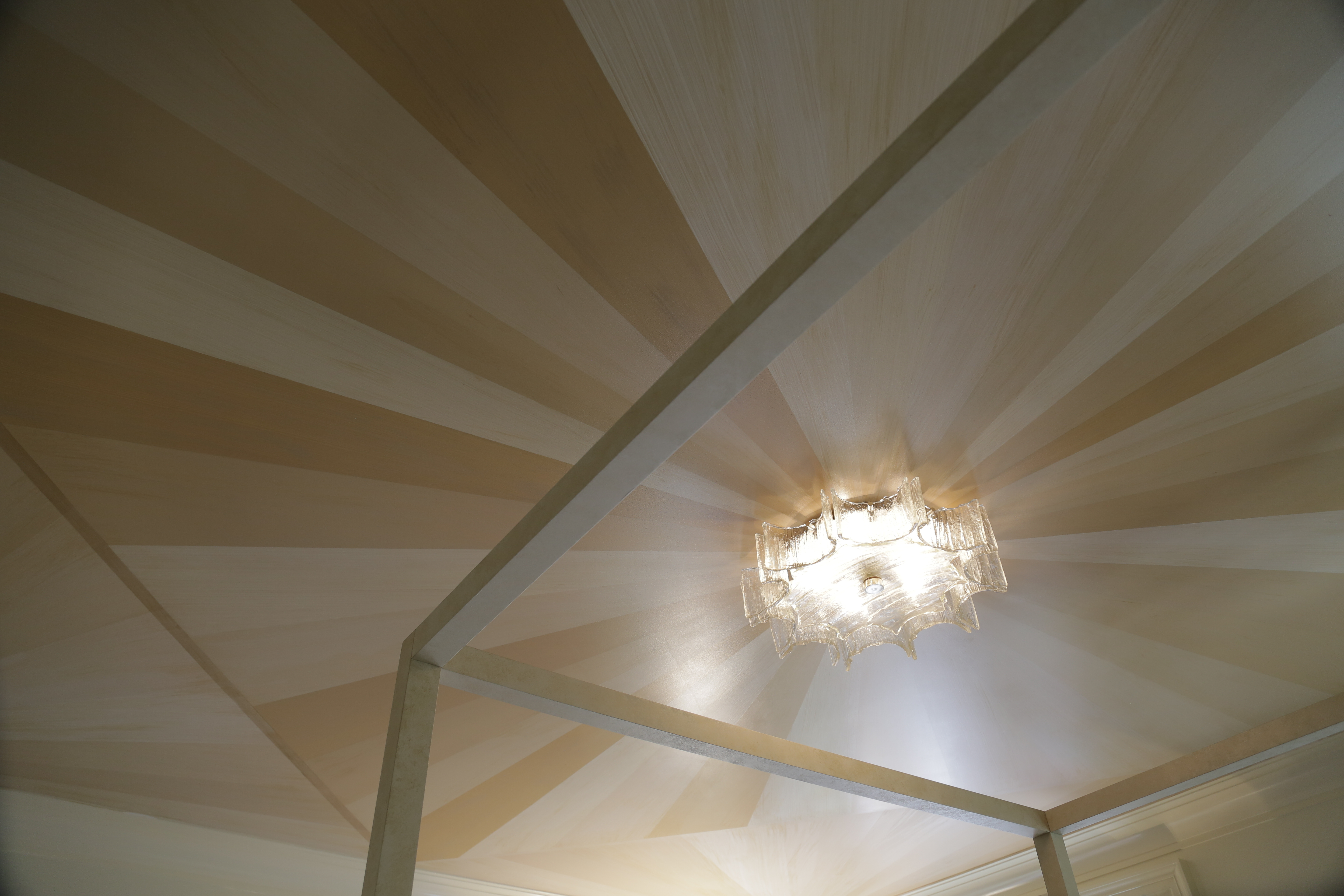
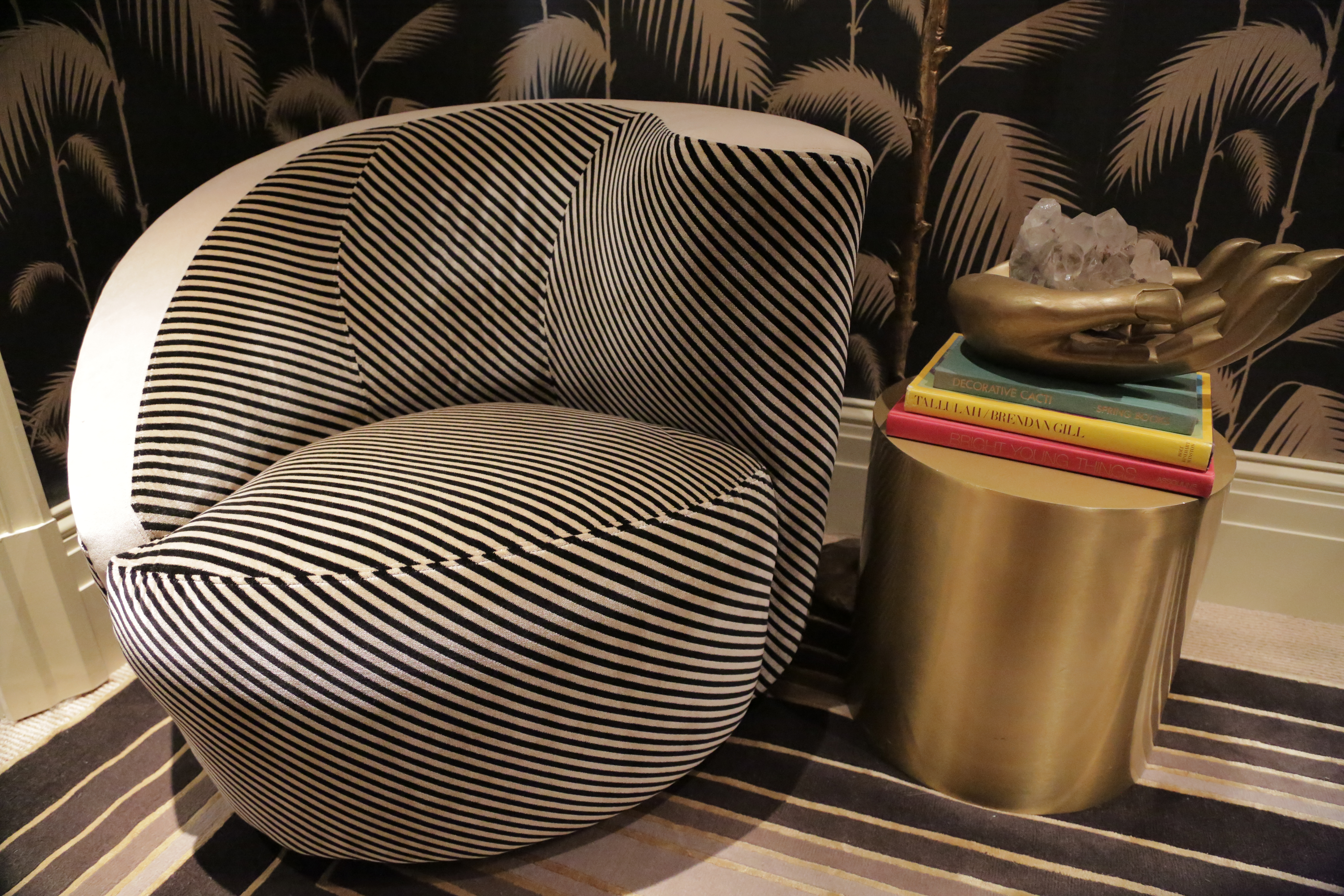
I loved the marquetry ceiling in Suzana Monacella's space.
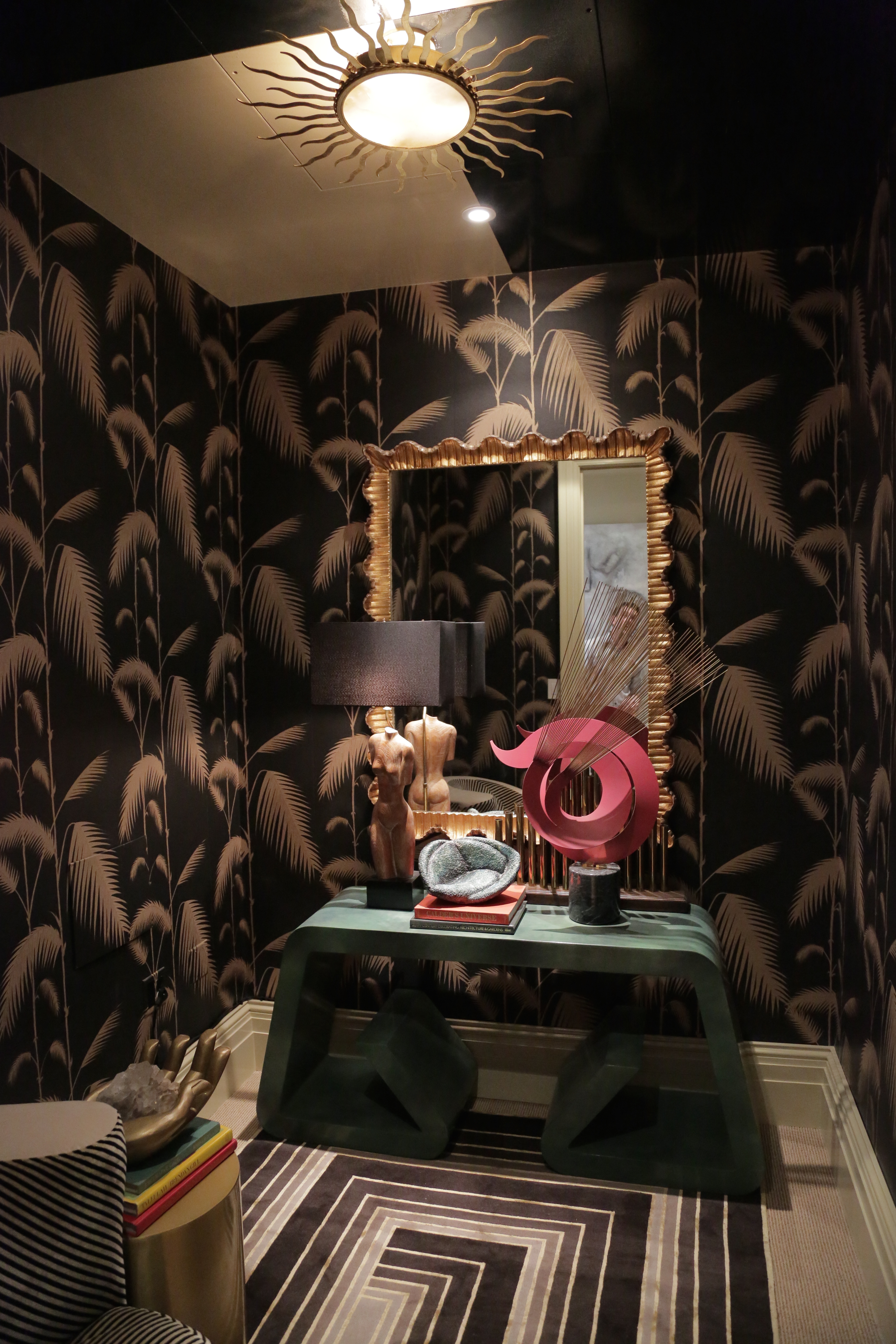
A Tropical Boudoir
As I walked into the bedroom designed by Suzana Monacella, I was struck by its minimal furnishings--considering how maximal the rest of the Show House was this year. As my eye traveled to wallpaper festooned with tropical leaves, I immediately thought of Blanche Devereaux's popular bedroom in the 80s TV series The Golden Girls. But unlike Blanche's boudoir, this room felt restrained in its tropical-ity. The Brazilian designer told me many of her clients want this tropical yet sophisticated vibe.
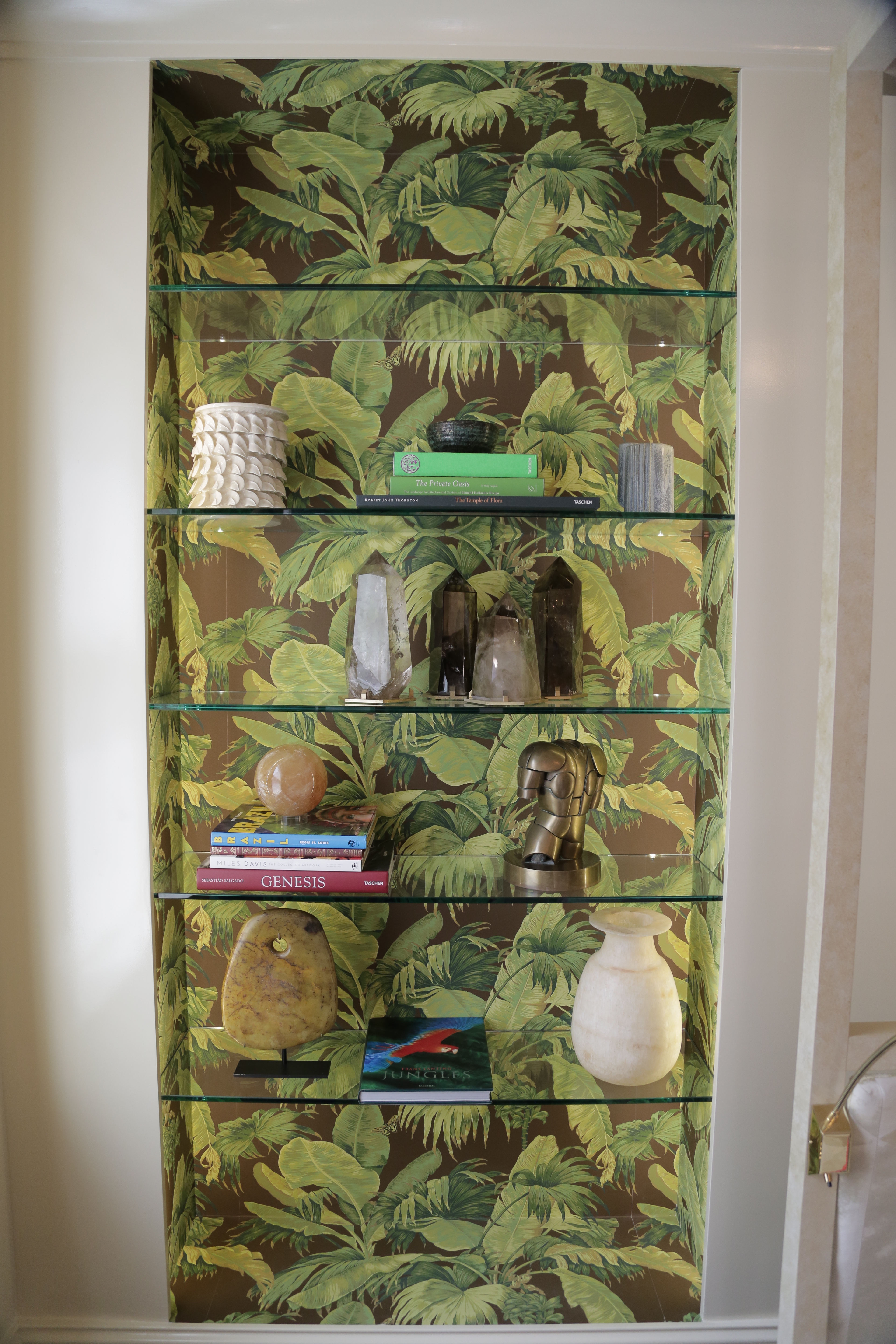
The wallpaper in Suzana Monacella's bedroom exuded a tropical feel.
The four-poster bed and chaise were built for comfort and Monacella pointed out that bedding was reversible, depending on whether the guest was male or female. In fact, guest seemed to be the operative word here, in that this would make a great guest room in that it has character and good design, but is not overly populated with personal items.
The bedding in Suzana Monacella's space was reversible, to accommodate a variety of guests.
The ceiling, which featured a marquetry pattern, was the star of this show, added depth and movement to the room.
The paint and lighting choices in Peter J. Sinnott's bathroom were exceptional.
A Brilliant Bath and a Fun Powder Room
Lastly, even the bathrooms and powder rooms at Kips Bay had a designer touch. Peter J. Sinnott's bathroom featured a sculpture in the shower and nine coats of paint to achieve the perfect Hermes orange gloss on the moldings. The grass-cloth wall covering, tiger marble tiles and marble wainscoting made the room feel very well planned and deeply luxurious.
A sculpture in the shower? Why not? This one was sensational.

I was impressed with Peter J. Sinnott's process and choices for finishes in one of the most-frequented rooms in the house.
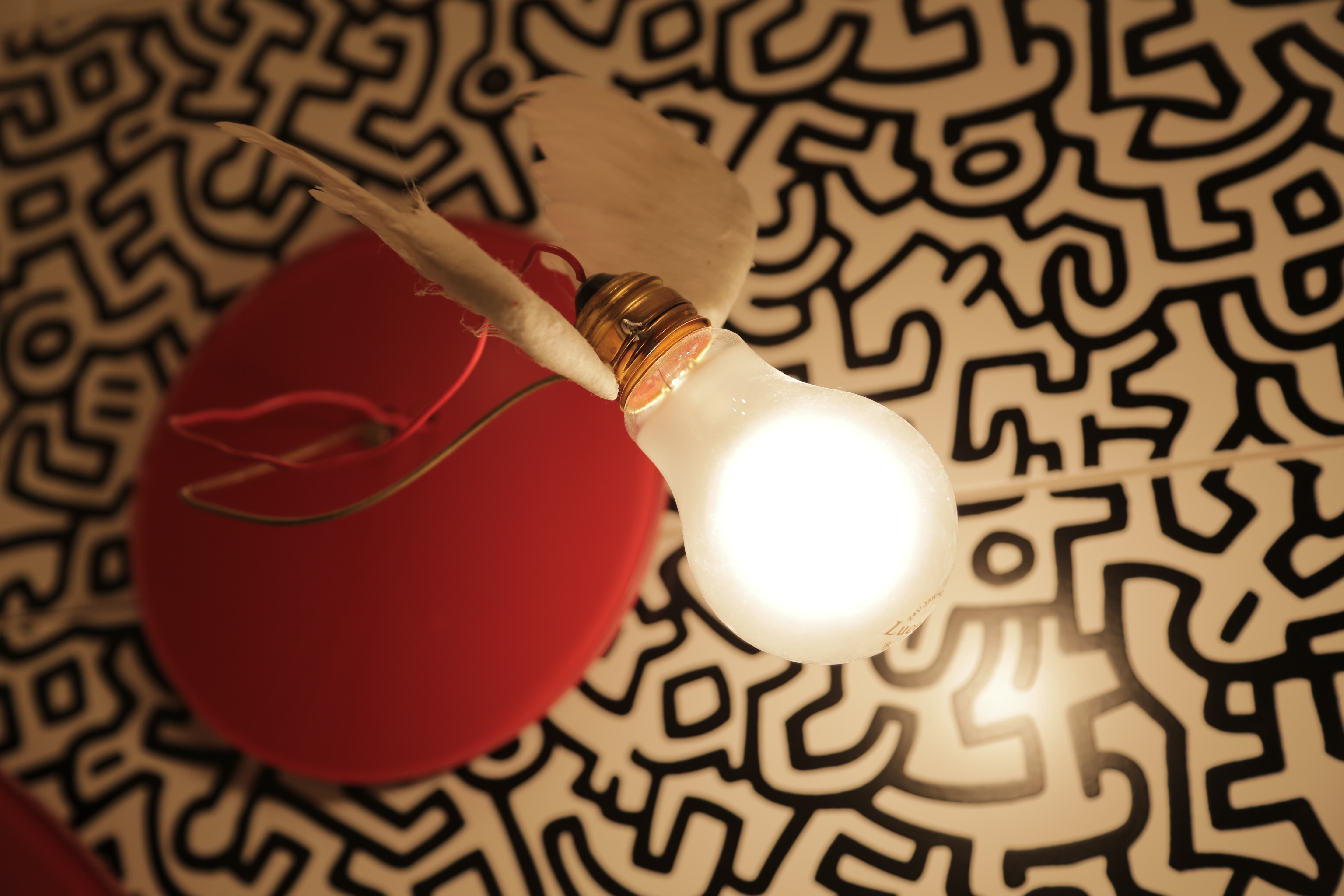
Gail Green channeled Keith Haring in the powder room.
Conversely, Gail Green's powder room was just plain joyful and fun. She channeled Keith Haring with wall and floor graffiti tiles. Her choices to include red accents like a round mirror and a winged light fixture just added to the sense of whimsy. I always tell clients that a great place to have fun with design is in the powder room, and if was a joy to see Green do just that.
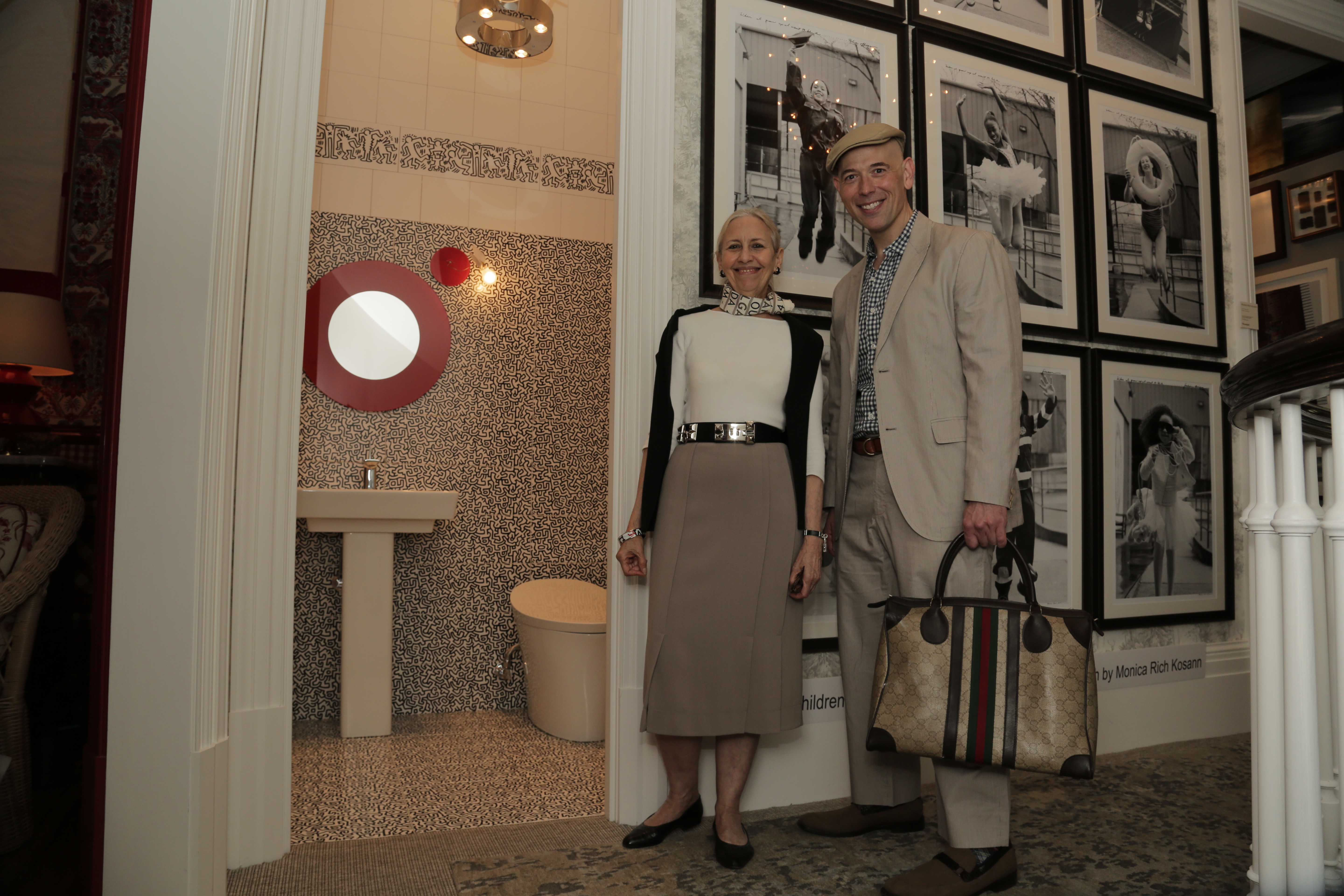
Gail Green's Keith Haring-inspired powder room added an an element of surprise.
See It For Yourself
Whether you're on the lookout for design inspiration, an actual designer or a newly refurbished Upper East Side mansion, this year's Kips Bay Decorator Show House is well worth a visit.
The Kips Bay Decorator Show House is located at the Arthur Sachs Mansion at 58 East 66th Street, and is open to the public until June 11th. Admission is $35. For more information, go to www.kipsbaydecoratorshowhouse.org.
The Arthur Sachs Mansion could be yours. Here's the listing with Brown Harris Stevens: http://www.bhsusa.com/manhattan/upper-east-side/east-66th-street/townhouse/11685991
All Photos By Blake Drummond