Cow Path Theory
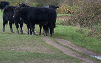
If you drop a cow in a random field it will eventually find its way to water or die trying. Though it may not be the fastest way, cows will do their best to reach their goal, and will continue to use the same trail leaving a cow path.
If you drop a user on the front page of your site they too will eventually find "water" -- desirable content -- or "die trying" -- abandon hope and leave your site. Though it may not be the fastest route, they will click their way to the desired content and take action without leaving a trail.
Usability
Cows use the trails left by other cows that have traveled through fields before them to reach water. Unfortunately site visitors do not have this luxury. Every new user must go through the discovery process; your job as a site owner is to make the path to water clear. Site analytics are your best friend toward reaching this goal.
Visitors should be using your site's main navigation to find what they need. Though every user is unique, some may prefer to navigate through search, and others may just be interested in browsing. This is why site architecture must be based on aggregate traffic and NOT be dictated by anecdotal testimony. "Oh, I never use drop downs, they're stupid," is not actionable data.
Clear navigation paths reduce site friction. Friction is every extra step a visitor must go through to find content or take action. Every extra step in a process increases the abandonment rate, so having your email sign-up, donation page or user login page buried on your site will decrease involvement.
Case Study
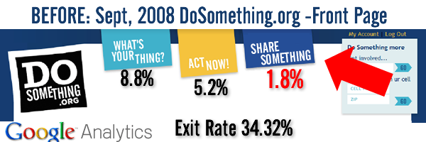
DoSomething.org created a new site with the assumption that users wanted to do three things: Learn, Act, Share and made those the three tabs in the main nav bar. After watching 100,000 users on the front page we found that only 1.8% of our front page traffic wanted to "Share Something" however, they were finding circuitous routes to get to our grants and cause campaign sections.

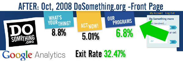
We responded by changing the top nav to Learn, Act, Programs (containing our grants, and campaigns) and immediately saw a more even use of the front page navigation.

The problem was that we had put a horizontal concept -- sharing -- in a vertical categorization. People want to share in response to reading content across the site, they don't come to the site with the primary goal of sharing. In addition to increasing the click-through percentage by over 5% it also helped decrease our exit rate by 2% (percentage of people that leave the site after viewing one page).
If DoSomething.org had waited another month it would have cost us 4,000 teen visitors (2% exit rate for 200,000 average monthly site visitors 2008). Another 6 months and it would have cost us over 30,000 teen visitors (site traffic continued to increase). By reacting quickly, DoSomething.org increased the number of teens taking action. What does it mean for your organization?
Tips for Finding Circuitous Cow Paths
A site launch may be the end of one process, but it's important to think of it as the beginning of a new one. If something is wrong do not wait to make the change, because it means that you are losing users through poor design. Slap the word BETA on the site, it helps Google.
- Google Analytics: site overlay
Analytics overlay shows a site with data about user clicking behavior on top of the page. This is both a great way to quickly understand traffic flow and visually present data to your team.
Bounce rate is the percentage of people that come to one page of your site and then leave. A symptom of poor navigation structure is a high bounce rate, so the goal when you make a site change is to reduce the bounce rate from the front page. Looking at your site's top content can show you what people are most interested in. Putting this content closer to the front page or in the main navigation may be a good idea.
Watching people use your site can show you where people are confused. This can be done by inviting a few of your target users into your office, giving them a lunch and noting how they use your site. Use Camtasia or Screenr.com to record the actions a user takes while navigating the site. Recommended reading: Don't Make Me Think, Steve Krug.