The fact that the U.S. health care outcomes lag that of many other wealthy countries (despite spending two to over four times more on health care) has been well established. What may surprise some is that the U.S. consistently lags other wealthy countries in health outcomes across all stages of life.
For this analysis, I selected the OECD countries with GDP per capita exceeding $20,000 per year since previous analysis has shown that above this income threshold there is no significant correlation between GDP per capita and health outcomes (discussed in the Health Chapter of Measure of a Nation). When this restriction was applied, 26 of the 34 OECD countries were retained including the US, Canada, Australia, New Zealand, Japan, South Korea and many European countries.
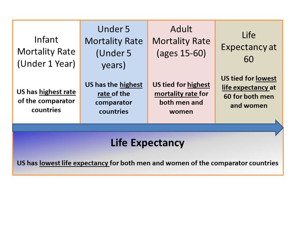
Starting the examination with the earliest time slices, the first year of life (Infant Mortality Rate) and the first five years of life (Under Five Mortality Rate), the United States has the highest rates of death for their children, exceeding that of all other comparator countries. In 1960, the United States had the 12th lowest infant mortality rate in the world but by 2008 we had dropped to 34th. There are major racial disparities in the U.S. with regard to infant mortality. For example, in 2005, African-American infants suffered a death rate of 13.63 per 1,000 births, more than twice the national average. If we focused only on the Caucasian population, America would still compare poorly versus the other countries. While there is some variability in how the mortality rates are calculated in different countries, the Center for Disease Control has shown that the U.S. numbers improve only slightly when other definitions are applied and that America's relative ranking is barely affected by the definition used.
From this earliest time slice, we move to the adult mortality rate, defined as the probability of dying between 15 to 60 per 1000 population. Here the World Health Organization reports that the U.S. has the highest adult male mortality rates (131 per 1000; 2011 estimate) and the highest adult female mortality rates (77 per 1000; 2011 estimate) in the set of countries examined. That is to say that, American men and women between 15-60 are both more likely to die than men and women of the same age in the comparator countries.
Moving to the later stages of life, we can examine the life expectancy at age 60. Here the life expectancy at age 60 for American men is tied for last place (21 years; tied with Slovenia, Portugal, South Korea and Denmark). Similarly, the life expectancy at age 60 for American women is tied for last place (24 years; tied with Denmark).
We can see clearly that across the age ranges that are generally reported, America performs consistently compares very poorly in terms of survival. Given this consistently poor performance for different age slices, it is not surprising to find out that the overall life expectancy for both American men and women is shorter than that of the other comparator countries.
Looking globally, it is important to note that the U.S. wasn't always a comparative laggard in life expectancy. Back in 1987, only seven other countries had longer life expectancies than America, while today America isn't even in the top 20.
The Affordable Care Act was passed in 2010 and was declared constitutional by the US Supreme Court in June 2012 yet many politicians continued to defend the status quo of the America health care system, a system that is vastly more expensive than other health care systems around the world and, as the data shows clearly above, produces worse health outcomes than other wealthy countries across the entire life spectrum.
Note: The Organisation for Economic Co-operation and Development (OECD) is an international organization comprised of 34 countries, representing many of the wealthier countries in the world. Its members include North American countries (Canada, Mexico and the U.S.), much of Western Europe, as well as New Zealand, Australia, Chile, Israel, Japan and South Korea. The data for this analysis was extracted from the World Health Organization database Follow Howard Steven Friedman's Facebook FanPage