Across the globe, men tend to live shorter lives than women -- on average, roughly 6 percent shorter to be precise. This gender-based difference in life expectancy is related to many factors, some biologic and social. Male mortality is higher than female mortality throughout life, from the earliest stages of childhood to later adulthood. Some biologists argue that the second X chromosome in women leaves them better insured against genetic mutations. Others argue that this difference in life expectancy is linked evolutionarily to the sex ratio at birth, where there are roughly 105 boys born for every 100 girls born.
While there are many factors that are likely to be driving the female life expectancy to exceed that of males, across countries there is great range in the difference or ratio in the life expectancy of men and women. This diversity across different countries may reflect the different country's genetic make-up, gender-based differences related to propensity towards diseases, murders, accidental deaths, etc., gender-based differences in access to health services or other factors. If there are sharp changes over time in the life expectancy difference, it speaks more to the latter factors and less to the idea of genetic differences driving the diversity.
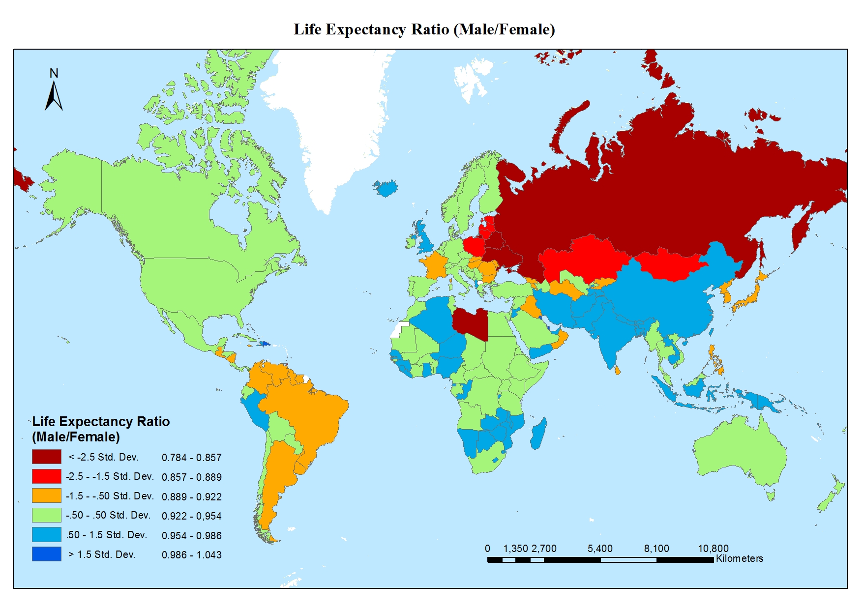
The global map of the ratio of male to female life expectancy is telling. There are only four countries where men are expected to live as long or longer than women: Tonga, Qatar, Tuvalu, Kuwait. Looking at this a different way, in these four countries, the ratio of male life expectancy to female life expectancy is one or more while the global average is around 0.94. These four countries may reflect either unusual longevity by men or shorter lives than would be expected for females.
These four countries with life expectancy ratios of 1 or more are not nearly as dramatic of a statistical outlier as the set of countries on the other side, with excessive male mortality. In the red-colored countries of the map, countries like Libya, Russia, Ukraine, Belarus, Lithuania, Kazakhstan men are expected to live at least 14 percent shorter lives than women. The excessive male mortality is due to different reasons, including excessive violent death and alcohol-related mortality. Outside of Libya, these countries are clustered around the former Soviet Union states where male life expectancy dropped sharply following the fall of the Soviet Union.
In the United States, men are expected to live roughly 6 percent shorter lives than women. As seen on the map, the ratio of male to female life expectancy is similar to that of Canada, much of Western Europe and the global average. The longer life expectancy for women results in a very accurate prediction: the older the population, the higher the ratio of women to men. Moreover, in countries with excessive male mortality, the ratio of older women to older men is even sharper.
The life expectancy ratio in America is very much dependent on race. Both Caucasian and Hispanic men are expected to live about 6 percent shorter lives than women of the same race, a difference that is in line with the global average. On the other hand, African American men are expected to live about 9 percent shorter lives than African American women, another example of excessive male mortality.
The author wishes to thank Dr. Sainan Zhang for her support in developing the global map of life expectancy ratio.