
Miles Corak has for years been making important contributions to the relationship between inequality and mobility. His data generated the figure in a recent presentation of the issues by White House economist Alan Krueger, featured here.
Corak posts a more recent version of the graph with more countries. Recall that the graph shows the relationship between inequality in these economies (x-axis) and lack of mobility (y-axis -- the "intergenerational earnings elasticity" is a measure of correlation between the income of grown children and their parents -- higher values suggest less mobility).
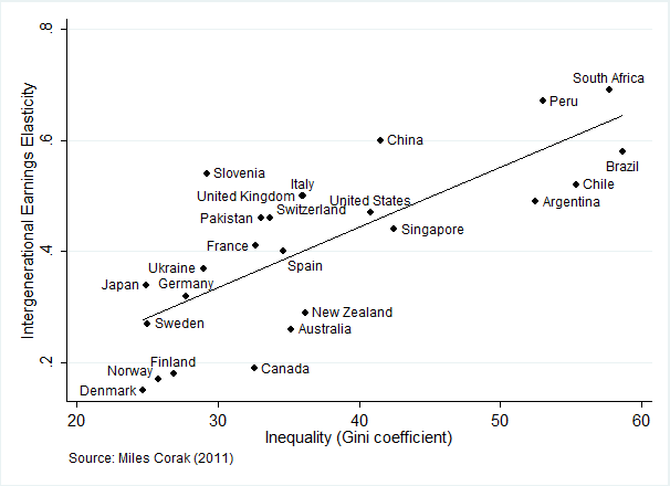
First of all, note that in the Krueger chart, the US scores among the highest on the combination of the two variables, but that's because that sample is limited to only "advanced" economies -- a legitimate comparison, by the way, as these economies are the most similar.
But here you see how we exist at the borderline between advanced and emerging. The question then becomes, which way do we go -- up the line toward South Africa or down the line toward Denmark?
My fear is that until we deal with the underlying structural factors driving inequality ever higher (outside of recessions), it's the former.
* Note: Scott Winship of the Brookings Institution has raised questions about these data and relationships that Corak addresses (and debunks) on his website (which is a treasure-trove of top quality info on these issues).
This post originally appeared at Jared Bernstein's On The Economy blog.