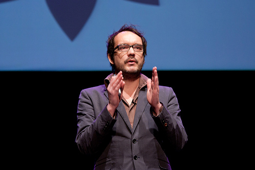
David McCandless is a UK-based author, data journalist, and information designer who has published multiple books on data visualization. His work has appeared in Wired, The Guardian, the TED Conference, as well as the New York Museum of Modern Art.
He took time out of his busy schedule to answer some of our questions on his influences, the state of data visualization today, and what we should expect from him in the future.
C5: How did you first get started working with data?
I was a programmer as a kid on early home computers. That gave me a feel for data and code. I turned that school towards my passion of the time, video games, which I used to hack, edit and customise to my own ends. I got so good at it that I was offered a column in a magazine. And that's how my experience in journalism started.
Later, a couple of decades later in fact, after many years as a print journalist, I found myself building, designing and creatively directing websites. That started seeding the idea in my mind about information and design working together.
When I started my book, I had to gather huge scads of data and found quickly that my hackerly past working with code gave me a natural feel for data and numbers. Together with years of experience writing stories, this meant I could think computationally and creatively at the same time.
Before becoming a data journalist, you were a programmer and writer, how did this affect how you perceive and deal with data?
I don't really see a big difference between writing journalism and designing infographics. Journalism is really about condensing and structuring information into tight understandable form, telling flowing stories and helping others to navigate and understand complexity. So I've really just started visualising my ideas, rather than writing them.
What was the first data visualization that you saw that made you appreciate the use of design to inform?
I think the classic example Tufte uses: Minard's Napoleonic war graphic.
What is one field you think hasn't embraced visualization and can benefit most from better information design?
I think the medicine and health arena is in dire need of visualisation. So much important data--personal medical records, health test results, epidemological studies, evidence randomised controlled trials--is walled off through bad presentation and poor information design.
What should we be expecting from you in the near future?
In the near future, we're going to be exploring motion infographics merging data and story. Using narrative and themes to shape little road-trips through information. Guided tours through the hidden patterns in the data all around us. Who knows where we'll end up?