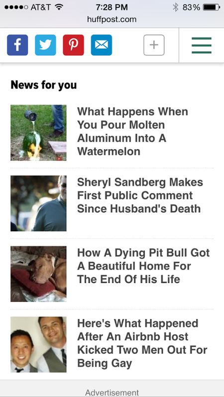
This week, in conjunction with our 10th Anniversary, HuffPost has unveiled phase one of our first-ever site-wide redesign: a new mobile web site. Over the past six months, we've been working alongside our agency partner, Code And Theory, to reimagine the HuffPost experience for the mobile-global-social world we now live in. Along the way, we've learned a lot about what is truly important to us here at HuffPost and to the digital media world at large. These are some of the things we've learned in the process, and will continue to focus on as we grow as a global media company over the next 10 years.
Mobile is the future, and the future is now
If you're reading this on desktop, you might be asking yourself: what redesign? That's because the HuffPost redesign took a truly mobile-first approach. We've launched on mobile web this week, and will roll out a new look on desktop and our apps in the coming months. Mobile accounts for 50 percent of HuffPost's traffic globally -- in Korea alone, that number rises to 85 percent. That is why it was (and will continue to be) paramount for us to optimize the user experience for our mobile users. We don't believe in scaling back a desktop design to fit mobile, potentially removing functionality in the process. Instead, we have an independent and highly flexible codebase dedicated to our mobile properties so that we can let our readers experience all of our content in the best way possible on mobile devices.
Think globally, act globally, grow globally
When AOL bought HuffPost in 2011, we had 30 million unique visitors and zero international editions. Now as we mark our 10th anniversary, we have 214 million UVs, and by the end of this summer we'll have 15 international editions in 10 languages. Most importantly, though, half of our audience now comes from outside the U.S., and we are well on our way to building a truly global newsroom. In order to get there, we need every HuffPost employee to think globally, which is why we put in a tremendous amount of work to ensure that phase one of the redesign was 100 percent global in scope. The mobile web redesign was deployed simultaneously across all of our international editions and gives readers amplified access to our worldwide coverage, regardless of which languages they speak. The new mobile site allows readers the option to seamlessly switch between editions and supports translations across all of our international editions. It also makes it clearer when content is coming from a foreign edition.
Every page is now a "front page"
With more and more traffic coming in through the "side door" -- that is, from external referrals like search and social to specific articles - every article now acts as a gateway to the rest of the site. Of course, HuffPost retains a healthy amount of direct traffic, particularly to our front page. But we're also consistently the #1 publisher on Facebook, and a significant portion of HuffPost's traffic comes through social referrals to article pages. This is especially true on mobile (though our mobile site does have a beautiful new home page, including a mobile-friendly take on our signature splash). To accommodate this, we're treating every page like a front page, giving readers more opportunities to find relevant and interesting HuffPost content from the mobile web article itself through infinite scroll, related content and personalized recommendations. And, because sharing is a core behavior of the HuffPost reader, we've developed a new strategy around microsharing, giving readers more opportunities to share elements of content from article pages, whether headlines, videos, quotes or photos.
Launch in phases, and iterate quickly
We could have spent more than a year preparing to roll a redesign out across multiple platforms, or wasted months debating which shade of green to use in our logo header. Instead, we decided to stay true to our startup roots and launch quickly with a minimum viable product (MVP) for mobile web in less than six months. We'll be tracking user behavior closely so we can iterate on the design as we learn what works in real time. There's a lot more to come. Tablet and desktop are coming soon -- stay tuned! And in the meantime, feel free to email your thoughts, complaints or suggestions to mobilewebredesign@huffingtonpost.com
Always choose performance over "pretty"
There was one point during our redesign when our editors fell in love with a font and we had to tell them that we couldn't use it because the files were too heavy and it would destroy our page load time. This underscored a really important lesson for us: for HuffPost, performance takes precedence over prettiness. Getting stories out to our readers in real time has always been our priority, especially on mobile web. With each iteration of our mobile web site, we've improved page load time around the world. This launch is no different; we even gave our new fonts a "speed test" to ensure that they wouldn't impact the speed of the site (they don't). We'll continue to maintain (and improve) our best-in-class performance target of rendering content under 1,000 milliseconds and offering the best possible experience to our readers.


