Regardless of the quality and utility of a service, so much of a service's success comes down to its packaging. This isn't a particularly new concept, but it's one small business owners would be wise to remind themselves of again and again.
It's easy to see how the pricing page might be an afterthought for many, in lieu of focusing on the landing page. After all, the landing page will draw prospective customers and clients in--but your pricing page is what will spur them to take that crucial step and sign up for your product. I mean, think about it: would you be inclined to sign up for a service if the pricing page was disorganized and difficult to understand? Seems shady.
Working at a small SaaS, my team spent hours agonizing over the new design for our pricing page. And we won't stop there. The reason we decided to update the pricing page in the first place was because we regularly test our landing page to see if it's effective. This is important: regardless of what pricing page guides you read, you should regularly test your own pricing page to see if it's working for your site. If people aren't signing up, it's time to make some big changes.
I'm going to draw your attention to six strategies that you have probably seen used many times on other sites, but that you may not have given a second thought to.
1. Highlight the "Best" Option
This is a standard strategy to encourage prospective customers to click on a certain plan. Present a few options and emphasize the one that offers the "best" value. The reason I put "best" in quotation marks is because while all of your options have value, but you want to give prospective customers the impression that they're being offered the best option. Usually the "best" option offers more features than the base option for a comparatively lower price overall, and is considerably cheaper than the most expensive option. To emphasize the "best" option, you can literally bring it to the forefront of your page design, with the other options pushed slightly to the back. Venngage highlights two options on their pricing page.

2. Place Options Side by Side
This might seem like a no-brainer but it's super important. You want prospective customers to be able to compare prices and easily weigh their options. That's why it's a good idea to 1) keep it to 3-4 options, and 2) place those options side by side. Most pricing pages use simple squares to frame each option, with the key features included in each. Additional features may be included beneath the squares, but it's a good idea to keep the main text sparse and to the point.
3. Use Persuasive Language
Odds are that unless your service is exactly what someone is looking for, prospective customers are going to be humming and hawing over whether or not they should pay for it. That's why it's important that the language on your pricing page gives them that extra nudge towards clicking on a plan. Rather than simply saying "Buy Now," you could word your call to action any number of ways like "Choose Plan," "Begin Now," or "Get Started." You will have to A/B test different phrasing to see what converts best.
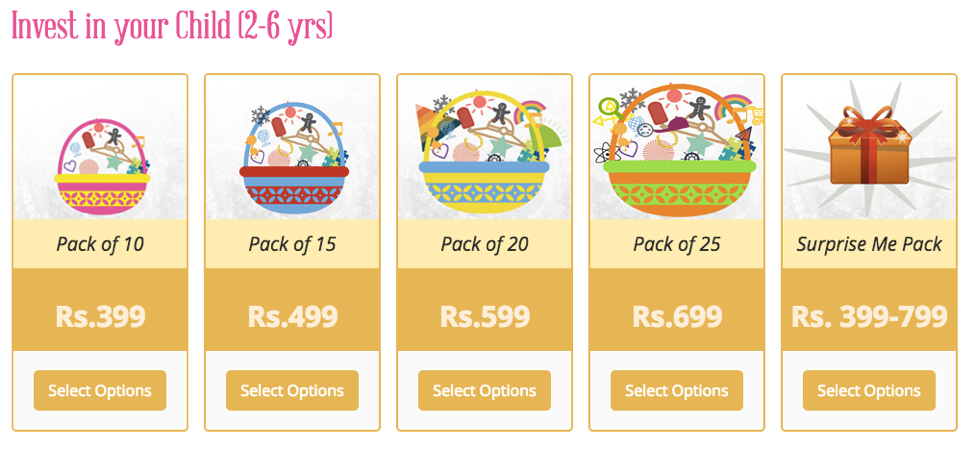
For example, this pricing page for Super Baby Online presents kits for crafts for kids not as an expense but as an investment in your child's creativity. This phrasing will encourage parents to think of how the product will benefit their child.
4. Use Different Colors
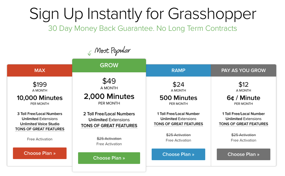
Break up the elements on the page and make your options more interesting by using more than one color. Grasshopper is smart about this. They offer four plans in four different colors: the cheapest plan in a dull grey, the slightly more expensive plan in a cool but inviting blue, the most expensive plan in an intense and energetic red, and the "best" value plan in a vibrant green that matches the color scheme of the rest of their site. This creates the impression that the green plan is the essential Grasshopper plan and the one that first-time customers should choose.
5. Include Testimonials
According to Business.com, 77% of people read online reviews before buying a product. With this in mind, it would be a missed opportunity to not include testimonials right on your pricing page.
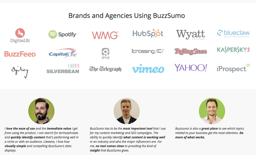
Buzzsumo follows a nicely organized design of presenting the prices at the top, then the features next below, then some answers to key questions that prospective customers might be asking at that point, then a collection of logos for companies that use their service and testimonials from industry influencers, and finally a button leading to where they can read more testimonials from customers like them. This top-to-bottom layout walks prospective customers through the process of considering whether or not they should register for an account with Buzzsumo.
6. Answers Some Questions Up Front
Most sites will have some sort of FAQ page but if your service is one that requires some explanation (such as a marketing tool), it can be beneficial to answer some of those questions right on the pricing page. Crazy Egg does this--their tool uses heatmap technology to reveal what parts of a site users pay the most attention to. To help prospective users understand the service, screen caps and short descriptions are provided right on the pricing page. The images also look really cool on the page.

A/B Test Your Pricing Page
I can't stress this enough. It's not enough to simply copy another site's layout--you will lose revenue that way. Testing a couple of different designs is the only way you will know for sure which design is the most effective for selling your specific product or service. You could A/B test small changes but if your site doesn't yet get a lot of traffic,
Offer your pricing page as much care and thought as your landing page. The landing page draws prospective customers in and the pricing page seals the deal.