Excerpted from the introduction to The Atlas of Design (North American Cartographic Information Society, $35 plus S&H) ed. Tim Wallace and Daniel Huffman
For many people, maps are solely about data. As far as these users are concerned, as long as the content is present and legible, the map "works."
While they are not necessarily wrong in their assessment, a case can and should be made for the importance of aesthetics in cartography. Content must take a form, and how something is said is just as critical as what is said. Aesthetics are not simply the wrapping paper we put around the data when making a map. They are the framework in which that data is presented.
Design and aesthetics matter, because form is not secondary to function; form is integral to function. A map cannot function if it remains unread. To truly engage map users requires that we present them with something worth looking at. Something that they will want to spend time studying. Something that acknowledges the human need for beauty. Something that causes the user to think about the map in terms beyond whether or not it simply "works."
Ignoring aesthetics means ignoring the senses of the reader, dehumanizing the final product. It yields maps that are consulted only out of necessity and rarely shared. When the data is not pleasant to look at, it reaches far fewer eyes. If we want to understand why so many people have a poor knowledge of geography, we might look at the maps being used to educate them. These maps may be accurate, but are they attractive and engaging? We need maps that people enjoy spending time with; maps that they'll voluntarily look at long enough to learn something.
In an era when mapmaking is being turned over to quick, cheap, insensate algorithms, our atlas reminds us of the power and beauty of well executed cartographic design carried out by talented people. It is meant to honor those individuals featured, and to loudly proclaim that what they are doing is important.
Their efforts result in the kinds of maps that inspire people to action, to conversation, and to make more maps. They are the answer for anyone who asks, "What do cartographers do?"
We care about how the map looks.
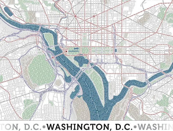
See below for some amazing images from The Atlas of Design. Click 'Full Screen' in the top right to see larger images:
