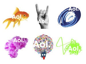
AOL is introducing a new logo and "brand identity."
The company's new look, which will be rolled out next month "when it is spun off from Time Warner, ditches the odd-looking triangle that has long served as the brand symbol and replaces the letters AOL with 'Aol.' -- complete with a period."
AOL posted a press release previewing the change on its website on Sunday.
The new AOL brand identity is a simple, confident logotype, revealed by ever-changing images. It's one consistent logo with countless ways to reveal. The new brand identity will be fully unveiled on December 10, when AOL common stock begins trading on the New York Stock Exchange.
"Our new identity is uniquely dynamic. Our business is focused on creating world-class experiences for consumers and AOL is centered on creative and talented people - employees, partners, and advertisers. We have a clear strategy that we are passionate about and we plan on standing behind the AOL brand as we take the company into the next decade," said Tim Armstrong, Chairman and Chief Executive Officer of AOL.
The New York Times quotes Sam Wilson, part of the team at Wolff Olins who designed the new look:
The period in the logo was added to suggest "confidence, completeness," Ms. Wilson said, by declaring that "AOL is the place to go for the best content online, period."
Mr. Armstrong said he liked to describe the period as "the AOL dot" because "the dot is the pivot point for what comes after AOL," whether it is e-mail, Web sites or coming offerings that will "surprise people."